


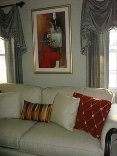
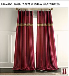
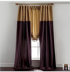
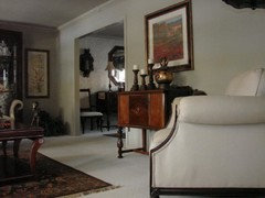
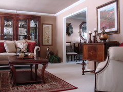
Looking to punch-up the color
charlieinnj
14 years ago


Featured Answer
Sort by:Oldest
Comments (49)

patty_cakes
14 years agoUser
14 years agoRelated Discussions
correctly lining up punches
Comments (1)read how to at graceful bee. Penny...See MoreTo Punch or Not to Punch (color of cabinets!)
Comments (4)I don't see grey as much of a punch!! but I do like the idea of colour inside some of the upper cabinets. I've seen some lovely pictures in books and magazines with bright colours painted inside. It does look sort of country, though. Is that what you want? Check out the Long House kitchen #5 http://www.plainenglishdesign.co.uk/longhouse-5 This is a cream kitchen so not quite the same, but the punch of colour is gorgeous! With white cabs you might want to do more of a pastel, but I'd go for a real colour rather than grey. I'd worry it would just look sort of dingy inside the cabinets. What colour dishes or glass wear will you put inside them? Maybe thinking about that will help you decide on a colour....See MorePunch list or pre-punch list work?
Comments (9)Agree that this is pre-punch. You've already articulated your biggest concerns. Now- not at punch- is the time to address it all. You have had a leak. To think that a few pieces of new tin will take care of it is to ignore the infrastructure issues that possibly lay, quite literally, above your head as you sleep. To think that the chipped tile can be seamlessly fixed? Well, hopefully the order was 20% over what you needed, from the same lot. Otherwise, you could be looking at the same as the ceiling- patchwork. Things go wrong- I get it! But you need to calmly, but firmly state your issues, and work for the remedies,....See MoreHow can I add interest to a long hallway
Comments (17)I think if you keep the frames all the same size with white matts then add your colorful photos and don’t get all stressed about the colors working.I agree 3 fixtures would be a good idea make sure they are LEDs in 4000K to keep the colors true....See MoreIdeefixe
14 years agoholleygarden Zone 8, East Texas
14 years agocharlieinnj
14 years agocosmikcat
14 years agocharlieinnj
14 years agoamysrq
14 years agoandreadeg
14 years agonanny2a
14 years agoUser
14 years agocosmikcat
14 years agocharlieinnj
14 years agocharlieinnj
14 years agoUser
14 years agocharlieinnj
14 years agoUser
14 years agosandra_zone6
14 years agotarhlfan
14 years agocharlieinnj
14 years agoscanmike
14 years agovampiressrn
14 years agolynn_r_ct
14 years agocharlieinnj
14 years agoUser
14 years ago
Robbi D.
14 years agogigib_08
14 years agocharlieinnj
14 years ago
Kathleen McGuire
14 years agocharlieinnj
14 years agopatty_cakes
14 years agocharlieinnj
14 years agodee42
14 years agocharlieinnj
14 years agocharlieinnj
14 years agohomebodymom
14 years agodjsaw
14 years agocharlieinnj
14 years agohomersmom
14 years agovampiressrn
14 years agohaley_comet
14 years agocharlieinnj
14 years agodeclansmom
14 years agoKathleen McGuire
14 years agocharlieinnj
14 years agohoyamom
14 years ago
cyn427 (z. 7, N. VA)
14 years agoyodajo
14 years ago


Related Stories
KITCHEN DESIGNNew This Week: 4 Ways to Punch Up a White Kitchen
Avoid the hospital look by introducing a bit of color, personality and contrast
Full Story
BATHROOM DESIGN18 Dream Items to Punch Up a Master-Bath Wish List
A designer shared features she'd love to include in her own bathroom remodel. Houzz readers responded with their top amenities. Take a look
Full Story
ECLECTIC HOMESHouzz Tour: Comic Book Prints and Vintage Decor Punch Up a Dublin Home
Flowing space and an ever-changing mix of vintage finds are key to this home’s cool, creative look
Full Story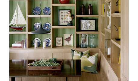
DECORATING GUIDESPunch Up Your Shelving
Show Off Shelves (and What's On Them) With a Backing of Pattern and Color
Full Story
ENTERTAININGA Punch List for Party Decorating
Of course, food and friends are the only essentials for a holiday party, but a few special touches really turn up the cheer
Full Story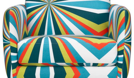
FURNITUREGuest Picks: 20 Upholstered Chairs that Pack a Punch
Armchairs, rockers and club chairs that'll rule the room with their eye-catching style
Full Story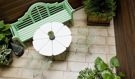
GARDENING AND LANDSCAPINGPint-Size Patios Pack a Punch
No room for a dramatic deck or a traditional terrace? You can still savor the delights of the outdoors with a small patio
Full Story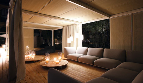
CEILINGS13 Ceiling Treatments To Look Up To
Intricate, Rustic, Modern or Metal, These Ceilings Make the Room
Full Story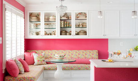
KITCHEN OF THE WEEKKitchen of the Week: A Punch of Pink for a White Kitchen
A homeowner shows her love of pink in bold walls that impart a cheerful vibe
Full Story
BATHROOM DESIGNVanities That Pack a Storage Punch
Get ideas for your powder room or bath from stylish vanities with great undersink storage
Full Story


yborgal