


New This Week: 4 Ways to Punch Up a White Kitchen
Avoid the hospital look by introducing a bit of color, personality and contrast
Mitchell Parker
November 6, 2015
Houzz Editorial Staff. Home design journalist writing about cool spaces, innovative trends, breaking news, industry analysis and humor.
Houzz Editorial Staff. Home design journalist writing about cool spaces, innovative... More
These days the words “white kitchen” seem redundant. When nearly half of homeowners out there are choosing white cabinets for their kitchens (49 percent, according to a 2014 Houzz survey on kitchen trends), you know we’re experiencing a full-on white-kitchen craze. But restrict yourself to too much white and you run the risk of creating a space that looks downright sterile. And nobody wants to be reminded of a hospital cafeteria.
Here, four designers share how they punched up mostly white kitchens with special features that brought color, personality and contrast.
Here, four designers share how they punched up mostly white kitchens with special features that brought color, personality and contrast.
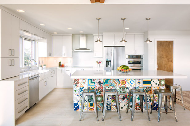
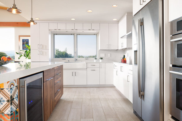
1. Statement Tile
Designer: Renee Urbanowicz of Melton Design Build
Location: Boulder, Colorado
Size: 180 square feet (16½ square meters); about 15 feet by 12 feet (4.5 by 3.6 meters)
Year built: 1975
Special feature: Handmade 8-by-8-inch Italian tiles. The homeowners wanted to add life to their kitchen in a fun way while maintaining a contemporary feel. A photo of a similar island seen in a magazine from Mexico inspired this idea. In each set, only four tiles have the same pattern. To mix things up even more, designer Renee Urbanowicz placed them in a random pattern.
Homeowners’ request: A contemporary, well-thought-out, easy-to-clean, family-focused space with durable surfaces.
Plan of attack: This kitchen was part of a remodel project for a 1970s-built house. The designers and homeowners first chose the slab cabinet door style without detailing. They then selected the white color for the kitchen, followed by the main countertop, the custom island countertop and the appliances. The colored tile on the island was one of the last elements selected.
Why the design works: The original space felt closed off and dark. Urbanowicz removed walls and soffits, refinished the popcorn ceiling and added better lighting, a walk-in pantry and the focal-point island. Keeping the cabinets along the perimeter of the room allowed for increased functionality and storage. Keeping the appliances in about the same location as in the previous kitchen reduced the need for extensive rewiring and plumbing work.
Who uses it: A couple and their three children.
Designer secret: “The key to designing a great kitchen is ensuring that your plans are both functional and beautiful,” Urbanowicz says. “In this space, we specifically focused on a balance between maximizing the storage and keeping things open to the dining, living and exterior areas. Using the same type of cabinetry throughout the home ensured there was continuity and enhanced the contemporary feel of the entire home.”
Splurges and savings: The homeowners saved on the tile and cabinet hardware so they could splurge on a thicker, custom countertop for the island.
Take-away: “Limiting the number of colors used in the finished palette for a space really helps preserve a timeless feel,” Urbanowicz says. “The white base allows for easy changes to be made throughout the years to come.”
The nitty-gritty: Cabinets: Full Access, Omega Cabinetry; countertop: lattice quartz, Pental Granite & Marble; sink: Whitehaven, Kohler; tile: Varese, Design Materials; faucet: Trinsic, Delta
Team: Studio Q Photography
See more of this home
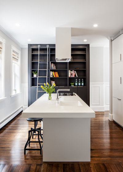
2. Bold Bookshelf
Designer: Chris Greenawalt of Bunker Workshop
Location: South End neighborhood of Boston
Year built: 1900
Special feature: A tall black bookshelf. “The client was really into the idea of having a minimal white kitchen look,” designer Chris Greenawalt says. “I felt that the space would be elevated if we added an element that was in complete contrast to everything else in the room.” Its color isn’t the only thing setting it apart. While the white cabinets are smooth, the medium-density fiberboard and thermofoil black cabinets and bookshelf have a bit of texture to them.
Homeowners’ request: The previous layout was not working functionally and was choking an already tight space. The homeowners wanted the basics: a better flow, a place to store their kitchen items and a place for their books.
Plan of attack: Greenawalt first asked the homeowners what wasn’t working for them. “I find that people tend to better express themselves when describing what they’re missing, not necessarily what they want,” he says. “I think this leads to a more personally tailored design instead of some generic kitchen as seen on Real Housewives.”
The homeowners felt the standard off-the-shelf cabinets and finishes had to go. Greenawalt started with a hardworking island. It serves as a cleaning and prep area, houses most of the appliances and functions as a dining table. The island also improved flow by allowing for two passageways through the space instead of the bottleneck layout that had existed.
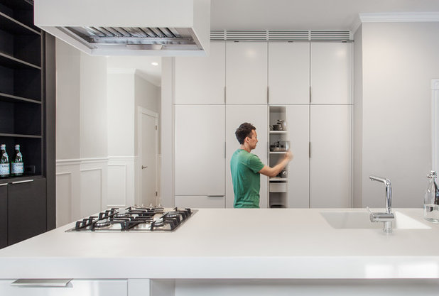
What goes on here: This space acts as the kitchen, dining room, bar and library.
Who uses it: Sheng Lin, a pharmacist and real estate agent, and Aaron Angotti, who works in financial services
Designer secret: “I’m proud of the way the bookcase looks and functions in the space,” Greenawalt says. “I really enjoy the minimalist aesthetic, but the look can quickly become boring if you don’t introduce some texture into the design.”
The nitty-gritty: Faucet: Blanco 441197; refrigerator: 24-inch built-in, Liebherr; cooktop: four-burner gas, Miele KM360GSS; oven: 24-inch electric, Miele DGC6700XL; dishwasher: 18-inch with panel, Miele G4580SCVI; microwave: GE JEM3072SHSS; countertops: Corian in Glacier White with 3-inch drop edge; cabinetry: custom, Camio; rolling ladder: Richelieu
Team: Michel Beaudry (builder); Camio Custom Cabinetry; Matt Delphenich (photographer)
See more of this kitchen
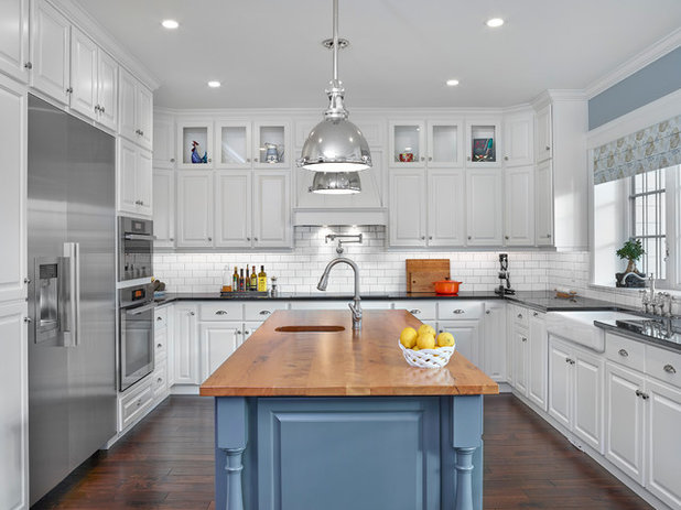
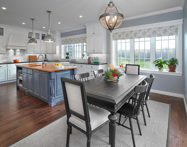
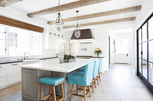
3. Standout Island
Designer: Sydney Bond of Effect Home Builders
Location: Sherwood Park, Alberta, Canada
Size: About 250 square feet (23 square meters)
Year built: 2014
Special features: A reclaimed-beechwood countertop on a blue-base island. Black granite on the perimeter countertops provides additional contrast. Soft gray-blue paint above the sink complements the island and continues on the walls throughout most of the main floor. “Blues are used a lot throughout the home,” designer Sydney Bond says. “A prairie-sky palette is familiar and comforting to Albertans.”
Homeowners’ request: Spacious, with lots of windows. The homeowners also preserve fruits and vegetables from their garden and bake and cook every day, so the kitchen needed to be functional for that and have ample storage.
Plan of attack: The hand-scraped walnut floors came first, followed by the white cabinets. From there came the countertops, then a subtle subway tile backsplash that wouldn’t take away from the main feature: the reclaimed-wood countertop on the island. The lighting and paint colors came last. Customized storage includes a recycling center, cookbook shelves and glass-front cabinets for displaying accessories. “There is an interesting mixture of some very traditional elements, like the apron sink and deck faucet, and then very modern elements, like the induction cooktop that blends in with the black granite,” Bond says.
Who uses it: A husband and wife, both of whom are doctors, and their son and daughter, whom they home-school.
Designer secret: Using charcoal-colored grout with white subway tile. “This small design element makes a world of difference,” Bond says. The grout helps transition the white cabinets to the stark black countertops. It was also a practical decision. “White grout is beautiful, but you will drive yourself crazy trying to keep it white,” Bond says.
“Uh-oh” moment: “When cabinets were made and installed but were not made to accommodate the apron sink the homeowners purchased,” Bond says. “Somehow this was not communicated to the cabinetmaker. A cast iron apron sink weighs a ton, and needs to be considered when designing the cabinets. Luckily, we were able to find an apron sink with a smaller apron and a bit smaller width, and the cabinetmaker made adjustments onsite to make it fit.”
Splurges and savings: By saving on the simple porcelain subway tile, the homeowners were able to splurge on the reclaimed-wood slab on the island.
Take-away: “Elegance can be found in sometimes the most understated areas,” Bond says. “The kitchen is meant to be functional, but it turned out being one of the most beautiful rooms in the home. All it took was a couple of feature elements in a simple white kitchen to make a standout space.”
The nitty-gritty: Backsplash and flooring: Builder’s Floor Centre; cabinetry: Pioneer Cabinets; countertop: granite: Granite Worx; lights, faucets and pot filler: BA Robinson; reclaimed-wood island top: Flo Form; appliances: Miele; wall paint: Zephyr, Cloverdale; island base paint: Iron Mountain, Benjamin Moore; cabinet paint: Simply White, Benjamin Moore; wall coverings: National Drapery
Team: Fuse Architecture + Design; Pioneer Cabinets; Merle Prosofsky (photographer)
4. Material Mix — Reclaimed Wood, Copper and Iron
Designers: Michael and Betty Terry of Graystone Custom Builders
Location: Newport Beach, California
Size: About 335 square feet (31 square meters)
Year built: 2015
Special features: Exposed reclaimed-wood rafters. A range hood handcrafted out of treated copper and trimmed in painted white millwork. Chicken wire on the upper row of cabinets. A darker paint color on the base of the island that grounds the white marble countertop. Slipcovered chairs that complement the seaside color scheme found elsewhere in the home.
Granite perimeter countertops have the look of soapstone without the maintenance, and play beautifully with the Michelangelo Calacatta marble island countertop. The rustic white painted brick backsplash contrasts the cabinet details — dentil molding and beading — and bell jar light fixtures. Iron doors open to an outdoor patio.
Homeowners’ request: A rustic-meets-refined kitchen with a coastal theme. “This is the heartbeat of the home, right in the center,” designer Betty Terry says.
Who uses it: An empty-nest couple who likes to entertain.
“Uh-oh” moment: Where to end the brick backsplash. The designers eventually decided to continue the brick around the corner and into the hall.
Splurges and savings: The homeowners liked the look of soapstone for the perimeter countertops but were able to save half the cost by going with granite. They splurged on the reclaimed-wood beams, details on the custom cabinetry and copper hood. The iron doors were the biggest splurge.
The nitty-gritty: Island countertops: Michelangelo Calacatta marble, Venetian Tile & Stone Gallery; bell jar light fixtures: Hampton pendants, Hudson Valley; sink: Barclay 36-inch single-bowl farm sink, Pirch; faucet and fittings: Waterstone Annapolis collection, Pirch; range: 48-inch dual-fuel range, Thermador; dishwasher: panel-ready, Thermador; wine fridge: 24-inch stainless steel, Miele; refrigerator: 30-inch stainless steel, Miele; freezer drawer: 30-inch panel-ready, Sub-Zero; ice maker: Perlick; bifold iron doors: Euroline Steel Windows & Doors; slipcovered stools and window covering: Blackband Design
See more photos of this home


Our well qualified and certified team of hard working craftsman and specialists have a proven record of quality... Read More
What are you working on?

Related Products
Related Stories
New This Week
4 New Kitchens With Wonderful Wood Cabinets
Pros share how they used various wood species, styles, stains and details to create warm and welcoming kitchens
Full Story
Kitchen Backsplashes
30 Bold and Beautiful Range Backsplashes
Get ideas for eye-catching tile and stone backsplashes inside stove alcoves and behind cooktops
Full Story
Kitchen Design
7 Essential Features of a Well-Designed Kitchen
Make sure your new kitchen not only looks good but also functions beautifully
Full Story
Kitchen Workbook
How to Map Out Your Kitchen Remodel’s Scope of Work
Help prevent budget overruns by determining the extent of your project, and find pros to help you get the job done
Full Story
Kitchen Storage
Foolproof Storage Solutions for Corner Kitchen Cabinets
By tidgboutique
Consider Lazy Susans, pullouts and more to maximize storage
Full Story
Trending Now
The 10 Most Popular Kitchens So Far in 2024
Get inspired by the warm neutral palettes, ample storage and inviting islands in these most-saved new photos on Houzz
Full Story
Houzz TV
5 Trends for Kitchen and Bath Products in 2024
See fascinating new features for showers, tubs, faucets and more launched at the 2024 Kitchen and Bath Industry Show
Full Story
Kitchen Backsplashes
Where to Start and Stop Your Backsplash
By tidgboutique
Consider these designer tricks to work around cabinets, windows and other features for a finished look in your kitchen
Full Story
Kitchen Workbook
How to Find Your Kitchen Style
If you’re planning to remodel your kitchen, here’s how to find inspiration and start narrowing down your choices
Full Story
Kitchen Design
15 Stylish Kitchen Range Hood Ideas
Get ideas for hood shapes, sizes and looks that can elevate a kitchen’s design while ridding it of bad air and odors
Full Story
Very good tips, thanks!
Here are a few of our Range Hoods in White Kitchens.