


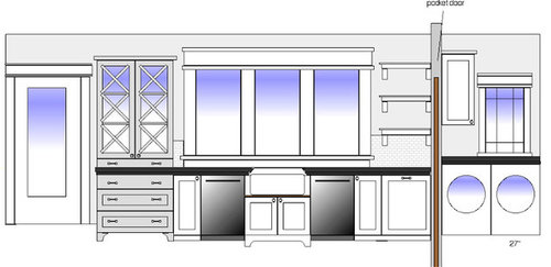
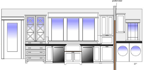
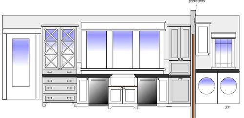
What would you put here?
worldmom
14 years ago


Sort by:Oldest
Comments (62)
Related Stories
MOVINGRelocating? Here’s How to Make the Big Move Better
Moving guide, Part 1: How to organize your stuff and your life for an easier household move
Full Story
LIFERelocating? Here’s How to Make Moving In a Breeze
Moving guide, Part 2: Helpful tips for unpacking, organizing and setting up your new home
Full Story
GARDENING GUIDESYour Garden Is Stirring — Here’s What to Do in February
February is a good time to start seeds, shape up shrubs and watch for the earliest blooms. Here’s what to do in your part of the U.S. now
Full Story
PETSHere’s How to Show Your Pet Even More Love
February 20 is Love Your Pet Day. Find all the ideas and inspiration you need to celebrate right here
Full Story
KITCHEN CABINETSChoosing New Cabinets? Here’s What to Know Before You Shop
Get the scoop on kitchen and bathroom cabinet materials and construction methods to understand your options
Full Story
ARTHere’s Looking at You: Supersize Portraiture at Home
Go big. Go bold. Hang huge portraits on blank walls for maximum impact
Full Story
MOST POPULARSpring Gardens Are Blooming — Here’s What to Do in April
Get the guide you need for gardening in your U.S. region, with tasks, climate-appropriate plantings and more
Full Story
SPRING GARDENINGEnjoy the Peak of Spring Gardening — Here’s What to Do in May
Bid the frost farewell and treasure the blooms. No matter what U.S. region you’re in, one of these guides will help your garden flourish
Full Story
DIY PROJECTSHere’s a Thanksgiving Centerpiece You Can Use Through the New Year
Make a fall centerpiece that can transition to winter with ingredients foraged in nature
Full Story
GARDENING GUIDESKeep Your Cool in the Garden — Here’s What to Do in August
Don’t let summer’s heat go to your head. These U.S. gardening guides will help you make sensible choices for all of your plantings
Full Story


worldmomOriginal Author
worldmomOriginal Author
Related Discussions
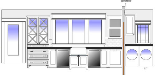
What would you put here?
Q
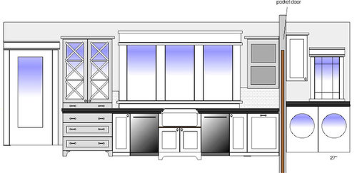
What would you put here?
Q
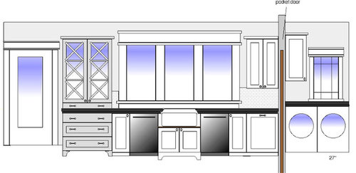
What would you put here?
Q
What would you put here to block plug?
Q
worldmomOriginal Author
brickton
worldmomOriginal Author
worldmomOriginal Author
missmuffet
judydel
rhome410
plllog
worldmomOriginal Author
rhome410
worldmomOriginal Author
rhome410
missmuffet
plllog
westchestermom
ccoombs1
malhgold
beekeeperswife
brickton
kaismom
karen_belle
karen_belle
plllog
sweeby
weidiii
worldmomOriginal Author
worldmomOriginal Author
worldmomOriginal Author
plllog
sweeby
plllog
rhome410
plllog
worldmomOriginal Author
country_smile
rhome410
sweeby
worldmomOriginal Author
sweeby
worldmomOriginal Author
User
plllog
rhome410
plllog
rhome410
plllog
worldmomOriginal Author
plllog