


Plllog, can I run my backsplash ideas past you?
honeysucklevine
14 years ago
Sort by:Oldest
Comments (41)
Related Stories

FUN HOUZZSo Your Style Is: Sci-Fi Past and Future
Are you more likely to search for design ideas at Comic-Con than High Point Market? If so, the future of decorating is yours
Full Story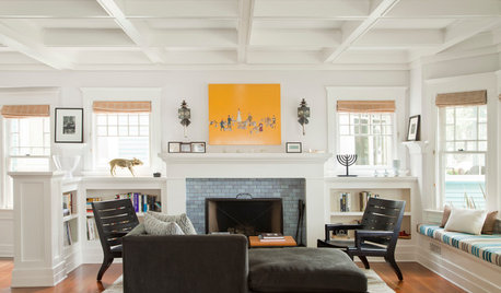
CRAFTSMAN DESIGNHouzz Tour: Bridging Past and Present in a California Craftsman
A Santa Monica bungalow says goodbye to gloominess and hello to a bright new look that mixes modern and traditional
Full Story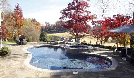
GARDENING AND LANDSCAPINGEnjoy Your Pool Long Past Labor Day
Don't give your pool and patio the cold shoulder just because the air is chillier. New accessories can help foster a warm relationship
Full Story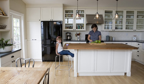
ORGANIZINGDo It for the Kids! A Few Routines Help a Home Run More Smoothly
Not a Naturally Organized person? These tips can help you tackle the onslaught of papers, meals, laundry — and even help you find your keys
Full Story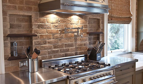
KITCHEN DESIGNYes, You Can Use Brick in the Kitchen
Quell your fears of cooking splashes, cleaning nightmares and dust with these tips from the pros
Full Story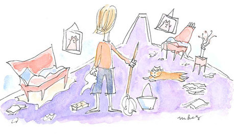
LIFEWe Can Work It Out: Living (and Cleaning) Together
Run a household without fussing and fighting with these ideas for how to work together on household chores
Full Story
ECLECTIC HOMESHouzz Tour: Historic Home Connects With Its Past
This Sydney family home survived a series of makeovers before finding its perfect match
Full Story
WALL TREATMENTSHow to Get Past Your Fear of Bold Wallpaper Prints
Follow these tips and you’ll never be afraid of putting up that pattern-crazy paper again
Full Story
KITCHEN DESIGNThe Cure for Houzz Envy: Kitchen Touches Anyone Can Do
Take your kitchen up a notch even if it will never reach top-of-the-line, with these cheap and easy decorating ideas
Full Story
KITCHEN OF THE WEEKKitchen of the Week: Marrying Past and Present in Los Angeles
Something old, something new and all the rest make for a happy kitchen union in a tony L.A. neighborhood
Full Story


plllog
plllog
Related Discussions
Here's my kitchen - need backsplash ideas!
Q
backsplash ideas for my oak kitchen?
Q
Vertical Backsplash? A Backsplash Regret?
Q
Backsplash pencil liner runs into outlet help
Q
honeysucklevineOriginal Author
plllog
honeysucklevineOriginal Author
plllog
honeysucklevineOriginal Author
plllog
honeysucklevineOriginal Author
plllog
honeysucklevineOriginal Author
plllog
honeysucklevineOriginal Author
plllog
honeysucklevineOriginal Author
plllog
honeysucklevineOriginal Author
plllog
honeysucklevineOriginal Author
plllog
honeysucklevineOriginal Author
honeysucklevineOriginal Author
honeysucklevineOriginal Author
plllog
honeysucklevineOriginal Author
teppy
plllog
honeysucklevineOriginal Author
plllog
honeysucklevineOriginal Author
plllog
honeysucklevineOriginal Author
honeysucklevineOriginal Author
plllog
honeysucklevineOriginal Author
plllog
honeysucklevineOriginal Author
plllog
plllog
honeysucklevineOriginal Author
plllog