


i can sing a rainbow
User
13 years ago
Sort by:Oldest
Comments (15)
Related Stories
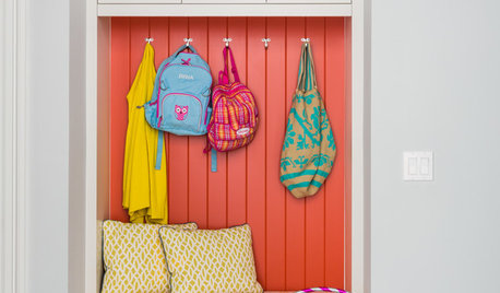
COLOR10 Ways to Lift a White Room With Rainbow Brights
Add a small splash of bold color with these tips for bringing sunshine shades into your home
Full Story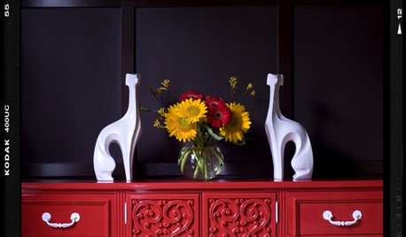
COLORHappy Color: A Rainbow of Dressers
A dresser is the perfect place to experiment with a bold shot of color for your mix
Full Story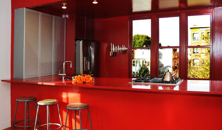
COLOR9 Monochromatic Rooms That Span the Rainbow
One color can yield infinite interest when it's done right — just hop on over the rainbow with us and see
Full Story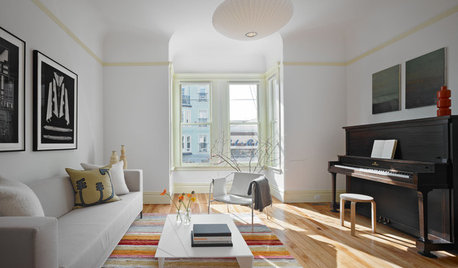
MORE ROOMS8 Ways to Make Your Piano Room Sing
Turn your upright piano into the star of the room or a great supporting player
Full Story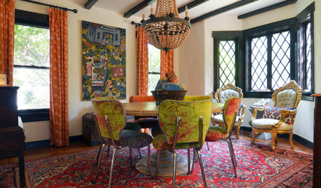
HOUZZ TOURSMy Houzz: A Fort Worth Cottage to Make Your Heart Sing
Choosing for love leads to delightfully unexpected colors, patterns and artworks in a Texas couple’s home
Full Story
SMALL HOMESMy Houzz: Color and Pattern Make a Manhattan Apartment Sing
Wild colors, fearless patterns and a bit of burlesque show that downsizing doesn't have to mean cutting style short
Full Story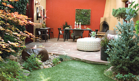
GARDENING AND LANDSCAPINGColor Makes a Garden Dining Room Sing in Santa Fe
Vibrant stucco walls, living art and chic furniture harmonize in an outdoor dining room in New Mexico
Full Story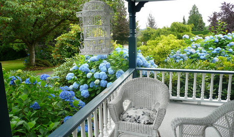
GARDENING GUIDESSummer Gardens Sing With Blues
When hot weather hits, bursts of blue keep the garden palette cool and calm
Full Story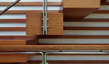
THE ART OF ARCHITECTURE16 Architectural Details That Sing
Get inspired by construction details as important as the building itself
Full Story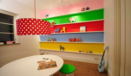


sylviatexas1
mashamcl
Related Discussions
Can I grow Rainbow Eucaluptus In My Zone, 9a?
Q
More singing of rainbows, hopefully, not off key
Q
3 thing I love best about W.Sing
Q
And while I'm singing praises...
Q
aimeekitty
rosefolly
sherryocala
aimeekitty
melissa_thefarm
elemire
mendocino_rose
ingrid_vc so. CA zone 9
professorroush
anntn6b
harborrose_pnw
mariannese
oath5