


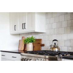
Help please! is this too busy??
Denise Manly
9 months ago

Featured Answer
Sort by:Oldest
Comments (75)

RedRyder
9 months ago
Denise Manly
9 months agoRelated Discussions
Help Pls - Entry Tile pattern too busy-tile guy on his way
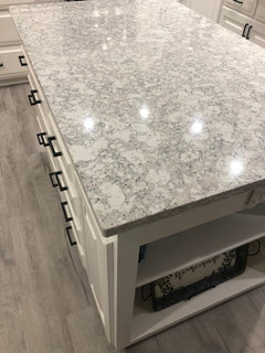
Comments (50)thanks all, ajsmama, yes I said Ididn't like the rug and I didn't, but this is the best pattern for that space andnow that I see it I see that dh and others here were correct. I know too funny, I now have what I didn't like and now like what i didn't like, strange process for me....See MoreMy Kitchen backsplash is too busy! Help
Comments (36)Monochromatic means one color. I'd say this actually is monochromatic or close to it--all the same color family. The issue isn't that it is too colorful. The issue is whether it is too busy. That relates to pattern, which I think people often discuss in terms of whether something is too "busy." It is too busy for my taste. If the OPer had said in her first post, I love my new tile, I wouldn't say anything. But since she asked, I do think it is too busy. And I don't think the sunk cost is a reason not to change it. I think it can be changed with not much additional cost by simply pulling down the tile and painting a neutral color pulled from the countertop, or really even a different color which would be a way to introduce color without pattern. And a recent, favorite, not-at-all monochromatic kitchen reveal here that comes immediately to mind is Carrieb's....See MoreHelp! I chose Countertops that are too busy.
Comments (2)Can you post a picture? Try a solid cream color tile for backsplash. I have river bordeaux and slate floors. It's kind of wild but I love the natural element it brings....See MoreDesign help! Picking tile for backsplash that won't be too busy
Comments (7)What are all those receptacles and switches on the walls? I've never seen so many. Your backsplash will be very broken up by all of those. Depending on your local Code, but most say that a wall receptacle needs to be installed every 2'. You need to remove some of whatever those are....See MoreK Laurence
9 months agoRedRyder
9 months ago PRO
PROJAN MOYER
9 months agoDenise Manly
9 months ago
deegw
9 months ago PRO
PROBeverlyFLADeziner
9 months agoDenise Manly
9 months ago- PRO
JAN MOYER
9 months agolast modified: 9 months ago marylut
9 months agoPaul F.
9 months ago PRO
PRODebbi Washburn
9 months agodecorpatti
9 months agoRedRyder
9 months ago
thinkdesignlive
9 months agoanna_682
9 months agolast modified: 9 months agoDenise Manly
9 months agoDenise Manly
9 months agoHU-655638150
9 months agolast modified: 9 months ago
texmax13
9 months agoHU-918119203
9 months agoHU-918119203
9 months agoCaroline Hamilton
9 months ago
chloebud
9 months agolast modified: 9 months agoRedRyder
9 months agomarmiegard_z7b
9 months agochloebud
9 months ago
rebunky
9 months agolast modified: 9 months ago
Kathy Handy Ginter
9 months agoDenise Manly
9 months agothinkdesignlive
9 months agodeegw
9 months agolast modified: 9 months agoanna_682
9 months agolast modified: 9 months ago- PRO
JAN MOYER
9 months agolast modified: 9 months ago 
Rachel
9 months ago PRO
PRODeWayne
9 months agoanna_682
9 months agodoods
9 months agolast modified: 9 months ago
Lynn Lou
9 months agochispa
9 months ago
acm
9 months ago PRO
PROQuicklok Cabinets
9 months agoM Miller
9 months agolast modified: 9 months agoLynn Lou
9 months ago- PRO
Debbi Washburn
9 months ago Sophia
9 months ago
Toni Hamlett
9 months ago
sprtphntc7a
9 months agolast modified: 9 months agoRedRyder
9 months ago


Related Stories


LATEST NEWS FOR PROFESSIONALS3 Practices That Can Help You — and Your Business — Grow
You don‘t always need a class or a coach to improve professionally. Focus on getting better at these everyday tasks
Full Story0

DECORATING GUIDESMy Houzz: A Tranquil Place on a Busy Street
An interior designer helps a couple transform their urban apartment in bustling San Francisco into a home
Full Story
HOME OFFICESQuiet, Please! How to Cut Noise Pollution at Home
Leaf blowers, trucks or noisy neighbors driving you berserk? These sound-reduction strategies can help you hush things up
Full Story
BATHROOM MAKEOVERSBathroom of the Week: Bright and Airy Design for a Busy Mom
A designer at a design-build firm helps a homeowner pull together her ideas and create a well-functioning space
Full Story
KITCHEN DESIGNKitchen of the Week: White Cabinets With a Big Island, Please!
Designers help a growing Chicago-area family put together a simple, clean and high-functioning space
Full Story
WORKING WITH PROS8 Ways to Keep Your Home Project Going While Helping Local Pros
Helping design and building businesses during this crisis offers advantages for homeowners
Full Story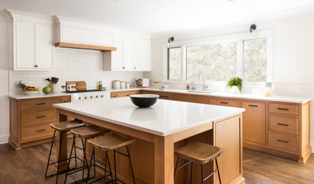
KITCHEN MAKEOVERSKitchen of the Week: White and Wood for a Busy Family of 5
A designer helps a New Jersey couple create a brighter and more efficient space for their active lifestyle
Full Story
GARDENING GUIDESGreat Design Plant: Ceanothus Pleases With Nectar and Fragrant Blooms
West Coast natives: The blue flowers of drought-tolerant ceanothus draw the eye and help support local wildlife too
Full Story
GARDENING GUIDESGreat Design Plant: Silphium Perfoliatum Pleases Wildlife
Cup plant provides structure, cover, food and water to help attract and sustain wildlife in the eastern North American garden
Full Story


deegw