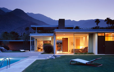
Busy, Busy, Busy: Decorating with Patterns

Neutral rooms are great. They're calming and simple and minimal. Unfortunately, they can also be very boring.
That's why I'm all about patterns. They're invigorating. Whether it’s a tiny polka-dotted teacup or a bold stripe painted right on the wall, patterns add energy to the room. There’s a limit, though. Too much pattern is, well, too much. But with a little bit of thought and planning, incorporating patterns into a room is easy and pretty fantastic.
Here are some uses of pattern that I love:
Anybody can paint a striped room (even if it does require some patience - I speak from experience!) These colors are perfect, too. They'd each be cool alone, but together the tiny nook is captivating, but somehow still fairly neutral. Plus, check out the rug - it's great and an amazing alternative to a safe, plain rug.
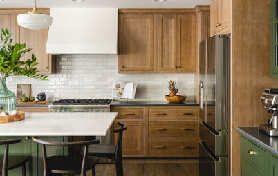
A rug is a perfect low commitment way to inject some pattern into a room. It provides a base for the whole look, so it spices things up. At the same time, since the floor is rarely a focal point, it's safer to go bold there than on, say, the walls.
I love the use of multiple patterns all within one color palette, but going multiple means you have to be careful not to overdo it. Small accessories, like a tea set, are a great way to inject a little energy without overwhelming the whole space.
Windowpanes are a really unexpected way to add pattern to a room. On one hand, mixed with the landscape, they almost blend in. However, the choice of a bold red - so daring - pops the check pattern into the foreground.
The portraits on these walls are pretty much the ultimate in bold use of pattern. It's a risk, but works thanks to the limited color scheme and simple lines. Plus, I love how the squiggles on the chair play off the curves in the portrait. The whole effect is sleek and (definitely) bold.
As far as I'm concerned, the ultimate patterns are the ones inspired by Pucci, like this screen print. It's natural and brigh all at once - and safe for use against a clean white background with only natural plants as complements. This would be equally at home in a living room with white walls simple charcoal, green and chartreuse accents.
Wallpaper. As I've mentioned before - more than once - I love it, especially when it looks like this. I'm into the big, bold pattern in subtle colors. It makes a statement but it's far from obnoxious.
Function and form! This screen effect does a great job of dividing this open space without cutting off light. With it's simple pattern, it's also a cool design element. I love the tangerine color, as well as the Mondrian-like lines.