


Accent color cohesion throughout house or switch/lighten it up?
Monica Horseman
last year
last modified: last year


Comment
Related Stories
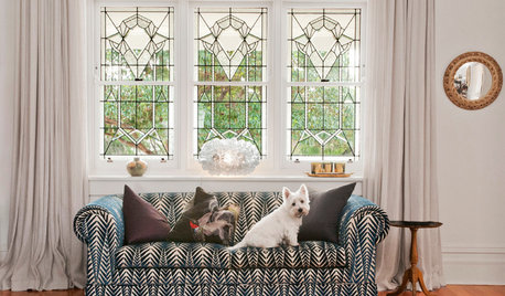
DECORATING GUIDESHouzz Tour: Lots of Love for a Lightened-Up 1909 Home
A family in Perth, Australia, lavishes attention on their historic house. Vintage furnishings fill the newly cheerful renovated space
Full Story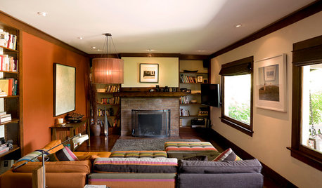
HOUZZ TOURSHouzz Tour: A California Craftsman Bungalow Lightens Up
Japanese and '60s-mod touches give heavy-looking interiors a new outlook in this Pasadena home
Full Story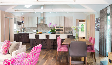
KITCHEN DESIGNLightened-Up Midcentury Kitchen Goes With the Flow
A ranch’s kitchen, dining area and living room are combined in one beautifully unified space, while a mudroom solves a clutter problem
Full Story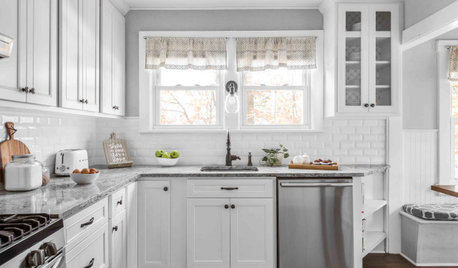
KITCHEN MAKEOVERSKitchen of the Week: Refaced Cabinets Lighten Up the Room
A designer saves her clients time and money by reusing what they already have in their 120-square-foot space
Full Story
HOUZZ TOURSMy Houzz: Humor Lightens Up Midcentury Style in Dallas
A clutter-free decorating philosophy gets a youthful update with bright colors, quirky art and Pac-Man
Full Story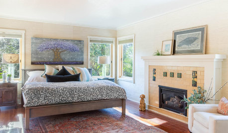
BEFORE AND AFTERS100-Year-Old Craftsman Home’s Master Suite Lightens Up
A designer balances architectural preservation with contemporary living in this Northern California remodel
Full Story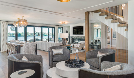
DECORATING GUIDESHow to Create a Cohesive Color Flow Throughout Your Home
Designers share eight techniques for avoiding a choppy feeling in your spaces
Full Story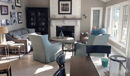
BEFORE AND AFTERSLiving Area Lightened Up and Ready for Anything
Porcelain tile and outdoor fabrics prepare this lakeside home for the challenge of pets and kids
Full Story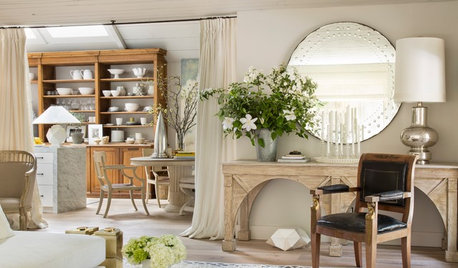
HOUZZ TOURSBefore and After: A California Wine Country House Opens Up
An interior designer revamps his Healdsburg getaway into a comfortable, welcoming home full of character
Full Story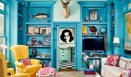
HOUZZ TOURSHouzz Tour: A Federalist-Style Home Lightens Up
A creative homeowner who loves color infuses her traditional brick home in Texas with energy and style
Full Story


Related Discussions
Help me lighten up!
Q
Lighten up kitchen ideas
Q
Need advice on how to pick paint colors throughout home!
Q
How do I lighten this up and modernize it?
Q