


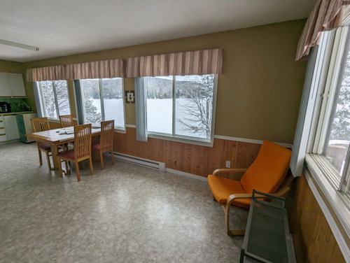
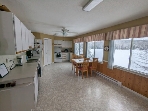
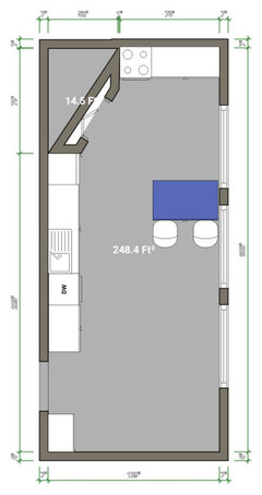
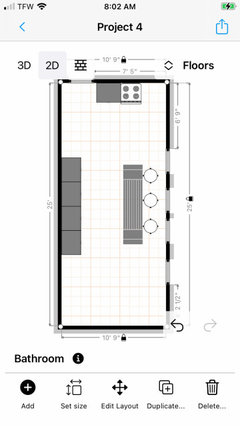
Awkward kitchen layout
Ana
last year
Featured Answer
Sort by:Oldest
Comments (17)

HU-918119203
last yearRelated Discussions
Small, Awkward Kitchen Layout
Comments (52)"...AND the plans are all running traffic one way or the other back and forth through the kitchen, some plans even requiring you to dodge others while you carry boiling water from stove to sink..." Rosie - please take a closer look at the layouts I drew up - there are prep sinks in all of them to avoid the very thing you're saying is an issue. Is it perfect? No - but then, no one's kitchen is perfect. If the OP says s/he does not want to change/move something b/c s/he wants a certain feel and function for the space or it cannot be done for financial reasons, then I think we should respect that. We can suggest s/he consider new ideas - which s/he has done - or to check out the actual cost for some changes b/f assuming it would be too expensive, but once the OP has made a decision for his/her home, then we should let it go. Some people may think their ideas of what the style/use of the home should be are "right" and that owners shouldn't change it b/c these same people think they shouldn't - but...this is not our kitchen, space, or home - it's Cluch's. Every project has compromises - what is acceptable as a compromise to the OP may not be to you and compromises you might think are acceptable may not be to the OP. To remind everyone of what has been mentioned by the OP: "...We want to open up the space by removing the wall between the kitchen and dining room, and also the wall between the kitchen and sunroom. We are after a large family, eat-in kitchen, great room sort of feel. However this will be our only dining space as well, so we need to be able to squeeze in up to 8 people at the table on rare occasions...." "...we prefer the kitchen to be connected the sunroom. Also, we are hoping to change the window in the dining room to french doors and build a deck off the back, as that is the only place where we can put a deck. ..." "...I don't know how we would expand the kitchen into the sunroom and the expense to change that space would be too costly. ..." "...We have considered putting the kitchen in the dining room, but I keep feeling as though I would be left out in the kitchen while all the fun and visiting goes on in the sunroom. And your drawings of the kitchen in the sunroom look awesome, but I feel sad to lose that space as a family area...." "...I want to be working in the kitchen and be able to see what is going in in the sunroom and see the ding table at the same time...." "...I think that I desire a "great room" feel for our family and for visitors. I see the sunroom being a big part of that. I love the idea of working in the kitchen and interacting with people in the sunroom at the same time as people at the dining table...." "...We do not need an eating area in the sunroom, and a banquette in the dining area could work. Prefer one long bench, as opposed to a corner banquette...." "...I don't think we are willing to make any other structural changes inside in terms of doorways and......See MoreSmall awkward kitchen layout, help?
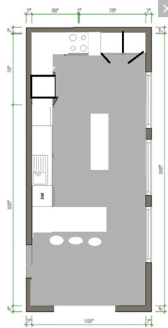
Comments (21)Here is a really quick sketch of a what kind of kitchen adding that space would get you: (The counter on the window wall is 30" deep. The counter on the range wall is standard 25" deep.) You now have a nice wide counter (and deep!) between the sink and range. That's the best location in a kitchen for prepping, and now you have a great big counter right there with a window over it to make it extra pleasant to work there. There's also a wide counter to the right of the sink for clean-up (loading/unloading the dishes) or snacking (using the dishes and the microwave) without disturbing the cook working at the primary prep counter. The counter to the right of the sink could also be used by a second cook. Here's a terrible mock-up of how much more open your kitchen would feel compared to the current plan:...See MoreAwkward Kitchen Layout?
Comments (19)I'd like to suggest reading the "Layout Help" topic to see what information would be really helpful (see end of post). E.g., what can be changed/what cannot be changed? Just plopping down a layout and asking for help isn't enough...we need to know what we have to work with. Right now, people are making suggestions with very little information to know if the suggestions make sense or are even possible. I do agree that your "new" layout is not very functional. Have you considered moving the kitchen to any other space - not just the bedroom, what about the other bedroom or the Dining Room? I think your mud room could also be improved. In fact, I think you might want to take a step back and look at the entire floor and how the various rooms relate to each other and the flow - which I'm not sure is being adequately addressed here. I'm itching to redesign the entire floor! :-) Other questions: Why do you want a "breakfast" room? Do you really need two types of table seating? You say you "already have a lot of bedrooms in the house" - how many? Where are they? What about full bathrooms? Do you need two bathrooms on this floor? What other rooms would you find useful? A library/study/den? Does anyone work from home? What is the composition of your family? Is the wood deck area your family entrance? Is this where the groceries are brought into the house? +++++++++++++++++++++++++++++++++++++++++++++ Please check the following resources: Kitchen Design FAQ threads - they will explain things like work zones, aisles, island/peninsula seating, etc. These threads will help you understand questions/comments you will receive. Layout Help - FAQ for asking for layout help. It has a sample measured layout as well as a description of the other information we need . Layout Help: How do I ask for Layout Help and what information should I include? http://ths.gardenweb.com/discussions/2767033/how-do-i-ask-for-layout-help-and-what-information-should-i-include . Kitchen Design FAQ threads: Kitchen work zones, what are they? http://ths.gardenweb.com/discussions/3638270/faq-kitchen-work-zones-what-are-they Aisle widths, walkways, seating overhangs, work and landing space, and others http://ths.gardenweb.com/discussions/3638304/faq-aisle-widths-walkways-seating-overhangs-work-landing-space-etc How do I plan for storage? Types of Storage? What to Store Where? http://ths.gardenweb.com/discussions/3638376/faq-how-do-i-plan-for-storage Ice. Water. Stone. Fire (Looking for layout help? Memorize this first) http://ths.gardenweb.com/discussions/2699918/looking-for-layout-help-memorize-this-first...See More1925 awkward kitchen layout
Comments (5)Sure! Yep, that is the spice rack and I really don’t want to lose it! It would make designing the kitchen soooo much easier if it weren‘t there. So yes, the doors are really 3’ 6”, the whole kitchen is so wonky! You can tell it was built before standard cabinets were the norm. The door I referred to as a “doorway” has had the actual door removed at some point and it leads into the dining room. The other two doors swing out away from the kitchen. In the first set of pictures it shows the door leading to the laundry room swung into the kitchen, but I had it flipped already. The other door leads into the hallway just right off the living room. Basically there is only one little L wall that separates the kitchen, dining, living, and hallway that leads off to two bedrooms and a tiny bath. It’s amazing how many doors this little cottage has for 1122 sf! They’ve grown on me though. You can walk in a perfect circle from living room to dining to kitchen. I’ll attach more photos of the house for fun :) basic house layout: Built in spice rack: House: Before floors were redone and pink walls were painted. Photo taken from kitchen doorway: Dining room now: Sleeping porch before: Sleeping Porch now: Laundry room as was when I moved in, leading into kitchen. Living room/sleeping Porch/ hallway upon moving in: Now: Bathroom before and after:...See More PRO
PROSabrina Alfin Interiors
last year- PRO
Patricia Colwell Consulting
last year  PRO
PRORL Relocation LLC
last year
YouTube's Mountain Home Rookies
last yearAna
last year
cpartist
last year PRO
PROBeverlyFLADeziner
last yearAna
last year
KW PNW Z8
last yearlast modified: last yearherbflavor
last yearlast modified: last year
kazzh
last yearroarah
last yearlast modified: last yearnickel_kg
last year- PRO
RL Relocation LLC
last year Ana
last year
Related Stories
KITCHEN OF THE WEEKKitchen of the Week: An Awkward Layout Makes Way for Modern Living
An improved plan and a fresh new look update this family kitchen for daily life and entertaining
Full Story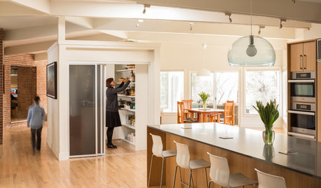
HOUZZ TOURSHouzz Tour: Dialing Back Awkward Additions in Denver
Lack of good flow once made this midcentury home a headache to live in. Now it’s in the clear
Full Story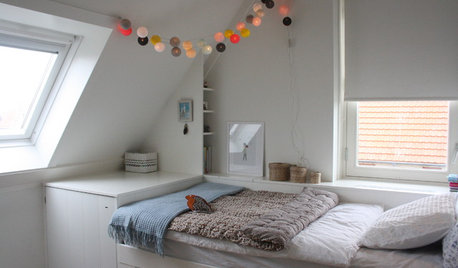
ATTICS14 Tips for Decorating an Attic — Awkward Spots and All
Turn design challenges into opportunities with our decorating ideas for attics with steep slopes, dim light and more
Full Story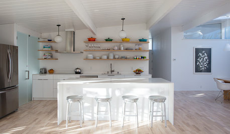
ROOM OF THE DAYRoom of the Day: Great Room Solves an Awkward Interior
The walls come down in a chopped-up Eichler interior, and a family gains space and light
Full Story
DECORATING GUIDESHow to Work With Awkward Windows
Use smart furniture placement and window coverings to balance that problem pane, and no one will be the wiser
Full Story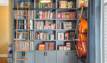
THE HARDWORKING HOMEFrom Awkward Corner to Multipurpose Lounge
The Hardworking Home: See how an empty corner becomes home to a library, an LP collection, a seating area and a beloved string bass
Full Story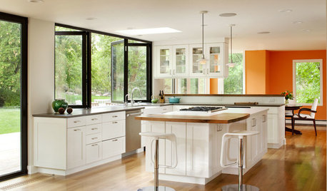
KITCHEN DESIGNDetermine the Right Appliance Layout for Your Kitchen
Kitchen work triangle got you running around in circles? Boiling over about where to put the range? This guide is for you
Full Story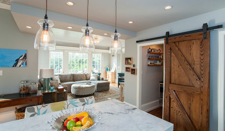
KITCHEN DESIGNKitchen of the Week: Barn Wood and a Better Layout in an 1800s Georgian
A detailed renovation creates a rustic and warm Pennsylvania kitchen with personality and great flow
Full Story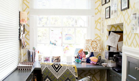
HOME OFFICESRoom of the Day: Home Office Makes the Most of Awkward Dimensions
Smart built-ins, natural light, strong color contrast and personal touches create a functional and stylish workspace
Full Story
WINDOWSAwkward Windows and Doors? We've Got You Covered
Arched windows, French doors and sidelights get their due with treatments that keep their beauty out in the open
Full Story
BeverlyFLADeziner