


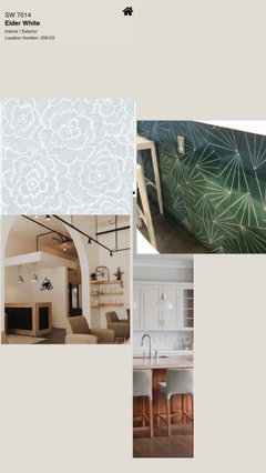
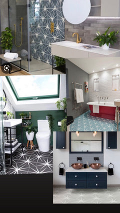
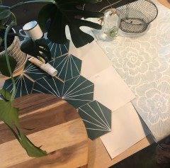
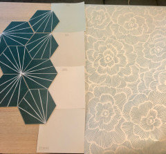
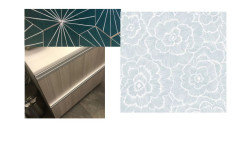
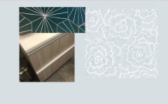
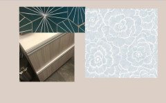
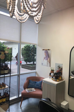
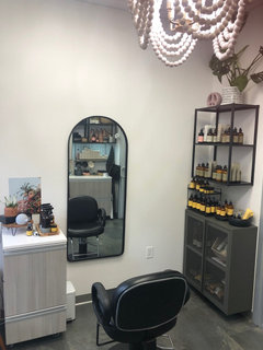
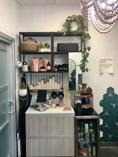
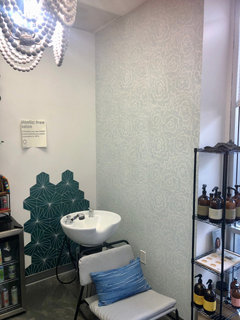
Wall color advice
Jenni Sharma
last year
Featured Answer
Sort by:Oldest
Comments (24)

elcieg
last yearlast modified: last year
Jenni Sharma
last yearRelated Discussions
Cant figure out color of couch ,wall color advice
Comments (12)if you were thinking darker-go darker:) most people think lighter:) while dark can be really cool but. take into account the size of the room-if it's much larger than what we see on photos, i wouldn't go too dark, would stay mid-range max..not that you can never go dark in big spaces, but it's already higher level to do this right..or so I feel..demands many other things whether in skills or money or both. I'd also mind the ceilings-how high are they? with darker colors, ceilings should be tinted the wall color..ever so slightly if they're 9 or 10 feet..but I'd say greater proportion is needed if they are standard. otherwise this white ceiling on top of four much darker walls starts looking and feeling like a lid on the pot-too high a contrast on too short a space. crown moldings can help a lot though and make this transition smoother-that lifts the lower ceiling up as well (not to give a wrong impression- you can paint ceiling a different color too. it's just that few people dare. )...See MoreNeed wall color advice
Comments (9)Your drapery panels should not be puddling on the ground. I would mount the rods a bit higher. I would also consider changing the fan to a chandelier. Although we cannot see the full bedroom, I'm not sure this is the right location for the bed. Seems like this might be a better location for a sitting area. I like your paint color and drapery panels, but none of the linens or bedding work in the room currently....See Moreneed wall color advice
Comments (3)Not enough information. I assume this is a kitchen - what color are the cabinets? Your “light” floor is what color? Light oak wood? Light beige tile? White tile? Gray LVP? What about the countertops? Do you have a tile backsplash? What color is it? How many windows? Do you have good strong lighting?...See MoreAccent Wall Color Advice Needed
Comments (6)Thanks so much for the input. Let me know if you happen to know particular paint brands and colors you can recommend (the paint chips are fun but hard to assess). Also, any experience with non-VOC paint?...See MoreJenni Sharma
last yearMrs. S
last yearlast modified: last yearJenni Sharma
last yearMrs. S
last yearJenni Sharma
last yearJenni Sharma
last yearJenni Sharma
last yearJenni Sharma
last yearMrs. S
last yearJenni Sharma
last yearJenni Sharma
last yearJenni Sharma
last yearMrs. S
last yearJenni Sharma
last yearJenni Sharma
last year
Jennifer Hogan
last yearJenni Sharma
last yearJenni Sharma
last yearMrs. S
last yearlast modified: last yearJenni Sharma
last yearJennifer Hogan
last year


Related Stories
LIFEEdit Your Photo Collection and Display It Best — a Designer's Advice
Learn why formal shots may make better album fodder, unexpected display spaces are sometimes spot-on and much more
Full Story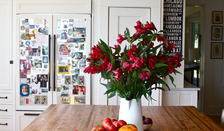
DECORATING GUIDES10 Design Tips Learned From the Worst Advice Ever
If these Houzzers’ tales don’t bolster the courage of your design convictions, nothing will
Full Story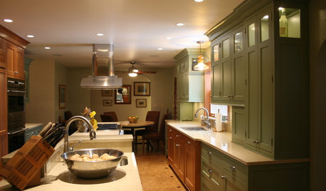
KITCHEN DESIGNSmart Investments in Kitchen Cabinetry — a Realtor's Advice
Get expert info on what cabinet features are worth the money, for both you and potential buyers of your home
Full Story
HEALTHY HOMEHow to Childproof Your Home: Expert Advice
Safety strategies, Part 1: Get the lowdown from the pros on which areas of the home need locks, lids, gates and more
Full Story
KITCHEN STORAGEKnife Shopping and Storage: Advice From a Kitchen Pro
Get your kitchen holiday ready by choosing the right knives and storing them safely and efficiently
Full Story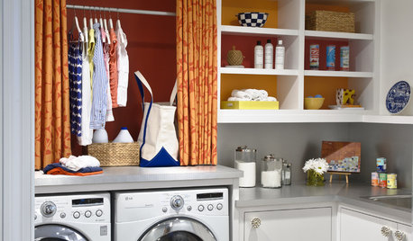
REMODELING GUIDESContractor Tips: Advice for Laundry Room Design
Thinking ahead when installing or moving a washer and dryer can prevent frustration and damage down the road
Full Story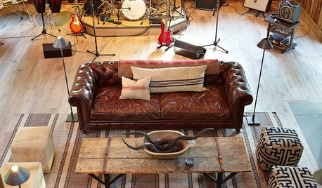
THE ART OF ARCHITECTURESound Advice for Designing a Home Music Studio
How to unleash your inner guitar hero without antagonizing the neighbors
Full Story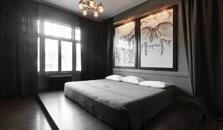
DECORATING GUIDESDecorating Advice to Steal From Your Suit
Create a look of confidence that’s tailor made to fit your style by following these 7 key tips
Full Story
TASTEMAKERSBook to Know: Design Advice in Greg Natale’s ‘The Tailored Interior’
The interior designer shares the 9 steps he uses to create cohesive, pleasing rooms
Full Story
BATHROOM DESIGNDreaming of a Spa Tub at Home? Read This Pro Advice First
Before you float away on visions of jets and bubbles and the steamiest water around, consider these very real spa tub issues
Full Story


denise_curcio77