


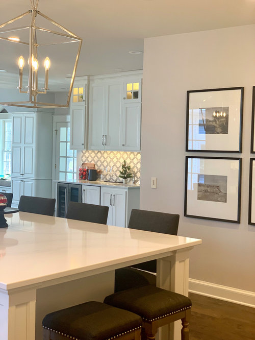
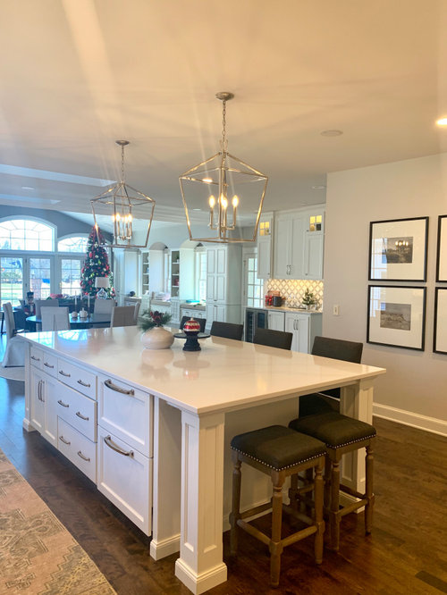
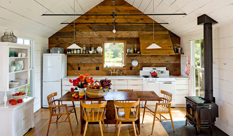
Wall color kitchen
mrsmacluvsdave
2 years ago

Featured Answer
Sort by:Oldest
Comments (25)

mrsmacluvsdave
2 years agoRelated Discussions
Help me pick a wall color for kitchen
Comments (5)I agree--green would be a nice choice with your cabinets and counter tops. A medium to dark color would be a nice contrast. Pastel would just get lost. Try BM Saybrook Sage, Louisberg Green, Kennebunckport Green, or any of the other greens in the Historical Paint Collection....See MoreHelp! Wall Color For Kitchen!
Comments (2)Thank you Judy G Design, Revere Pewter would go into a room (formal living room) I did not show you (on the other side of the kitchen table) and there are both a closet on one wall and stairway door opposite the closet directly next to the kitchen wall so the two colors will not meet (kitchen and Revere Pewter). That will be in the formal living room and hallway to a bathroom and her bedroom which will be Healing Aloe....See Morewall color in kitchen
Comments (2)B.M. Mt St Anne should work with the cream/oak combo. Do Not try to match a color to either the cabs or the backsplash....See MoreLuxury Vinyl tile combo & wall color kitchen
Comments (9)You’re putting oak veneer counters in a rental? Because you think your renters will take care of them, or because you can replace them if they don’t? I don’t know where you are nor how much rent you expect to collect for the unit, but the choices you are making for the floor and counters are 5 year choices, meaning you’ll be replacing both in 5 years. That’s not great business practice. If you can do better, do it now, and you won’t have to re-do either for a decade or more. Re: paint, the classic choice is SW 6126 Navajo White. SW 9166 Drift of Mist is a nice neutral grey, should be no problem....See Moremrsmacluvsdave
2 years agomrsmacluvsdave
2 years ago
Jennifer Hogan
2 years agoJennifer Hogan
2 years agomrsmacluvsdave
2 years agoGina C
2 years agomrsmacluvsdave
2 years agomdefree
2 years agomrsmacluvsdave
2 years ago
amykath
2 years agoJennifer Hogan
2 years agoJennifer Hogan
2 years agoJennifer Hogan
2 years agochloe00s
2 years ago
lawsonch19
2 years ago


Related Stories
KITCHEN DESIGNA Single-Wall Kitchen May Be the Single Best Choice
Are your kitchen walls just getting in the way? See how these one-wall kitchens boost efficiency, share light and look amazing
Full Story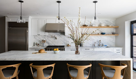
KITCHEN LAYOUTSHow to Make the Most of a Single-Wall Kitchen
Learn 10 ways to work with this space-saving, budget-savvy and sociable kitchen layout
Full Story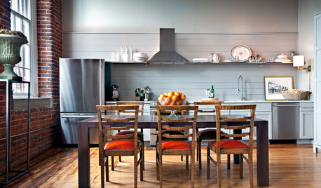
KITCHEN LAYOUTSWays to Fall in Love With a One-Wall Kitchen
You can get more living space — without losing functionality — by grouping your appliances and cabinets on a single wall
Full StoryKITCHEN DESIGNSingle-Wall Galley Kitchens Catch the 'I'
I-shape kitchen layouts take a streamlined, flexible approach and can be easy on the wallet too
Full Story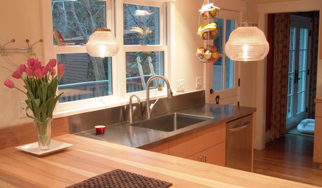
KITCHEN DESIGNKitchen Layouts: Island or a Peninsula?
Attached to one wall, a peninsula is a great option for smaller kitchens
Full Story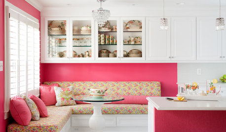
KITCHEN OF THE WEEKKitchen of the Week: A Punch of Pink for a White Kitchen
A homeowner shows her love of pink in bold walls that impart a cheerful vibe
Full Story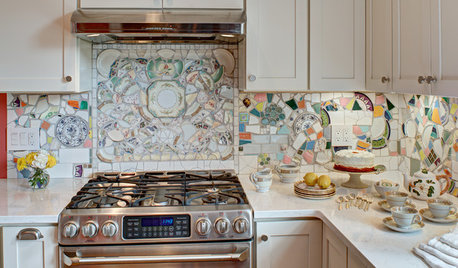
MOST POPULARKitchen of the Week: Broken China Makes a Splash in This Kitchen
When life handed this homeowner a smashed plate, her designer delivered a one-of-a-kind wall covering to fit the cheerful new room
Full Story
MODERN ARCHITECTUREThe Case for the Midcentury Modern Kitchen Layout
Before blowing out walls and moving cabinets, consider enhancing the original footprint for style and savings
Full Story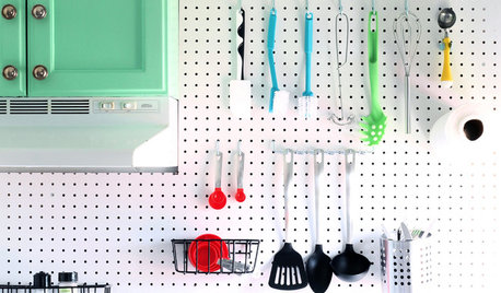
KITCHEN STORAGEBoost Your Kitchen Storage With Pegboard on a Wall
Julia Child knew it: This budget-friendly material is a winner for wall organization
Full Story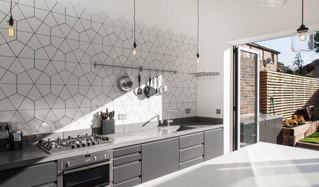
KITCHEN DESIGNKitchen of the Week: Geometric Tile Wall in a White Kitchen
Skylights, bifold doors, white walls and dark cabinets star in this light-filled kitchen addition
Full Story


Gina C