


Colors are way off in Paint Visualizers
Nina Lauderdale
2 years ago
last modified: 2 years ago
Featured Answer
Sort by:Oldest
Comments (7)
 PRO
PROPatricia Colwell Consulting
2 years agoRelated Discussions
Virtual paint-a-room to visualize colors?
Comments (2)thanks brendainnj, I just checked out the SW tool ... it looks like it would be an awful lot of work to mark off all the paintable areas! Gotta carefully go around wall hangings, lamps, furniture, etc. Any tips on making that easier? And does it give a realistic result in the end after all the work? (i.e., when changing the color of a wall, does it preserve shading and shadows, or does it just do a simple "color fill"?)...See MoreCan anyone help visualize the trim and fireplace painted white?
Comments (45)I dunno, Erica. Kinda looks like it has been...dare I say it,...painted! Yes, painted brown, Im almost positive. If its already been painted, then yes, you can be granted special dispensation by the old house gods and allowed to paint it white. Beth, I stand by my earlier statement that vintage old growth heart pine has value, esthetically and in dollars and cents terms - salvage prices for it have surpassed oak in some instances unless we are talking about quartersawn. Its really all supply and demand, economics 101....See MoreHelp! Any way to visualize light to dark cabinet color change?!
Comments (16)Oh my gosh yes! Looks familiar, lol the rug! Love that rug :-) Yes I would be happy to help! It's really not too difficult to accomplish, just takes time! You need to remove any existing dirt, laquer from cabinets first. The product comes in the Rustoleum Transformations kit, but I also used TCP to clean them really good first (can purchase at Home Depot, Lowes). Here's a few more pics (since we have similar taste!)... I also painted my laundry room cabinets, and bookcase/fireplace mantel Expresso to match the kitchen.......See MoreNeed help! I'm unable to visualize any way to update/remodel exterior
Comments (24)I wouldn't replace the bay window for what will be a fairly small difference in appearance, unless it is otherwise defective. It won't be that noticeable if the trim is painted a less obtrusive color, and when there is landscaping in place so that there is something else to look at. It only stands out now because of the trim and lack of landscaping. It's expensive to replace a large window and that money would be put to better use on other changes....See More
Jennifer Hogan
2 years ago
WestCoast Hopeful
2 years ago
Abby Mac
2 years ago
Nina Lauderdale
2 years agolast modified: 2 years agoUser
2 years ago
Related Stories

DECORATING GUIDESPaint Color Ideas: 8 Uplifting Ways With Yellow and Green
Dial up the cheer with yellow and green paint combinations sure to cast off winter doldrums
Full Story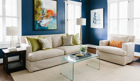
MOST POPULARThe Right Way to Test Paint Colors
Here are 5 key steps to take to ensure you're happy with your wall paint color
Full Story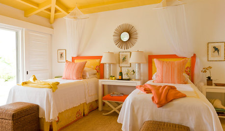
DECORATING GUIDESPaint Color Ideas: 7 Bright Ways With Yellow and Orange
Go with the glow. These sample palettes and room examples show you how to work with two of the happiest hues around
Full Story
COLORPick-a-Paint Help: 11 Ways to Mine Your World for Colors
Color, color everywhere. Discover the paint palettes that are there for the taking in nature, shops and anywhere else you roam
Full Story
DECORATING GUIDESLoving Color: 5 Ways to Decorate With Paint Chips
Turn those also-ran paint strips into conversation-starting art and accessories for your home
Full Story
COLORColor of the Year: Off-White Is On Trend for 2016
See why four paint brands have chosen a shade of white as their hot hue for the new year
Full Story
COLORBest Ways to Use the Soft Yellow Color of 2014
You may fall for PPG Pittsburgh Paints’ Turning Oakleaf if you like your hues warm, mellow and cheery
Full Story
LANDSCAPE DESIGN8 Ways to Add Year-Round Color to Your Yard
Brighten up your landscape with paint, garden accents, lights or furniture
Full Story
COLORColor-Coated Casegoods: Way to Charm Up a Room
Transform Your Furniture With a Coat of Unexpected Paint Color
Full Story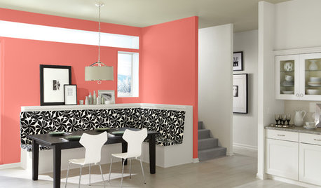
COLORBest Ways to Use This Coral Color of the Year
Sherwin-Williams goes for a preppy pop of color in its paint pick for 2015
Full Story


Lori A. Sawaya