


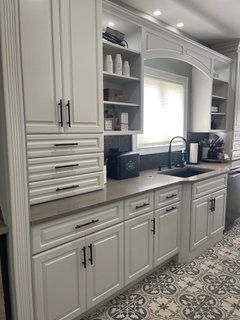
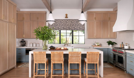
HELP! Cabinet paint color? Totally lost!
Kavita Dobbs
2 years ago

Featured Answer
Sort by:Oldest
Comments (185)

User
2 years ago PRO
PROLB Interiors
2 years agoRelated Discussions
Please Help!! ... Lost in Paint Chips!!
Comments (1)I have always liked the color we had, very safe! Often a one-liner like that is an indicator as to exactly how the new color scheme will end up. Are you sure you like the existing body color because you perceive it as being a safe color choice -- or do you really like that color on your house because you think it *fits* it better than any other color you can think of or imagine �" and every time you leave/come home that color speaks 'home' to you. That is the question. . ....See MoreNew house. Kitchen gut! Totally lost with what to do! Help!
Comments (103)Great stuff! Gas line change, you will need a pro for, I don't know if it gets more expensive the further you move it, but something to consider. If your DH can move the plumbing for the sink, that's all to the good. You're getting some great suggestions here. Go to an actual IKEA and look at the cabinets. Some of their products are indeed shoddy, some lines are excellent, and you should be able to tell in person which are good and sturdy for your needs. While I don't have IKEA cabinets, I did go in person to pick out IKEA furniture which are things I remain totally satisfied with. Countertops: friends in my new neighborhood recently remodeled their kitchen, and while I KNOW they put their range in a truly stupid spot (they didn't seek anyone's advice...) they did go with laminate countertops which look awesome. Yes, they could have afforded granite. Both Formica and Wilsonart have wonderful selections to choose from, and it's no longer your grandmother's formica… you don't have to have those seams anymore, you can have a variety of edgings without any seams. Well, maybe not triple ogee with summersaults, but you get the idea. And they're pretty hardy surfaces... even the stuff in my old home with the seams that dated from the late 60's only have two unremovable stains at this point in their lifespan. Something to consider, and easy enough to replace when the time comes, should you choose. Best of everything on pulling your kitchen and your house together!...See MoreLooking for artwork that complements our new rug, but totally lost!
Comments (33)I rarely shop in B&M stores however last night I found myself in Home Goods. I was really surprised. They had a huge assortment of art. Some of the abstract pieces looked very nice. I was also shocked by the size of some of the pieces. They had a handful of pieces around 5'x5' in the price range of around $200. Honestly, I would consider those pieces in a heartbeat if actual paintings were not available. The piece that I was most drawn to looked like actual paint from afar but up close it was more like a plastic overlay with ridges and grooves. Over a fireplace mantel, it would have been just fine. As for artwork that is matchy-matchy, I somewhat like art that has a sprinkle of color that compliments the space but does not match completely. It's fine for me if it is even an exact match in tiny doses. As I think about the art in my own home, I have at least a tiny bit of matching going on in all of it. In a couple of cases, it is more than a tiny dose. Given all that, I stand by my statement that it does not need to be all matchy-matchy to look great. In most cases, matching is a complete turn-off. I think complimenting and coordinating artwork is just fine. I think the best way to go is to find artwork that makes your heart throb no matter where it was purchased or how it was produced. If heart-throbbing were not available, I would still have art in my home, maybe even from Home Goods....See Morehelp!! totally lost on what to do with these rooms!
Comments (57)Yes to the second you posted, as long as it's large enough. Do you know the measurements? The general rule of thumb to determine size is to add the width and length of your room to get the # of inches the fixture should be. So if the room is 10 x 12, that would mean the fixture should be about 22" across. The bottom should hang about 36" from the top of the table....See More
Jennifer Hogan
2 years agoJennifer Hogan
2 years agoUser
2 years agolast modified: 2 years agoJennifer Hogan
2 years agoKavita Dobbs
2 years agoKavita Dobbs
2 years ago
H D
2 years agoKavita Dobbs
2 years agoUser
2 years agolast modified: 2 years ago PRO
PROLisa Caudill Designs
2 years agoKavita Dobbs
2 years agoKavita Dobbs
2 years agoJennifer Hogan
2 years ago- PRO
LB Interiors
2 years agolast modified: 2 years ago Kavita Dobbs
2 years ago- PRO
LB Interiors
2 years agolast modified: 2 years ago Kavita Dobbs
2 years agoJennifer Hogan
2 years ago PRO
PROBeth H. :
2 years agolast modified: 2 years ago
Jeanne J
2 years ago
RedRyder
2 years agoH D
2 years agoH D
2 years agoUser
2 years agolast modified: 2 years agoKavita Dobbs
2 years agoJennifer Hogan
2 years agoUser
2 years agolast modified: 2 years ago
Melissa R
2 years ago- PRO
Beth H. :
2 years agolast modified: 2 years ago RedRyder
2 years agoKavita Dobbs
2 years ago- PRO
Beth H. :
2 years agolast modified: 2 years ago Kavita Dobbs
2 years agoRedRyder
2 years agoKavita Dobbs
2 years ago
indira_ranganathan
2 years ago
raee_gw zone 5b-6a Ohio
2 years agoMelissa R
2 years agoKavita Dobbs
2 years ago- PRO
Beth H. :
2 years agolast modified: 2 years ago Kavita Dobbs
2 years agoKavita Dobbs
2 years agoKavita Dobbs
2 years agoKavita Dobbs
2 years agoRedRyder
2 years agoraee_gw zone 5b-6a Ohio
2 years ago
susanlynn2012
2 years ago


Related Stories
KITCHEN CABINETSPainted vs. Stained Kitchen Cabinets
Wondering whether to go for natural wood or a painted finish for your cabinets? These pros and cons can help
Full Story
COLORPick-a-Paint Help: How to Quit Procrastinating on Color Choice
If you're up to your ears in paint chips but no further to pinning down a hue, our new 3-part series is for you
Full Story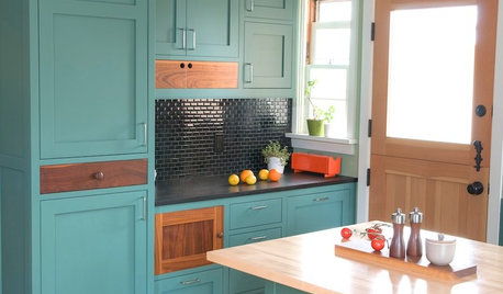
KITCHEN CABINETSKitchen Cabinet Color: Should You Paint or Stain?
Learn about durability, looks, cost and more for wooden cabinet finishes to make the right choice for your kitchen
Full Story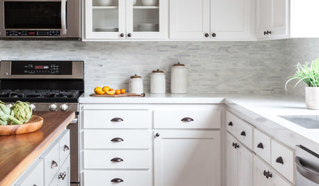
KITCHEN CABINETSHow to Update Your Kitchen Cabinets With Paint
A pro gives advice on when and how to paint your cabinets. Get the step-by-step
Full StoryMOST POPULARFrom the Pros: How to Paint Kitchen Cabinets
Want a major new look for your kitchen or bathroom cabinets on a DIY budget? Don't pick up a paintbrush until you read this
Full Story
COLORPick-a-Paint Help: How to Create a Whole-House Color Palette
Don't be daunted. With these strategies, building a cohesive palette for your entire home is less difficult than it seems
Full Story
COLORPaint-Picking Help and Secrets From a Color Expert
Advice for wall and trim colors, what to always do before committing and the one paint feature you should completely ignore
Full Story
EXTERIORSHelp! What Color Should I Paint My House Exterior?
Real homeowners get real help in choosing paint palettes. Bonus: 3 tips for everyone on picking exterior colors
Full Story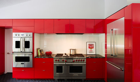
COLORFUL KITCHENSCabinet Paint Colors That Are Anything but Neutral
Craving some color for your kitchen? Consider these bright choices for your cabinetry
Full Story
COLORPick-a-Paint Help: 11 Ways to Mine Your World for Colors
Color, color everywhere. Discover the paint palettes that are there for the taking in nature, shops and anywhere else you roam
Full Story

Kavita DobbsOriginal Author