


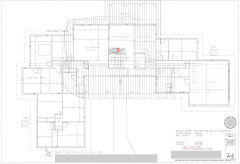
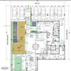
Floorplan review please
lyfia
3 years ago
last modified: 3 years ago
Featured Answer
Sort by:Oldest
Comments (31)

lyfia
3 years ago PRO
PROMark Bischak, Architect
3 years agoRelated Discussions
Floor plan review please
Comments (33)I should probably mention that I got the idea from the plan attached below. The garage was way too small and I wanted a mud room, so I increased the width of the house and decreased the length to (hopefully) keep the area reasonable. In addition to layout issues in my original plan, the second reason why I'm so eager to switch designs is that I got a builder's quote on Monday for my previous design; it was over $600,000!!! I'm thinking that he added a large PITA fee for the unusual build. My hopes is that that this one will be much cheaper. Here is a link that might be useful: New house idea...See MoreFloor plan review please
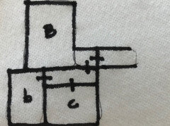
Comments (43)Just some quick thoughts for you... Maybe try putting your half bath slightly under the stairs (assuming no basement) and in the entry from the foyer. It really would open up some space in your mudroom area. I have draw up a quick sketch of what I am thinking but it is what it is... The half bathroom would is an L shaped bath with the sink under the stairs. The pantry could be whatever size suits your needs. In the mudroom, maybe you would want to keep it larger (everyone on this forum says large mudrooms are the way to go) or you could add an 'overflow/off-season' closet. Maybe it will work, maybe not. Take what you like, leave the rest....See MoreFloor plan review please!
Comments (27)I recently joined GW and while searching past threads for feedback on ranch floor plans I came across several of your posts. I see you have uploaded two different ranch floor plans to âÂÂmy clippingsâ and was wondering which one you decided to go with and why? Have you started building and if so, did you find keeping all the jig-jags in the floor plan to be expensive? Both of your submitted plans have some of the things IâÂÂve been looking for in a home design. My husband and I are in the beginning stages of working with our architect and I donâÂÂt think he quiet understands my vision yet. My specific list of must haves that went into the design of this first draft follows: A split bedroom ranch floor plan with 10 foot ceilings and 8 foot door openings totaling a maximum of 3500 sq. feet. A formal entryway foyer. The master bedroom will be on the right side of the home. I would like a layout that allows for moving from the master bedroom to the master bathroom to the closet and then laundry room. I would prefer not to pass through the entire bathroom just to get to the closet. The guest bedrooms would be on the left side of the home with each having their own bathroom. The garage and kitchen would need to be on the left side of the home. I would like a 3 car garage and would be open to a 2 and 1 configuration. I would like a friend entrance located somewhere around the garage on the front or side of the home. We are looking to have a screened in porch on the backside of the breakfast area. The elevation of the home will be craftsman with a covered front porch and door. By the way, how do you get people to respond to your questions? I posted requesting feedback on my ranch plan and had a few give their point of view. When I typed in my response to them, they never answered back. Is it that once you post, they only visit your question once and tend not to return? Thank you for your time and look forward to hearing from you soon. Switchback...See MoreFloorplan review please!!
Comments (16)Yes, that one is better, but I'm concerned because it's significantly different from the first one in terms of # of rooms and basics. This makes me think you haven't yet clarified what you need your house to do. I'm a teacher, so here's your homework: Together with your spouse, sit down and brainstorm what rooms your "forever home" needs to have ... and then for each room, write down all the functions that room needs to provide ... and your must-have details for each of those rooms. If we all did this, we wouldn't agree on what we want our rooms to do for us, so it's important to think this through and clarify it for ourselves. Take your time doing this -- don't jump in too fast; right is better than fast. For example, if I were to make a list for my master bedroom, here's what I'd say: - Must be on the first floor - Space for a king-sized bed, but no wasted space -- this isn't a splurge room -- prefer that foot of bed faces the doorway -- prefer bed set back into room /traffic pattern passes by the foot of the bed /not by a sleeper - Built in unit: Cabinets on bottom for storage of hobby items /bookshelves on top, space for a TV mounted to the wall (need cable jack) -- simple, inexpensive, paint-grade stock cabinetry - Room to be placed at the back of the house /doorway to back porch - Windows on two walls for cross-ventilation - Flat ceiling -- not a place to splurge / must have ceiling fan - Large walk-in closet to hold all clothes and shoes (no dresser in bedroom) /must be convenient to laundry / Elfa shelf storage /good lighting /electrical outlet for a hand-vac /storage space for suitcases /include step stool - Light colors, restful, plenty of natural light - Re-use our current bed /paint white /add new, sumptuous bedding with plenty of layers and pillows - My grandfather's cedar chest is to remain at foot of bed for linen storage - Swing-lamps attached to the wall on each side of the bed / think about reading in bed without disturbing other spouse - Bathroom and closet doors placed so light doesn't shine onto bed /waking sleepers - Outlets placed at "nightstand height" -- four on each side, to include USB outlet - New nightstands w/ open shelf for books - Wooden steps so dog can reach the bed Now, I'm in no way suggesting that your idea of a "perfect bedroom" should match mine; rather, I want you to think about the kinds of things you should be considering. Looking at my list, you might say, "No, I don't want cabinets for hobby storage -- we're going to include a craft room, and our junk will be stored in that room." Or you might say that you want a bay window with space for two comfortable chairs and a table so you can have coffee in privacy when you have company. You might say you don't want a TV in your bedroom, or you might want a desk in your bedroom. You might say you want your bedroom to be connected to a study or an exercise room. You might need storage space for special medical needs. Note that I don't care whether I have eastern light for the morning -- you might. The point is for you to really dig down and decide what YOU WANT from each room. Don't bother with how the rooms will connect yet. Instead, focus on what rooms you want and what would be ideal in each room. Do this for every room in the house (I chose the bedroom as an example because I thought it'd be the shortest list). For each room, consider how you'll use the room, what you want to store in the room, what activities you want to happen in the room. THEN you'll be able to look at a floorplan and say with certainty, "This can work for me"....See More- PRO
Mark Bischak, Architect
3 years ago 
gracecarol26
3 years agolyfia
3 years agolast modified: 3 years ago- PRO
Patricia Colwell Consulting
3 years ago gracecarol26
3 years agolyfia
3 years agolast modified: 3 years ago- PRO
Mark Bischak, Architect
3 years ago - PRO
Mark Bischak, Architect
3 years agolast modified: 3 years ago 
shead
3 years agolast modified: 3 years ago- PRO
Mark Bischak, Architect
3 years ago - PRO
Mark Bischak, Architect
3 years ago BT
3 years agolyfia
3 years agolast modified: 3 years agolyfia
3 years agolyfia
3 years ago
One Devoted Dame
3 years ago- PRO
Mark Bischak, Architect
3 years ago lyfia
3 years ago PRO
PRORococo & Taupe, Inc.
3 years agoOne Devoted Dame
3 years ago- PRO
Rococo & Taupe, Inc.
3 years ago lyfia
3 years agolast modified: 3 years ago- PRO
Mark Bischak, Architect
3 years ago - PRO
Mark Bischak, Architect
3 years ago lyfia
3 years agolast modified: 3 years ago- PRO
Mark Bischak, Architect
3 years agolast modified: 3 years agolyfia thanked Mark Bischak, Architect lyfia
3 years ago


Related Stories
ARCHITECTUREThink Like an Architect: How to Pass a Design Review
Up the chances a review board will approve your design with these time-tested strategies from an architect
Full Story
PRODUCT PICKSGuest Picks: 21 Rave-Review Bookcases
Flip through this roundup of stylish shelves to find just the right book, toy and knickknack storage and display for you
Full Story
KITCHEN CABINETSCabinets 101: How to Choose Construction, Materials and Style
Do you want custom, semicustom or stock cabinets? Frameless or framed construction? We review the options
Full Story
CONTRACTOR TIPSBuilding Permits: What to Know About Green Building and Energy Codes
In Part 4 of our series examining the residential permit process, we review typical green building and energy code requirements
Full Story
MOST POPULAR5 Remodels That Make Good Resale Value Sense — and 5 That Don’t
Find out which projects offer the best return on your investment dollars
Full Story
CONTRACTOR TIPSBuilding Permits: The Final Inspection
In the last of our 6-part series on the building permit process, we review the final inspection and typical requirements for approval
Full Story
KITCHEN WORKBOOKHow to Remodel Your Kitchen
Follow these start-to-finish steps to achieve a successful kitchen remodel
Full Story
KITCHEN DESIGNPaging All Foodies: Your Banquette Is Ready
Please follow us to these 7 gorgeous dining nooks designed for everything from haute cuisine to s'mores
Full Story
BATHROOM DESIGNRub-a-Dub-Dub, Add Color to Your Tub
Perk up that old claw-foot with a hit of paint that’s as bold or subtle as you please
Full Story


Mark Bischak, Architect