


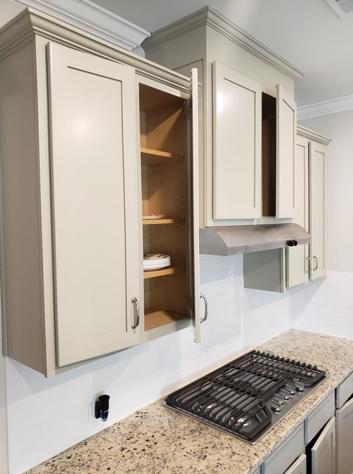
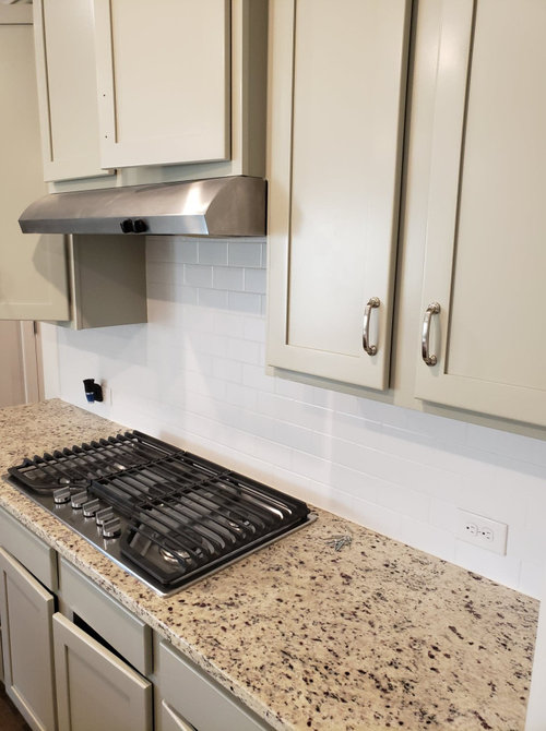
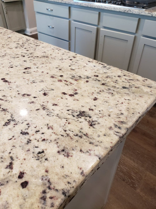
SW Repose Gray 50% - Kitchen MAYHEM - Ugly
Dylan Bay
3 years ago
last modified: 3 years ago
Featured Answer
Sort by:Oldest
Comments (16)

herbflavor
3 years agoRelated Discussions
Paint Help - SW Agreeable Gray vs SW Anew Gray
Comments (52)I have anew gray currently in my bedroom on the walls and alabaster on the trim. I think it would be beautiful to have the trim and perhaps the door also sw anew gray and the walls alabaster. Another look depending on the height of your ceilings, you could paint the ceiling anew gray with alabaster walls....See Morerepose gray or agreeable gray?
Comments (113)sorry for the delay everyone, we ended up going with Mindful gray. the others looked too light. this is artificial lighting after just painting it. will post a picture when everything is back in its place and during daylight! :)...See MoreLooking for SW lighter warm gray for North Facing/Lake view reflection
Comments (3)I agree with the above post. Agreeable Gray is very light and is a warm color. Goes good with ivory and creams. All grays have some undertone--it might not appear that way when the color is by itself, but next to other grays, they either look more green/yellow, blue, purple, orange, or beige. AG happens to be beige. I've used Repose Gray, Mindful Gray, and Dorian Gray for my basement and foyer. Recently used Agreeable Gray for a bedroom and I love it. Much lighter and warmer gray....See MoreIs there a PPG color that is very similar to SW Repose Grey?
Comments (19)How do I know how it will look on the wall as far as what the color it portrays? Is there a value for that? Excellent question. The hue/value/chroma color notation is a fact. That's why it's called factual color. It's derived from following a set of standards to measure the color. It's repeatable. You and I could both follow the same process and measure a swatch of the same color in different locations and get very similar results. How a color actually looks in a space is actual color. Everyone guesses about how a paint color is going to show up in a specific space. There's no such thing as fool proof paint colors. Which is why everyone has to follow some kind of a process to test color in context of the space, inherent lighting, and contents of the room We can use use factual color notations - hue/value/chroma/LRV - as a framework to anticipate how it will actually show up in a space. For example, we use the notations to make sure the paint color relates to some important element. Like a rug or even the floor. Because if there's a level of relationship between the paint color and one or more elements, then odds are excellent the paint color is going to be perfect. We also use each channel of hue, value and chroma to find paint colors with specific characteristics. For example, based on your comment that you're looking for a color similar to Swirling Smoke only lighter I'd suggest you take a look at: Silent Smoke PPG1025-2 Dogwood Blossom PPG14-24 Paraffin PPG-14.31 I don't want to say "undertones" because from what I read that word is overused and cringey. Is that hue? The problem with "undertones" is everyone is making it up as they go. Undertones are just someone's subjective opinion about what a color actually looks like - according to their color acuity - in whatever context and light source they happen to be lookin' at it. Which is why you'll find dramatically different opinions on the internet about what a paint color actually looks like. Whereas hue family is, as mentioned, a factual, measurable attribute of color....See Moremegs1030
3 years agoJustDoIt
3 years agoK S
3 years agorebasheba
3 years agoeld6161
3 years ago
beckysharp Reinstate SW Unconditionally
3 years agoTara
3 years agolast modified: 3 years ago PRO
PROColor Zen
3 years agolast modified: 3 years agocupofkindnessgw
3 years agoajrlittle
3 years agooreolucca1
3 years agowiscokid
3 years ago
Gerry
3 years ago
Related Stories

MOST POPULAR50 Shades of Gray
Gray is hotter than ever, thanks to a hit novel full of risks and dark secrets. Tell us: Which paint shade possesses you?
Full Story
KITCHEN DESIGNNew This Week: 3 Stunning White-and-Gray Kitchens
See how the classic color palette works wonders in spaces in a variety of styles
Full Story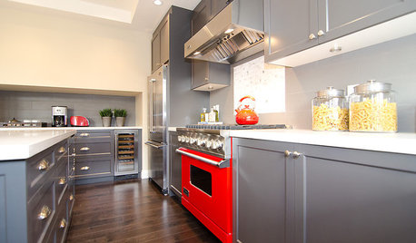
COLORCooking With Color: When to Use Gray in the Kitchen
Try out Trout or shake up some Martini Shaker gray for a neutral-based kitchen that whispers of sophistication
Full Story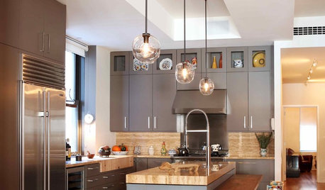
KITCHEN DESIGNObsessed With Gray in the Kitchen
See How to Use This Sexy Neutral to Heat Up Your Cookspace
Full Story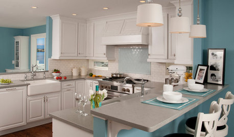
KITCHEN DESIGNKitchen of the Week: A Seattle Family Kitchen Takes Center Stage
A major home renovation allows a couple to create an open and user-friendly kitchen that sits in the middle of everything
Full Story
GRAYDesigners Share Their Favorite Light Gray Paints
These versatile neutrals can help create a range of moods in any room
Full Story
DINING ROOMSColor Feast: When to Use Gray in the Dining Room
The right shade of gray pairs nicely with whites and woods to serve up elegance and sophistication
Full Story
MOST POPULARRethinking Beige in a World Gone Gray
Gray, the ‘it’ neutral of recent years, has left beige in the shade. But is it time to revisit this easy-on-the-eyes wall color?
Full Story
DECORATING GUIDESColor of the Week: Decorating With Warm Gray
Tired of tan? Getting gloomy from cool gray? Make warm gray your new go-to neutral
Full Story
MOST POPULARWhat’s Your Neutral: Beige or Gray?
A designer shares 10 tips for using the neutral shade that works best for you
Full StorySponsored


mama goose_gw zn6OH