


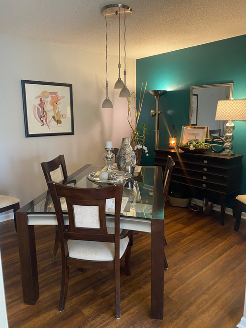
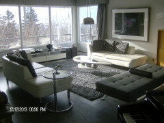
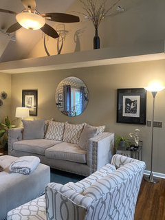
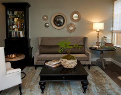
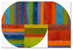
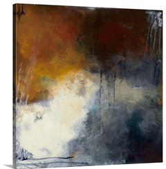
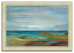
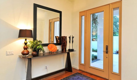
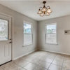
My style? Color suggestions?
Stacy Shelkop
4 years ago


Featured Answer
Sort by:Oldest
Comments (36)

User
4 years agoRelated Discussions
Shelf color and leg style suggestions for my desk
Comments (3)I would put a square box-like base on it. I don't think any type of leg would look very good. Or you could add a box-like top on your piece....one that opens up to put things in. How much extra height do you need to make it a stand up piece?...See MoreCurtain style and color suggestions needed.
Comments (40)If you don't live by the sea or have any ties to the ocean it lacks context, and isn't cute enough to outweigh the incongruity. JMHO! I do like your desire add a color in the red/pink/orange/coral family. Thibaut has an oriental toile that has a strong color background with a black and white medallion design. It comes in red, I know (we have wallpaper in the pattern) and a vivid apple green, which would be fantastic In your laundry room....See Morecabinet style/color suggestions? stained tongue/groove walls
Comments (7)I used stained beadboard in the butler's pantry/scullery part of my kitchen, with painted cabinets. Here's a picture: While the dishes in these may make it appear to dressy, I think it can give you an idea that a simple shaker style painted cabinet could look appropriate and great. I could see it in pale yellow (as mine is), a green, grey-blue, white, even barn red, depending on what overall look you're going for. Good for you not wanting to paint...it'll keep that wonderful character. Love it....See MoreSuggestions for curtain colour / style for this space please!
Comments (22)Thanks Sigrid. We have a fabric market in Amsterdam that my mother in law wants to go to choose the fabric. They have a huge selection so hopefully we will find something there (at least for the main curtains). I'm still stuck on what colour(s) to choose though to suit the space and furniture. Any suggestions from anyone are still welcome. : )...See Moreeverdebz
4 years agolast modified: 4 years ago
Stacy Shelkop
4 years agohoussaon
4 years agolast modified: 4 years ago
Julie Schmooley
4 years agojck910
4 years ago PRO
PRONorwood Architects
4 years agoStacy Shelkop
4 years ago- PRO
Patricia Colwell Consulting
4 years ago Stacy Shelkop
4 years agojck910
4 years agoElizabeth
4 years agoStacy Shelkop
4 years agoeverdebz
4 years agoeverdebz
4 years agoeverdebz
4 years agoStacy Shelkop
4 years agoeverdebz
4 years agolast modified: 4 years agoStacy Shelkop
4 years agoeverdebz
4 years agolast modified: 4 years agoeverdebz
4 years agolast modified: 4 years agodianabythelocks
4 years agoeverdebz
4 years agoeverdebz
4 years agoeverdebz
4 years agoeverdebz
4 years agolast modified: 4 years agoeverdebz
4 years agoeverdebz
4 years agoeverdebz
4 years agolast modified: 4 years agoeverdebz
4 years ago
katinparadise
4 years ago
Dana Galka
4 years agoStacy Shelkop
4 years agoJulie Schmooley
4 years agoDana Galka
4 years ago


Related Stories
ENTRYWAYSSensible Style for Your Holiday Foyer
Help your guests in and out with a handy console table, coat hook, mirror and artful ambiance
Full Story

The New Simplicity: Today's Style for Food and Home
Make yourself at home with a more relaxed style at the table — and in interior design
Full Story0
VINTAGE STYLEElements of Style: Road Signs
All roads lead to style when working these industrial mainstays into your decor
Full Story
KITCHEN OF THE WEEKA Shaker-Style Family Kitchen That’s Calm and Light
An addition provides a perfect opportunity to create an airy family kitchen with classic good looks in Wales
Full Story
DECORATING GUIDESDesign Dilemma: How Do I Get a 5th Avenue Style?
The Decor Demon Comes to the Rescue in the Questions Board
Full Story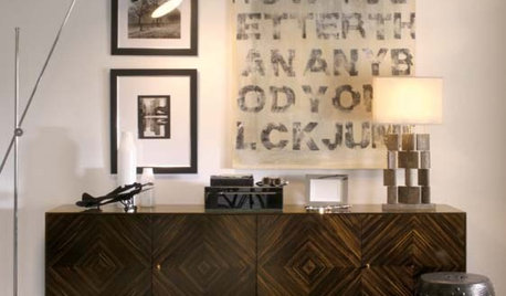
MORE ROOMSThe Credenza: Compact Office Storage With Style
9 tips for finding or assembling the right storage table for your home workspace
Full Story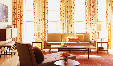
DECORATING GUIDESSourcebook: Midcentury Modern Style
Love the streamlined shapes and retro appeal of midcentury furniture and accessories? Here's where to find them
Full Story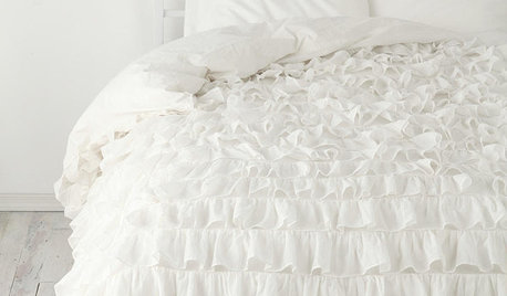
PRODUCT PICKSSourcebook: Romantic Style
Layer the look of love into your home with these resources for sweet and stylish furniture and accessories
Full Story


BeverlyFLADeziner