


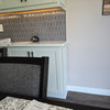
Benjamin Moore’s version of accessible beige?
Em
4 years ago
last modified: 4 years ago
Featured Answer
Sort by:Oldest
Comments (10)

User
4 years agolast modified: 4 years agoElena O
4 years agolast modified: 4 years agoRelated Discussions
Could you share paint names, ideas?
Comments (3)I have some relatively old BM paint chip catalogs, Caroline and these colors may be what you're looking for: Apache Rede #1295 ...dark burgandy Bermuda Turquoise # 728...very dark green Bone White #03 ...slightly beige white...or... Windsor Beige [which is marked "special prescription"]...which is a slightly darker version of Bone White Frankly...I don't know where they get the names for these colors. "Bermuda Turquoise" has no resemblance to turquoise as far as I can see. Personally...I think they give the job to some little ole person whose office has no windows and his only job in this 8' x 8' room is to invent new names for colors. They only let him/her out once a day and that's after dark. ;-) No offense intended toward anyone who may be a paint namer. Hope the above helps. Anne...See MoreBenjamin Moore’s white opulence paint color
Comments (75)It has been a while since the last activity on this thread, and I felt it might be beneficial to give my updated perspective on White Opulence #879 from Benjamin Moore as a paint color for main areas. Having lived with this color for a bit longer now since my last comment, I am beginning to understand how tightly it regulates what other colors can be placed with it for anyone who cares about a homogeneous scheme and also how undeniable the pink tone can be when applied over large surface areas. White Opulence is a tint of red, but it is so light that in ample daylight or under bright white lighting it can "read" as white. In average daylight, it produces a whisper-light pink hue. The effect of this is magnified the larger the area that is covered by it. Using this color on the walls in the main space of a large, open-plan layout with high ceilings, for example, will imbue the area with a light, yet undeniable, pale pink cast in average lighting. It would be a good idea to prepare not only yourself but also any other significant users of the space of the pink tinge before selecting this color because some people truly dislike pink, and it is courteous to work with all regular users of spaces during design planning to try to ensure no one will be overly uncomfortable with the final effect. One thing that hasn't been discussed is how White Opulence can cast a peach tone under warmer lighting colors, especially in the absence of any compensating daylight, meaning nighttime in most home spaces. If peach is a color you want to avoid and you utilize warm lighting -- that is, progressively orange-tinged the further under a 4000K color temperature you go -- then this is a paint color to avoid. The general recommendation is that 4000K is quite cool for home environments, so if you don't know what color temperature your home lighting is, you can probably assume it is warmer than 4000K if you selected average bulbs from your home supplies provider. White Opulence as a red-based white was an attractive choice for my main space because I already had a red accent in a permanent finish and personally prefer the fresh look that a red-white lends versus common alternate choices for main area wall colors like yellow-based beiges or blue-based grays. The problem is that so many home goods available are manufactured in colors that go with beige and gray wall colors rather than the faint red-white of White Opulence that color coordination requires more work than may be expected. Of course, you could decorate using pure white items, but what you really need are options for whisper pink basics which are hard to find. Adding stronger pink or red items is not always the solution either because you cannot feasibly fill the room with accents; you need some basics that blend with the wall tone. Then there is the issue of coordinating White Opulence with colors for auxiliary rooms if you wish to have some variety throughout the home while still maintaining the feel that all of the home's colors work together. Most blues coordinate with White Opulence, but if you have already used red accents in rooms painted with White Opulence, then red is challenging to pair with blue in most instances unless it is a dark, cool blue like navy. Where this has been a dilemma for me has been my hallway colors connecting the main open space to the bedrooms which are all different pastels. The color plan I have will work, and I'll enjoy the variety of colors that I have been able to make flow together, but to be honest, at times I have wondered how much easier the design process might have been if I had picked plain white for the main space. White is the ultimate neutral some might say. At the very least, a basic white for the main area would have given me more freedom in selecting fabrics and other home products for the main space as well as coordinating colors for other rooms. It is all too easy to second-guess decisions that will affect your life long-term. I am using Benjamin Moore's durable Aura formula in a satin finish, so I expect the new White Opulence paint will last decades. Had I selected a plain white or yellow- or blue-based off white, I might be back on this very forum wishing I had gone with White Opulence to add appeal beyond the standard choices. I hope this is helpful to anyone still considering this color....See MoreAgreeable Gray against beige tile?
Comments (95)Have you looked at BM Edgecomb Gray? I had a problem with BM Balboa Mist and SW Agreeable Gray going too blue in my house. Edgecomb Gray is a light warm gray. Sometimes it looks light gray, greige, beige or a light mushroom, depending on the room or time of day. It's a neutral that has worked well in all areas for me. Of course, your home may be totally different though....See MorePaint Color Help Needed ASAP
Comments (26)I think that BM Gentleman's Gray ( just looked it up - it's beautiful!!!) would work well color wise, but the room is small so I wonder if that would be too much. Were you thinking of painting the whole room or half walls?I know there's not much wall space and there is the window with shutters on one wall and then just a half wall so maybe it would work. I love the colors you have in your space and the white also looks great carried throughout. Guess I am not much help other than saying it looks really nice....See MoreMizLizzie
4 years agolulu bella
4 years agolulu bella
4 years agosnauzoo
2 years ago
Em
2 years agoChessie
2 years agoHU-592414563
11 months ago
Related Stories

MOST POPULARWhat’s Your Neutral: Beige or Gray?
A designer shares 10 tips for using the neutral shade that works best for you
Full Story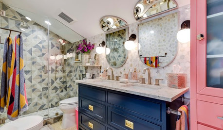
BEFORE AND AFTERSBeige Windowless Bathroom Gets a Fun, Colorful Makeover
A designer transforms a 1980s bathroom in Austin, Texas, for 3 sisters
Full Story
COLORBeige Is Back: Designers Share 10 Beautiful Warm Paint Colors
Enthusiasm for cool grays has waned, and warm neutrals have returned. See which beige and greige tones designers prefer
Full Story
MOST POPULARRethinking Beige in a World Gone Gray
Gray, the ‘it’ neutral of recent years, has left beige in the shade. But is it time to revisit this easy-on-the-eyes wall color?
Full Story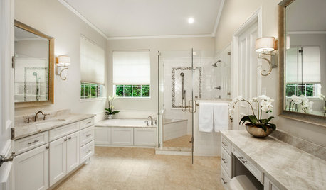
BATHROOM MAKEOVERSBathroom of the Week: Timeless Style Updates a ’90s Master Bath
A designer gives a Dallas couple’s bathroom a smarter layout, new vanities, quartzite countertops and more
Full Story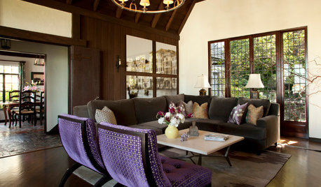
HOUZZ TOURSMy Houzz: Boho Flair for a 1920s California Tudor
Frumpy furniture gets the boot in favor of eclectic pieces that appeal to the travel-loving homeowner
Full Story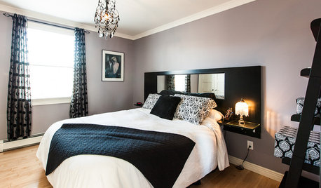
COLORDreaming in Color: 5 Fab Not-Beige Bedroom Neutrals
Go soothing without slipping into yawn territory, with purples, blue-grays and more on bedroom walls
Full Story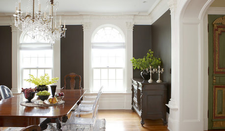
MOST POPULARDare to Decorate With ‘The World’s Ugliest Color’
See how this hue can actually look quite handsome inside your home
Full Story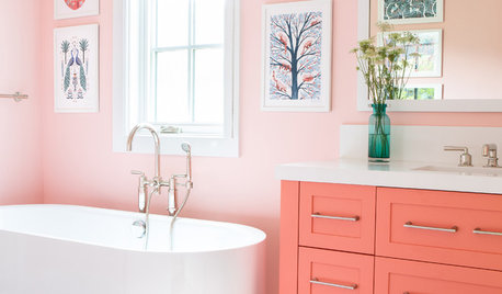
COLORS OF THE YEARAre You a Fan of Pantone’s 2019 Color of the Year?
Living Coral is bold and bright. Here are places to consider using it indoors and out
Full Story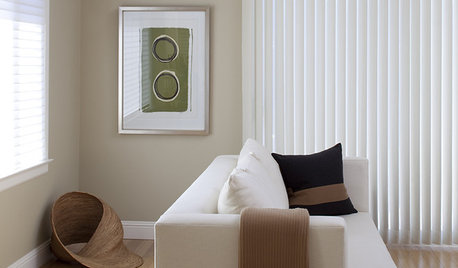
BROWNBeige to Almost Black: How to Pick the Right Brown
Warm your home with paint the color of lattes, espresso and chocolate
Full Story
Beth H. :