


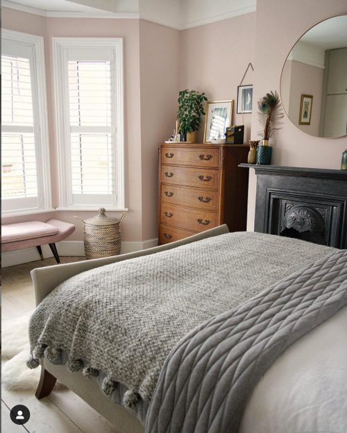
Sophisticated Pink Paint Color Suggesions?
eastautumn
4 years ago
last modified: 4 years ago

Featured Answer
Sort by:Oldest
Comments (22)
Related Discussions
DD's pink bedroom----do I let her pick the paint?
Comments (49)I'm very late to the opinion party here, but I just wanted to point out that I think it's wonderful to partner with our children on decorating their rooms. Letting them experiment with color, helping them with furniture placement and other design elements ... I think essentially it's really helping to develop the inner decorator in each of them! Think how many adults are afraid to paint anything other than white -- would life be different if their moms & dads had encouraged color exploration in their own homes and rooms? Last year, before loading some gorgeous Art Deco furniture we bought off Craigslist into our then 10-y.o. daughter's room, I talked to her about how the yellow that was on the walls (which she chose) just didn't work with the light bird's eye maple furniture. (Truly, it was going to be a terrible combo). We talked about potential colors and we went to the paint store. She went straight to BM French Lilac as her one and only choice. I, of course, picked out several other paint chips for variety and home we went. Well, we ended up with her first, instinctive choice and the room is just gorgeous. It better be, because that furniture is never going anywhere. Heavy doesn't even begin to describe it! LOL Anyway, I love that my daughter loves her room, and that she chose the paint. I never had that chance when I was a kid!...See Moreneed a really nice pale shabby chic pink color
Comments (11)Funcolors a slight side track- who cuts the paint by 50%? HD? or does the consumer need to buy a second gallon and mix it 50-50 themselves.? and is the old numbered MS pink paint available at HD? or just ask for them to mix by number? The ballet pink sound wonderful I ahve long loved the color of ballet slippers! Well, as several emails have reminded me today !!! I usually frown upon cutting formulas. I just recorded a "Burst of Color" mini-podcast in which I said don't cut formulas. Apparently that was not lost on a the listeners who also read here. :) So, to clarify... some paint colors do 'cut' more gracefully and predictably than others. Slipper from SW is one of those colors. If you cut it yourself using white, you have to take into consideration the "color" of the white you are using. What colorants are in THAT can of paint to make it THAT white -- and how will those colorants affect the can of Slipper? Can try it with a small amount first, but to do that you're committed to buying quantity unless you want to try with samples - a lot of unpredictability comes with this choice. Plus, you have to figure out how much paint you need for the project. Mixing two gallons together is not a big deal -- unless one gallon is all that's need for the entire project. Ending up with a whole gallon left over is not a good thing. So, Slipper from Sherwin Williams is probably best 'cut' in terms of formula/colorant at the paint store. Ballet Slipper Pink from the Home Depot is #MSL033. Slipper from SW is #8358. Home Depot could probably mix #8358 and cut it. In general it's an easy color and I would think HD could handle it....See Morecolor gurus - suggest a pink for this tile?
Comments (9)I struggled with pinkish/grayish tile in my last house and just couldn't bring myself to paint the walls pink. My intention was to go with a very strong pink or terra cotta to skew the tiles toward gray. But in the end, I used BM Gray Horse and was happy with the result. Tiles were still pink :-) but the gray was more sophisticated to my eye and it was easier to narrow down the choices amongst the grays. What I think is important here is that you don't feel restricted to "matching" the pink in the tile. Often times, people will pick a color from a bedspread and put it on the walls because it matches. Nevermind it is a lousy color for walls! Especially because you have the wainscoting separating the two pinks, they need not be identical...merely related. It is more important that you pick a color that actually works and pleases you for the walls. Your brain will "make up the difference." I also would want to see you choose something that plays nicely with the room/s beyond. That color relationship is even more important than the floor/wall relationship, IMO. Do you have a plan for that room yet? Beware the pinky-beige-looking-like-a-bandaid problem. The first house I ever painted, about twenty years ago, ended up looking like bandaids! Live and learn. If you have Ben Moore fandecks, I suggest looking at the lightest colors on the brown strips in the middle of the decks. Things like Woodland Snow and Winter Sky, or Onyx White and Gentle Repose. Don't let the fact that the are on the brown strips fool you. In the right surroundings, these will read pink. They are pink! (Do buy a test quart before committing so that you don't end up with Band Aid!) This is a trap you know....you think you ned to look at the pink strips to find pink paint. That's when you wander into Pepto Bismol territory! :-) One last thought is to take a peek at the F&B pinks. They are very unusual and complex pinks. Rich but never Pepto. Any of those might be an interesting choice, depending on what's going in the other rooms. Good luck! Here is a link that might be useful: Dead Salmon anyone?...See MoreToo much gray? Depressing or sophisticated?
Comments (25)Grey is a very reflective color so it changes with the light in the room, It can go warm or cool depending upon the amount of natural light and can also create a shadowed feeling. I use a lot of grey personally, but some people do find it affects their mood on cloudy days. Very sophisticated in the right space and in the hands of an expert who can watch and correct the shades throughout the day and even through warmer sunnier months and cooler rainier months when the color will change dramatically.If I were in the process of doing a beach property, I'd avoid all beachey themed decorating options and turn to the colors and look of the Restoration Hardware palette for sophisticated casual elegance. Check out the colors online and do look at the towels for their graduated colors too. The sunny sandy ivories, subtle greyed seaglass blues and greens, driftwood and beachgrass cocoas all blend and compliment each other and will create a seamless look when moving from one room to another and when seeing one room from another too. Choose a silver sage with a creamy ivory trim in one room and then move on to an ivory room where there is less light and more brightness needed and accent with silver sage and cocoa. Choose three colors you love and use them in all the rooms in different applications and you'll love the clean sophisticated pulled together look. Punch up the serene colors with bright sunny accessory pillows on neutral linen upholstery and add some sparkle and shine with mercury glass, that has that subtle gold and silver distressed finish. Large inexpensive clear vases from pier 1 or world market filled with fresh flowers that are anchored in tumbled stones (buy them by the bag) add another pop of color, fragrance and a natural element for not much money. Add large mirrors to reflect light and your beautiful view. Colorful oversized artwork and photography will also add personalization, punctuation and color to the spaces. Simple squared wood gallery framing is the way to go with artwork, no gold, silver or ornate carving, and groupings would be very dramatic especially if spotlighted from a directional ceiling spot. Keep things clean and uncluttered and the lighting adjustable from bright to dim with white or ivory linen shades. Window treatments should be simple, solid, natural fabrics like a linen scrim and not obstructive to your views in any way. If budget permits, stain the oak floors a deeper brown, or go with a newly popular bleached, pickled finish. Watch the colors outside your windows too for inspiration. Most people forget that windows are the "other" walls in the room and the colors you see outside are the colors you're also incorporating into your color scheme. Hope this helps in some way....See More
eastautumn
4 years agoeastautumn
4 years agoeastautumn
4 years agoeastautumn
2 years agoeastautumn
2 years agolast modified: 2 years ago


Related Stories
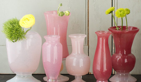
PRODUCT PICKSGuest Picks: Sophisticated Shades of Pink for Summer
No need to get stuck with bubble gum. These posh pink home accessories have a more grown-up flavor
Full Story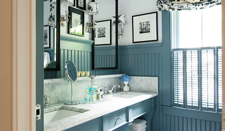
COLORBeyond Greige: 8 Sophisticated Paint Colors to Try Now
Ready for a shade that doesn’t rhyme with beige? Try one of these rich hues for your next room makeover
Full Story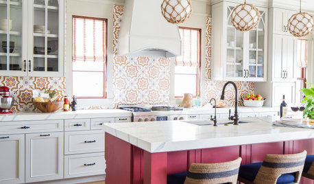
COLOR6 Attractive Pink Paint Colors for the Kitchen
From soft petal pinks to fearless fuchsias, these stylish hues can dress up the room
Full Story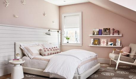
KIDS’ SPACESSophisticated Girl’s Bedroom Perfect for Now and Later
Dusty pink paint, white shiplap and a cozy daybed make this girl’s bedroom in New Jersey a lovely space to grow into
Full Story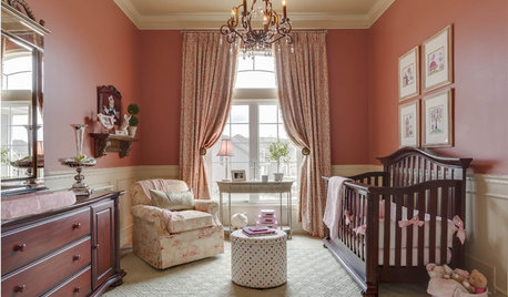
PINK15 Rooms to Tickle You Pink
Beautifully blushing or sizzling in hot shades, these rooms show that pink can take on sophistication without losing the enchantment
Full Story
COLORBathed in Color: When to Use Pink in the Bath
Even a sophisticated master bath deserves a rosy outlook. Here's how to do pink with a grown-up edge
Full StoryCOLOR8 Pink and Purple Rooms Sans Sugar Shock
Little-girl dreams find grown-up expression in rooms that work pink and purple into chic and sophisticated palettes
Full Story
PRODUCT PICKSGuest Picks: 5 Paintings, 5 Pastel Palettes
Go for harmonious, sophisticated, bright rooms with these pastel furnishings pulled from the colors of artworks
Full Story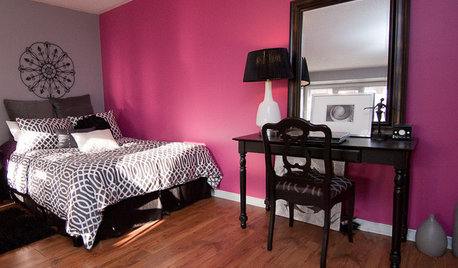
DECORATING GUIDESHow to Pick the Perfect Pink
See How These Rosy Tints Can Go Playful, Sexy and Sophisticated
Full Story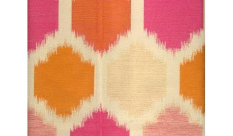
PINKGuest Picks: Pretty in Pink Fabrics
Far from juvenile, these fabric choices show the many sophisticated sides of the sweet hue
Full Story
Bunny