


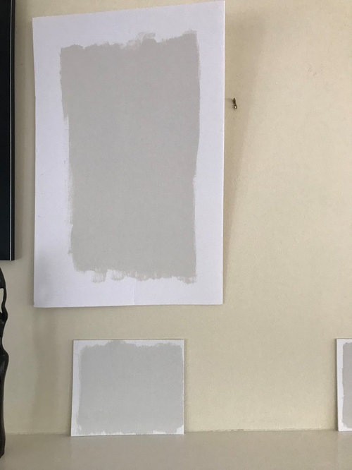
Classic Gray looks beige on poster board!
sjeschke
4 years ago
Featured Answer
Sort by:Oldest
Comments (6)

sjeschke
4 years agoRelated Discussions
Should I pair navy/hunter with beige or grey?
Comments (5)Greens (unless they're teal/turquoise/aqua) are warm. Gold is warm. Navy is weird. Technically, it's cool, but it offsets or complements or somehow goes with hunter greens & with burgundies, which are both warm, & it's a stunning complement to gold. so if you've got green & gold...I'd go with beige/tan/cream. Grays would go with navy if it's paired with silver or taupe. very nice bedroom!...See MoreClassic Gray vs Shoji White?
Comments (14)Oh wow lol, it’s fun to see what we thought when we first bought the house. We actually never did anything but paint, and put up some surprisingly realistic plastic backsplash stickers. The prices were just too high -$5k just to remove the tile, not even replace it, etc. We didn’t feel it was worth it for the starter neighborhood. But thanks to people moving out of the city en masse, we were able to sell the house for a fantastic profit this summer as-is. The new owners are doing a kitchen reno and floor replacement. When we set out to paint we must have tried 40 different colors, no exaggeration. I even hired a pro to pick out colors for me and she picked 5 awful options. I quickly learned that what is popular for 14 foot ceiling houses doesn’t look good at all in our 8 foot no-window house. All the subtle off-whites actually became dark beiges with strong undertones. We ended up with BM Cloud Cover, and are so smitten we plan to use it in our new house (which luckily has more windows and wood floors, but 90” ceilings). It reads slightly warm but not yellow. We did not paint the baseboards, they remained an awful high gloss white....See MoreBM Classic Grey - is it too beige/greige?
Comments (14)I think it looks fine. I have whole foyer and first floor painted in BM Balboa Mist and I love it. It’s a little more griege that the classic grey, so maybe that’s why it looks cool to me, but if you are looking for grey and not greige, then it totally works. I think it looks great with your cabinets and the floors! This article is really good at parsing up the greys and their pros and cons. Classic grey is in there...just thought I would share in case it helps. https://www.kylieminteriors.ca/the-9-best-benjamin-moore-paint-colors-grays-including-undertones/...See MoreDeciding between Classic Gray and Drift of Mist
Comments (2)I am scared if Drift of Mist looks dirty, this color changes a lot in different directions. Any thoughts?...See Moresjeschke
4 years agosjeschke
4 years ago
Related Stories

MOST POPULARRethinking Beige in a World Gone Gray
Gray, the ‘it’ neutral of recent years, has left beige in the shade. But is it time to revisit this easy-on-the-eyes wall color?
Full Story
MOST POPULARWhat’s Your Neutral: Beige or Gray?
A designer shares 10 tips for using the neutral shade that works best for you
Full StoryBEFORE AND AFTERSA Casual Gray Kitchen Effortlessly Blends Looks and Functionality
Durable, family-friendly finishes and cool tones help this San Diego kitchen keep a laid-back profile
Full Story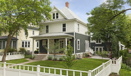
HOUZZ TOURSHouzz Tour: A Fresh Look for a Classic Minnesota Home
An architectural designer updates an urban farmhouse, mixing vintage details with an open layout made for modern living
Full Story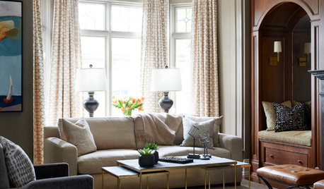
TRADITIONAL STYLEUpdated Traditional Look for a Modern Classic
A designer’s decor and furnishing choices create a feeling of relaxed formality in this Toronto home
Full Story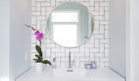
TILETile Workbook: New Looks With Classic Subway Styles
Check out 6 eye-popping takes on the traditional tile
Full Story
DECORATING GUIDESColor Guide: How to Work With Charcoal Gray
The most modern neutral, charcoal gray looks great in dining rooms, living rooms and even nurseries. Here's how to use it best
Full Story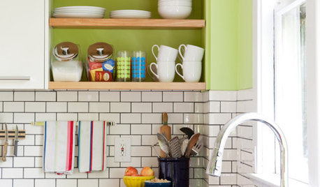
KITCHEN DESIGNSubway Tile Picks Up Gray Grout
Heading into darker territory, subway tile offers a graphic new look for kitchens, bathrooms and more
Full Story
COLORHow to Layer Tones of Gray for Depth and Harmony
Use texture, pattern, contrast and more to create a subtle, sophisticated look with this popular color
Full Story
KITCHEN DESIGNNew This Week: 3 Stunning White-and-Gray Kitchens
See how the classic color palette works wonders in spaces in a variety of styles
Full Story


tartanmeup