


What colors to compliment Benjamin Moore's Edgecomb Gray?
Mary
4 years ago
Featured Answer
Sort by:Oldest
Comments (14)
Related Discussions
What is the most true/neutral grey from Benjamin Moore?
Comments (16)Hi Lori, Color chip is a great tool to narrow down your color choices. When you’ve narrowed it down to a few finalists, pint samples are there to help you. We recommend painting a poster size board and move it around the room to see how light and other surrounding environment effects the color. View it in the morning, afternoon and at night with your lights on. Switch out to another color and which one you like better. That doesn't answer the question. You started out labeling the color chips with "bluer undertones" and "redder undertones" when they were compared to each other. Then when another set of colors were introduced to the mix, when the context for a narrow one-on-one comparison was changed, you changed how you categorized Stonington to "subtle yellow tones" when paired with blues. And that begs the question, so what about when it's not paired with blues? So, if depending on context, Stonington can have "bluer undertones" or "subtle yellow tones" why assign absolute "undertones" or "tones" in the first place? And "Sea Froth 2107-60 looks redder next to Barren Plain" but we don't get any more clarification about Barren Plain's attributes specifically. When asked to clarify, your solution is to go buy samples, paint them, and move them around the room. Because now - all of sudden - the light matters. Whereas when you were so definitively labeling and categorizing the colors by bluer undertones, redder undertones and yellow tones the light wasn't a factor --- then. .... but now it is. Apparently the only way out is to randomly go buy samples, shuffle through the painted boards and hope one of the colors in the stack works. At least I think that's what you're saying. (And just to be clear none of this has anything to do with Color DNA. Color DNA refers to color measurements and resulting spectral data/color data values.)...See MoreWhat is an exterior paint match for Benjamin Moore Gray Gardens?
Comments (5)Hi - BM Gray Gardens belongs to the Green-Yellow Hue Family, very close to the Green Hue Family. In balanced lighting, many see near neutral colours from this Hue Family neighbourhood as ‘just grey’. But in certain situations, it may be possible to flashes of their inherent greenness. (Which is what you are spotting in other samples you have tried.) Note also, that in some imbalanced light settings, low Chroma near neutrals, from this bottom right quadrant of the Color wheel can shift blue-ish. They aren’t blue and don’t have blue undertones, it’s an effect of light upon the colour. The nearest match for Gray Gardens in another Benjamin Moore colour, is HC-167 Amherst Gray. But it’s still not super close. It is from the same Hue Family but sits anticlockwise, to Gray Gardens, near the beginning of the Yellow-Green Hue Family. It is almost the same Value (lightness,) but is that bit more colourful than Gray Gardens. Worth a look....See Moreedgecomb gray or natural cream? (Benjamin Moore)
Comments (69)I am deciding between Edgecomb, Natural Cream and Elmira White. My room has both south and north facing and I tried (Clay Beige(too dark) Inukshuk(too pinky) Shaker Beige(too dark orange) but looks great on walls in other areas. Is Natural Cream less gray than Edgecomb. Not sure Elmira will work because it might go pink. I could go with Edgecomb but it is the more grayer choice and I wanted something more neutral beige with some grey and no orange, green or yellow undertones which seems impossible. Thought maybe windsbreath but might be too light. Any help would be appreciated. Thanks....See MoreStuck between Benjamin Moore Pale Oak and Benjamin Moore Classic Gray
Comments (42)Hi - these 2 colours sit increasingly further clockwise on the Color Strategist Wheel, away from Pale Oak. They will likely apoear a a little cooler by comparison. So in your setting, they are somewhat less likely to shift quite as pinky-purple. Sometimes, just moving a few degrees can make a difference, sometimes you may have to move a whole lot further to mitigate colour shift. These are a both a touch darker (lower Value) than Pale Oak + more colourful (higher Chroma). They have the capacity to appear a little greenish where Pale Oak reads well for you. But maybe less likely to do so where Pale Oak looks a little pink/purple. If either is too dark? Then you need a colour with higher Value. If either is too colourful? Then you are looking for a colour with a lower Chroma. If these still read too pinkish? Then moving further clockwise again could help mitigate that. Viewing large paint chips or samples in your space, with your lighting will help indicate how they are likely to behave for you. #huefamilies #value #chroma...See More
Mary
4 years agoMary
4 years agolast modified: 4 years agoMary
4 years agoMary
4 years agoMary
4 years agoMary
4 years agoMary
4 years agojck910
4 years ago
Dee Lirium
4 years agoojiwaji
2 years ago


Related Stories

COLORBenjamin Moore Floats Breath of Fresh Air as Its Color of 2014
Touted as a new neutral, this baby blue can stand on its own or support bolder colors. Here's how to use it
Full Story
DECORATING GUIDESColor of the Week: Decorating With Warm Gray
Tired of tan? Getting gloomy from cool gray? Make warm gray your new go-to neutral
Full Story
EXTERIOR COLORExterior Color of the Week: 7 Ways With Warm Gray
See why this hue can be the perfect neutral for any house
Full Story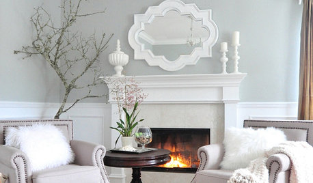
GRAYColor Guide: How to Work With Light Gray
The hottest new neutral can be cool or warm, formal or casual, and feminine or masculine. Talk about versatile
Full Story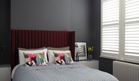
COLORDreaming in Color: 8 Gorgeous Gray Bedrooms
With this versatile hue, you can go dark and bold or slip into something more soothing
Full Story
DINING ROOMSColor Feast: When to Use Gray in the Dining Room
The right shade of gray pairs nicely with whites and woods to serve up elegance and sophistication
Full Story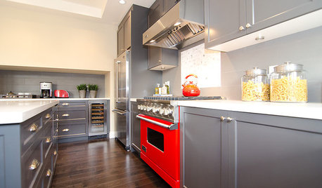
COLORCooking With Color: When to Use Gray in the Kitchen
Try out Trout or shake up some Martini Shaker gray for a neutral-based kitchen that whispers of sophistication
Full Story
DECORATING GUIDESColor Guide: How to Work With Charcoal Gray
The most modern neutral, charcoal gray looks great in dining rooms, living rooms and even nurseries. Here's how to use it best
Full Story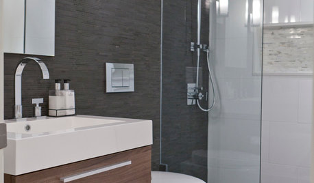
COLORBathed in Color: When to Use Gray in the Bath
Go for elegance and sophistication without going overboard on coolness, using these gray bathroom paint picks and inspirational photos
Full Story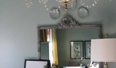


Evelyn Gorfram