SHOP PRODUCTS
Houzz Logo Print
zeenig

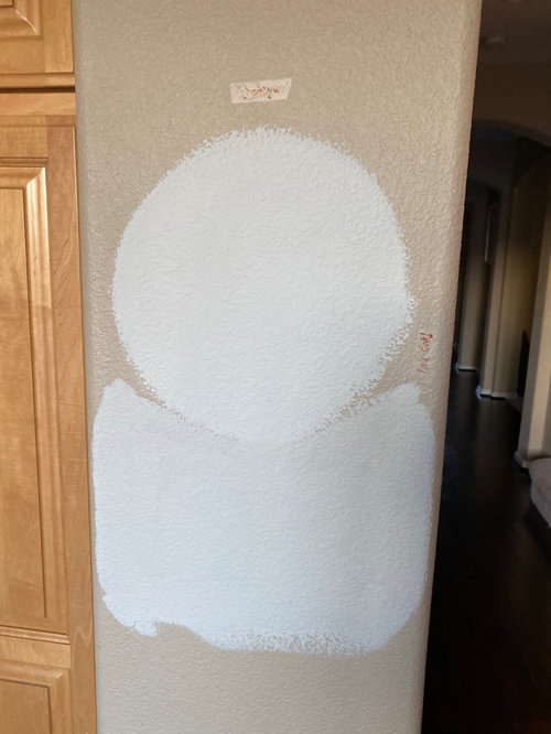
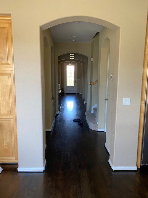
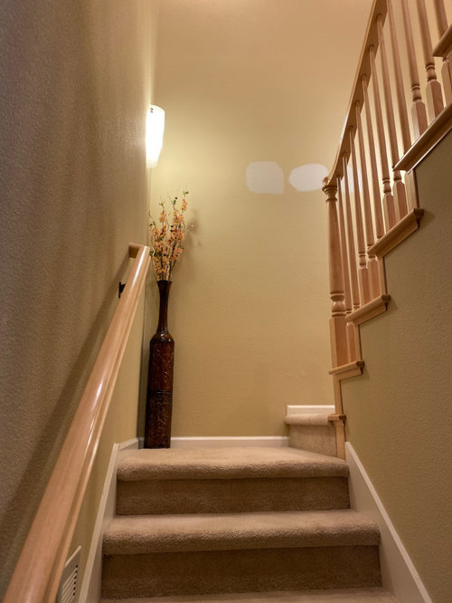
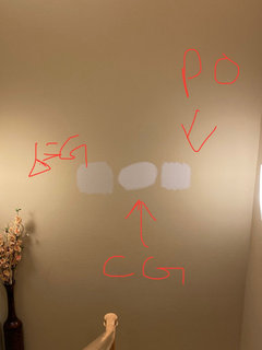
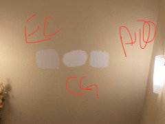
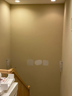
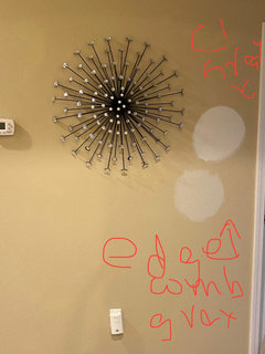
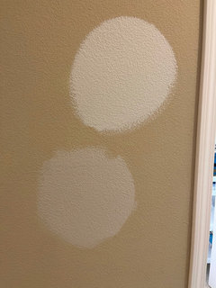
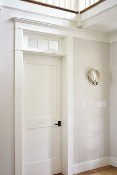
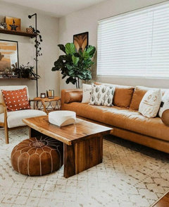
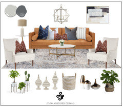
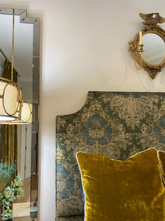
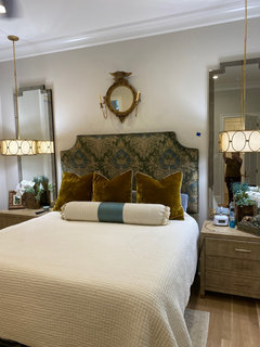
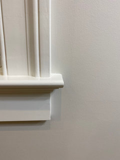
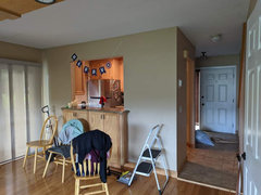
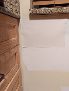
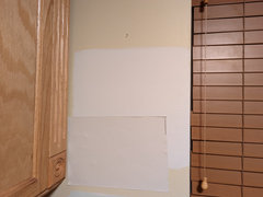
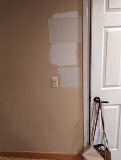
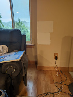
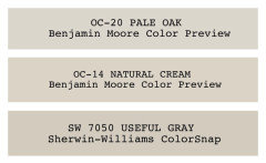
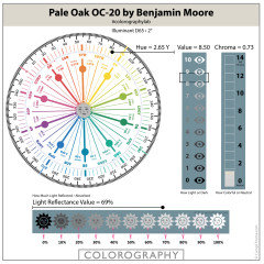
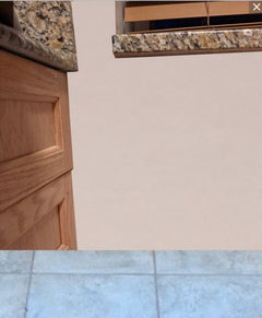
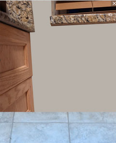
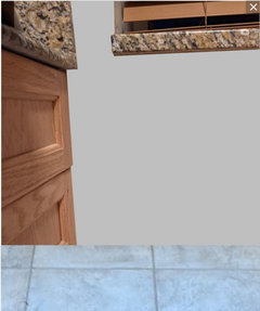
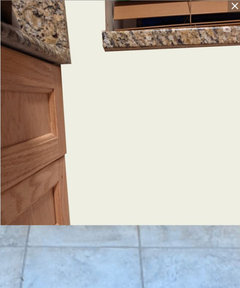
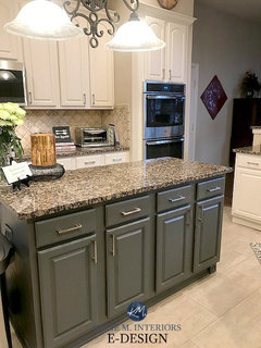
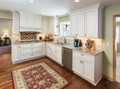
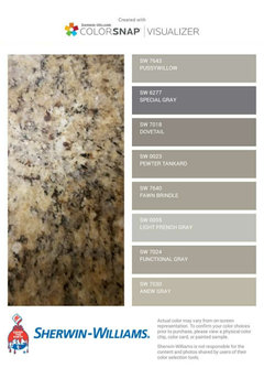
Stuck between Benjamin Moore Pale Oak and Benjamin Moore Classic Gray

Zeen
3 years ago

Hi all, I really need help in selecting a good neutral that can brighten up my home. I'm totally stuck between choosing BM Classic Gray vs Pale Oak vs Edgecomb Gray ( all BM colors) as our main color for the hallway, family room and upper hallway.

I am attaching pictures of my family room, downstairs hallway and stairway for second floor. I tested all three paints on my wall and inclining towards Classis Gray as it is looking brightest but I am worried if it is going to look too white or washed out.

Both my hallways get very less natural light, there is no window upstairs. My family room is south has very strong light throughout the day. Can you please advice which one so can pick as main theme for all the house.

Comments (42)

  • Zeen
    Original Author
    3 years ago

    Attaching more pictures with colors tested on upstairs walls. Please pardon my markup, I am using CG for classic gray, PO for pale oak and EC for edgecomb gray.

  • PRO
    Beth H. :
    3 years ago
    last modified: 3 years ago

    just commit and paint a larger swath. who can tell by these little round circles?

    use the sample pot and try it out. do a large swath on the right and one on the left. (you really should prime it first tho.

  • Related Discussions

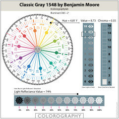
    Benjamin Moore Classic Gray - too beige?

    Q

    Comments (83)
    Without seeing the floors, it’s very hard to say, but somewhere in this post you can see my wood look tiles in my bathroom which are gray and it looks awesome. I would recommend getting a sample and putting it up in the basement. Since I assume there is very little natural light, the tone will largely depend on your lighting. If your flooring has a warm gray tone to it, it will probably look great. If it has a bluish cool gray tone to it, you’d have to see how it looks side by side. Hope this helps a little! Can’t believe this post is still going strong after so many years 😆
    ...See More

    Bruce flooring? White oak? Resale? Benjamin Moore Simply White?

    Q

    Comments (8)
    Bruce is now owned by Armstrong as is Robbins and Hartco. Between all of the offerings there's a wide range of products and looks with quality ranging from low to medium high. The comment about limited selection is the opposite of reality. They have a bunch of products. When I peruse their price list it's sometimes hard to figure out the difference between multiple items that sound the same on paper. The challenge is finding somewhere that might show the full product line. Big box stores generally have a limited selection. Many multi-surface flooring stores have Shaw or Mohawk since the sell carpet and tile. You'll get design opinions in the flooring forum but questions generally slants toward technical issues. Perhaps your cross-posts will work or you could inquire in Design Dilemma. First you need to set a direction, then you can set about executing a plan.
    ...See More

    Paint help! Benjamin Moore Calm, Seapearl, or Classic Gray

    Q

    Comments (7)
    Here are some slivers of Classic Grey in my nearly finished kitchen. I painted my whole house with it as my “back-up color”because all of the other gray paints I tried came out different than expected. I’m so glad I did because I really love it. It’s contemporary but not too cold, light but not harsh. You’ll see that near the floor it has more of a beige cast because it’s picking up the oak tones. So do consider it in the context of your floors and furnishings.
    ...See More

    Has anyone used Benjamin Moore Pale Oats in their project?
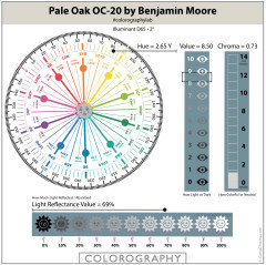
    Q

    Comments (1)
    Hi Laura, This might be way to late but we recently painted our home in Pale Oak. I'm still on the fence about it. It's definitely a warm grey that leans towards beige in some lights and can also look very cool in others. It is definitely a chameleon. Trying to figure out ways to add some colour to my space now too since it is very light. What colour did you decide on?
    ...See More
  • PRO
    HALLETT & Co.
    3 years ago

    These tiny swatches are useless because you are seeing it in context with the current Manila wall color. You need much larger swatches that touch each other and hide the current color. The colors you are choosing between are too similar to judge except in Person.

  • Zeen
    Original Author
    3 years ago

    Here is another closer look. Sorry I don't have the paints right now, so trying to show best with what I have 😔

  • PRO
    Beth H. :
    3 years ago
    last modified: 3 years ago

    prime the wall white. then paint larger blocks of the color.

    Right now, we're seeing the undertone and the reflection of the current wall color.

    Plus, without seeing the color in context w/everything else around it, it's impossible to pick one.

    from that photo, one looks taupe, the other looks like a pink toned white.

    here is Pale Oak


  • Zeen
    Original Author
    3 years ago

    Good idea. I will try that. the one I posted just now is Classic gray on the top and Edgecomb gray at the bottom.

  • PRO
    Beth H. :
    3 years ago
    last modified: 3 years ago

    what's the wall color in the room w/the tv and windows? looks nice w/the wood


    looks like you have cool blue gray sofa/rug and accessories, but the warmer wood, blinds and wall tones.

    If you kept the current wall color or even switched to white, I'd do furniture like this that works w/the built in


    you could even do this blue gray color (BM Solitude)

    and a warm white on the walls. works w/the maple stain color


    but w/your sofa and accent colors, I like this white on the wall and I'd paint your built in a darker blue gray color


  • Marylee H
    3 years ago

    Why not compare the colour attributes of each?

    Decide which elements you prefer in your space. It helps you hone in in upon what you like and what you don’t. See these colours and more in detail at The Land of Color .com


    p.s. Painting swatches on the wall severely limits your understanding of how the colour is likely to behave in your space. Painting two coats on larger boards offers you the flexibility of viewing them against the geometry of different walls both in shadow and light.


  • Zeen
    Original Author
    3 years ago

    Really appreciate all the suggestions, will paint on poster boards before finalizing. Thank you all!!

  • Jennifer Hogan
    3 years ago

    Picking a wall color is similar to picking an outfit. The wall color needs to be something you find attractive with the other colors in your home. Trim, flooring, furniture, cabinets . . .


    Since you are looking at going fairly light you may find that the color looks quite different in different rooms and with different lighting.


    With your woodwork I am not sure you are going in the right direction. Edgecomb Gray and Pale Oak are neutrals that I love, however they are both taupe. Taupe is the color between pink beige and violet gray. Next to the yellow tones of your wood I think they will go pink on you.


    Classic gray is a very neutral gray, not much undertone, but again, may not be the best with your woodwork. I think Patricia may have hit the nail on the head - I would lean toward a gray green or greige.


    Some that I would test would be November Rain, Gray Owl, Gray Mist.

  • Susan S
    3 years ago

    i have similar wood tones in my flooring and hallway and I went with pale oak and LOVE it. I was warned about pink undertones but I just don't see them Sometimes the color takes on more beige. Other times more grey, depending on the lighting and position of the sun.

  • riverrat1
    3 years ago

    I have a new build and we painted a few rooms with BM pale oak paint. I love it! I'll post a few pictures in the morning to show you what a whole room looks like. It paired nicely with BM White Dove trim. Warning that I have a lot of windows that also help lighten and brighten the spaces. I think your home will be lovely painted any color on the paint strip that has White Dove and Pale oak on it.

  • Zeen
    Original Author
    3 years ago

    Thank you so much!

  • riverrat1
    3 years ago

    This is a bedroom painted in Pale Oak with White dove trim.

  • riverrat1
    3 years ago

    Close up of Pale Oak walls and White Dove trim.

  • riverrat1
    3 years ago

    You can see the blue tape for the punch list. :-/. We’re not finished with the house yet.

  • Pat
    3 years ago

    I have pale oak in a northern facing room and I love it- it shows as a very creamy light gray with taupy tones- in a more direct light I think it would be a creamy beige. Best color ever.

  • Angela Wilcox
    last year

    @Zeen, I know this is an old post but did you end up choosing any of the colours you proposed? I have similar wall colour and wood work and I'm stuck between edgecomb and pale oak. I love the pale oak but it's too stark in the kitchen I think. I would probably need a darker shade of it in my partially open kitchen .

  • Jennifer Hogan
    last year

    You are looking at two taupe colors (Pink/purple undertones) when you have orange wood and blue gray flooring in your kitchen and orange wood flooring in the rest of the house.


    Taupe is very popular right now and I love taupe. I have painted my home with taupe, but I also have taupe flooring and pink brick and purple/red and green slate flooring and my decor is purple and violet grays and wine reds and blue greens.


    I don't have blue grays or orange beige in my home or blue or orange anything.


    Look at your flooring and cabinets with Pale Oak and with SW Creamy


    Pale Oak


    Creamy


  • Angela Wilcox
    last year

    @Jennifer - Thank you for that information! I do love the pale oak. I think I'm just concerned if it will look too start in the kitchen or if it will be fine.

  • Marylee H
    last year

    Do I understand this correctly?


    On a wheel of 360° - ALL colours,


    whether paint, textile, wood or stone are only relative to ”undertones” that sit between 78.6° + 106°?


    if that were so, to illustrate the fact, wouldn’t you only require a quadrant (ish)?

    What then, does any colour wheel have to do with it?


    🤔


  • Jennifer Hogan
    last year

    We are looking at light to mid toned neutrals.


    We have 3 types of cones that produce the sensation of color.

    Each type of cone is sensitive to different wavelengths of color

    When the Long wavelength cones are stimulated we see Red

    When the medium wavelength cones are stimulated we see Green

    When the short wavelength cones are stimulated we see blue.


    So how do we ever see yellow?


    We can only see yellow when both the red and green cones are highly stimulated. This requires a lot of light, Only white requires more light to see than yellow.


    Gray requires that all three types of cones are stimulated. Yellow is more transparent than the other colors so although a blue white may look blue, it often is recorded as a yellow or green hue because it takes more yellow to balance the blue and create white.


    It can be rather confusing, but play with some food color and see how easily yellows change color. Take 2 glasses, place 1 drop of blue and one drop of yellow in each glass. Then add 2 more drops of blue to one and 2 more drops of yellow to the other. Which color had the greater change, even though their are equal amounts.


    When we look at the SW paint line (excluding Emerald - I don't have all of the Emeral colors in the chart I am using) and look at the colors that have a luminosity over 90 by hue we get the following counts


    Hue-count

    55 - 1

    70 - 1

    75 - 2

    80 - 9

    85 - 17

    90 - 14

    95 - 8

    100 - 2

    105 - 4

    110 - 1

    120 - 3

    130 - 1

    150 - 1

    160 - 1

    180 - 1

    190 - 2

    200 - 2


    If we look by color we find that there are 0 Red, 0 blue and 0 purple hues.

    There is one orange hue, 3 green hues, 5 blue green, 8 yellow green hues and 53 yellow hues.


    Have you ever seen a light/ near white paint color that you would classify as pink, blue violet, peach?


    When you go to the dark colors you will find that there are no yellow hues with a luminosity of less than 30,


    I would also not think of Palm Leaf as a yellow, but the hue is yellow - slap dab in the middle of yellow. But it doesn't have enough light to stimulate our red and green cones to make us see yellow, just enough that the hue measures in the yellow hue range.


    Color isn't just about hue, it is a combination of hue and light and chroma that creates a color, and when we get very light or very low chromas or very dark the colors we see are not always equal to the measured hue.


    LCH is a measurement of colors based on the the way we see color, but it is not a perfect match to how we perceive color.

  • Marylee H
    last year
    last modified: last year

    I’m sorry I don’t follow that reasoning based on your own amendment of the colour wheel above.


    You have ascribed an angle to every ‘undertone.’


    Those angles range only from 78° to 106°. An incredibly small segment of a 360° wheel.


    As I understand it you are meant to hold that wheel up to ANY surface in order to determine the undertone & find an appropriate near neutral which shares a proportion of it?


    if those angles are correct, then a colour wheel is inappropriate to illustrate the theory.


    That’s a fundamental design flaw.


    One needs only a narrow segment, like a slice of pizza, which is subdivided yet again into each undertone.


    Allying Hue angles° to the undertones depicted, underlines the fact you cannot equate that wheel to any kind of science. They ALL belong to the Yellow Hue Family neighbourhood. It serves to illustrate it as the personal, subjective concept it is.


    I do not follow its own chain of logic.

  • Jennifer Hogan
    last year

    Maria's neutral color wheel is simply a circle showing the various neutral colors in equally spaced segments, same as the traditional color wheel is simply a circle showing the primary/secondary colors in equally spaced segments.


    The color wheel equally distributes the colors into 360 segments using a mathematical formula.

    with blue vs yellow on the X axis and red vs green on the Y axis.


    The wavelengths are not equally distributed, it is just a simple way to visualize and communicate color descriptions. People like things to be orderly and symmetrical. So we create views that match our desire for order.


    If we use a color wheel designed for digital color based on Magenta, Cyan and Yellow you can see that the color distribution of Munsell color chips depicting the center of each color family is not equal.


    Maria Killam didn't provide the measurements. I used a color muse to add the LCH values for my own benefit.


    Do I think her neutral color wheel is perfect - nope. But it is available and easy for people to understand.


    She simply used a wheel to depict the neutral colors as she classifies them.

    I classify them a bit differently based on my understanding of color perception and my experience painting in oils and acrylics.


    If I were to create a neutral color wheel it would have most of the same families as Maria Killam, but because we can see so many more shades of green than any other color I would separate out blue green grays, I would add the dark hue variant and I would define the transition between green beige and green gray as greige, same as we define the transition between pink beige and violet gray as taupe. (Maria's Green Gray is a color I would classify as Greige)


    Warm colors are beige or brown when desaturated, cool colors are gray when desaturated.


    -Light Pink Beige/ Mid tone Pink Beige / Red Brown

    -Light Orange Beige/ Mid tone Orange Beige / Orange Brown

    -Yellow Beige / Gold Beige / Brown

    -Light Green Beige/ Mid tone Green Beige/ Green Brown

    -Light Greige/ Mid tone Greige / dark Greige (Greige is the color between green gray and green beige - not yellow enough to be beige, not gray enough to be gray)

    -Light Green Gray/ Mid tone Green Gray /dark Green Gray

    -Light Blue Green Gray / mid tone Blue Green Gray / dark Blue Green Gray

    -Light Blue Gray / Mid tone Blue Gray / Dark Blue Gray

    -Light Violet Gray / Mid tone Violet Gray and Dark Violet Gray

    -Light Taupe / Mid tone Taupe / Dark Taupe (Taupe is the color between violet gray and pink beige, not yellow enough to be beige, not gray enough to be gray)


    It is kind of interesting to see how we communicate the colors in the middle of the yellow hue family, instead of light mid tone and dark blue we have 3 different names Yellow, gold and brown. We can't see a dark yellow. We have to desaturate the color to see it as dark.


    The top experts in color science define all colors with a chroma under 5 as neutral and don't specify a "color" for those tones.


    They are working on defining human perception of color vs hue angle. As Chroma and Light variables change the human perception of color curves where the hue angle remains linear.

    At each hue angle the curve flattens or enhances from the previous hue angle, leaving us without a perfect mathematical formula. The human brain is far more complex and flexible than current computer programming capabilities.


  • Marylee H
    last year

    Attempting to define architectural colour by undertones is inaccurate.


    The ’theory’ does not define under what quality of light, those subjective judgements were made. Therefore it is not a system.


    Assigning a permanent descriptor of a specific undertone to a colour is as misleading as it is inaccurate.


    Near neutrals from certain zones of the colour wheel have the capacity to shift colour appearance in varying imbalanced qualities of light.


    Using the Color Strategist Color Wheel we can identify those regions and flag-up what to look out for when sampling. (And perhaps more importantly which way to move to select an alternative which won’t repeat the problem.)


    That colour shift is not a fixed, inherent part of the colour, but a response to lighting and context. It does not occur with these colours in every room, every time.


    Degree of Chroma indicates whether a colour is strong and colourful or weak and near neutral.


    From your own measurements added to the wheel above, the main key differences between all the undertones listed is degree of Chroma. Not Hue location, nor Value.


    Terms such as yellow-beige/ light taupe / light violet gray are personal and subjective and do not scale up beyond an individual’s personal understanding of what they mean - to them. So again do not qualify as a system.


  • Marylee H
    last year
    last modified: last year

    The top experts in color science define all colors with a chroma under 5 as neutral and don't specify a "color" for those tones.


    That’s completely inaccurate.


    No scientist would be that inexact.


    Only colours on the greyscale, without any chroma at all, are described as achromatic greys. (And there are NONE readily available in high street brands.)


    All others are called chromatic greys, or near neutrals and ALL can be placed within an identifiable Hue Family.


    And it’s incredibly useful to do so as classical colour harmony relationships apply to them, just as much as their more colourful siblings.


    This knowledge, as freely provided by the Land of Color, is what empowers people to create colour palettes with finesse. No guessing of undertones required.


    #undertones #shifthappens #huefamilies

  • Jennifer Hogan
    last year

    I see where this is going.


    Let's start here:


    Sherwin Williams website contains information on undertones:

    https://www.sherwin-williams.com/architects-specifiers-designers/inspiration/styles-and-techniques/sw-art-stir-paint-undertones

    Benjamin Moore website describes whites as having specific undertones:

    https://www.benjaminmoore.com/en-us/color-overview/color-palettes/color-families/white-paint-colors

    Behr: https://www.behr.com/colorfullybehr/know-your-neutrals/

    PPG:https://www.ppgpaints.com/paint-color-undertones


    I think we can agree that most paint manufacturers are comfortable with the terminology "Undertone"


    Now lets look up paint color reviews for BM White Dove:

    Top 5 results

    https://www.kylieminteriors.ca/paint-colour-review-benjamin-moore-white-dove-oc-17/

    https://thecolorconcierge.com/white-dove-color-review/

    https://decoratedlife.com/benjamin-moore-white-dove-paint-color-review/

    https://joyfullygrowingblog.com/white-dove-paint-review/

    https://www.theharperhouse.com/benjamin-moore-white-dove-oc-17/


    All 5 reviews discuss the undertones of White Dove.


    There is also a color blogger that denounces the use of the term Undertone. Her reasoning is gobbledegook. She has to defend the system that she sells. Her system can't identify undertones, so they must be nonsense. If they are not nonsense her system is flawed.


    The rest of the world is wrong, so she can be right? I'm not going to play that game.

  • Angela Wilcox
    last year

    I didn't mean to start a debate. ὠ2 Sorry all.

  • Marylee H
    last year

    😆 Debate is good!


    When you say you are worried Pale Oak may feel too stark?

    Do you mean too light? Too neutral? Or both?

  • Angela Wilcox
    last year

    @Marylee H ὠ2 I'm worried it would look too stark against my countertops and in the west facing light. I love the colour in most main areas omy my home. The kitchen is making me hesitant though.

  • Angela Wilcox
    last year

    @Marylee H and also possiblity of a slight pink/purple undertone. I don't see that undertone anywhere else I've tested except the kitchen.

  • Marylee H
    last year

    Your experience of the colour is very understandable, for,


    ’If you change the light, you change the colour.’


    In that specific room, with that particular lighting you are noting a shift. to the expected colour.


    Each room has its own inherent quality of light.


    So I would suggest moving slightly further clockwise, on the Color Strategist Wheel, moving you further away from the ’can shift purple zone’, to find an alternative for you to view.


    I will have a look.


    🌈

  • Angela Wilcox
    last year

    Thank you @Marylee Does that mean I would need to reconsider a new colour for the other main areas? Or can I do something different in the kitchen while still remaining somewhat cohesive since it is partially opened?

  • Marylee H
    last year

    Hi - these 2 colours sit increasingly further clockwise on the Color Strategist Wheel, away from Pale Oak. They will likely apoear a a little cooler by comparison.


    So in your setting, they are somewhat less likely to shift quite as pinky-purple.


    Sometimes, just moving a few degrees can make a difference, sometimes you may have to move a whole lot further to mitigate colour shift.


    These are a both a touch darker (lower Value) than Pale Oak + more colourful (higher Chroma).


    They have the capacity to appear a little greenish where Pale Oak reads well for you. But maybe less likely to do so where Pale Oak looks a little pink/purple.


    If either is too dark? Then you need a colour with higher Value.


    If either is too colourful? Then you are looking for a colour with a lower Chroma.


    If these still read too pinkish? Then moving further clockwise again could help mitigate that.


    Viewing large paint chips or samples in your space, with your lighting will help indicate how they are likely to behave for you.


    #huefamilies #value #chroma

  • Marylee H
    last year


  • Marylee H
    last year

    These sit further clockwise again, than all the above.


    Again they are likely to render increasingly less pinky/purple, but you may note an increasing sense of greenness.


  • Jennifer Hogan
    last year

    @Angela Wilcox - If you love Pale Oak in the rest of the space, but it is reading pink/purple with the green in the countertop and blue gray floors you may want to consider keeping that color for the rest of the space and pick another color for the kitchen that looks like an intentional choice. A green that looks beautiful with the counter and with the Pale Oak or repeating the trim color in the kitchen.


    It is reading pink/purple because it is next to the green in the countertop and the blue in the flooring.


  • Angela Wilcox
    last year

    @Jennifer This is a close up of the kitchen counter.

  • Jennifer Hogan
    last year

    Closer doesn't always make perception better.


    Computer monitors are not always great at depicting color, so I don't know exactly what you are seeing, but when I look at your pictures above I am seeing Pink screaming at me.


    I took one of your pics and altered it to remove your current color and use the color you have sampled and a few other colors that I just created - not actual paint colors, but some other colors to let you see what the color families look like next to your finishes.


    Original pic next to my rendition - same color on the wall


    Your sample only - added your flooring to the pic.


    Other color families: Green greige,

    blue gray and a light yellow beige.


    Don't pick a color based on liking the color, pick a color based on liking that color with your other finishes.


  • PRO
    Beth H. :
    last year
    last modified: last year

    warrior 87. this is an old post belonging to someone else.

    is it possible you could start your own post w/your pictures? you'd get a lot more help.

    I'll leave you with a few helpful hints.

    Your granite is Santa Cecelia. aka Santa Cecelia Gold, Giallo Ornamental gold, New Venetian Gold, and variations of names w/those words in the title. All of these are very similar looking granites.


    Read up here and she talks to you about colors w/that granite. scroll down a bit until you get to yours

    https://www.kylieminteriors.ca/how-to-update-your-older-granite-countertops/

    She talks about using white w/this granite, and explains how to do it.


    She painted this one in Antique White. same granite as yours. (love the wood pantry doors)

    If you want to know how it would look w/a creamy white and updated door panels, here ya go:


    Here are some colors pulled directly from the granite


    Some others that I like w/your granite


  • Angela Wilcox
    last year

    @Beth H Yeah I didn't mean to blow this post up so much lol..I'll be putting up my own post shortly.