


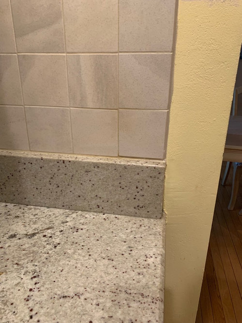
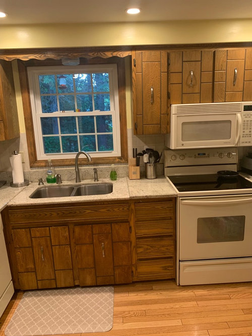
ugly yellow walls,granite with red specks,Gray backsplash?!
Sharee P
4 years ago


Featured Answer
Sort by:Oldest
Comments (24)
 PRO
PROSativa McGee Designs
4 years ago
njmomma
4 years agoRelated Discussions
Cottage-style kitchen - countertop & backsplash ideas
Comments (16)Fori is dead on about choosing later on since it is not part of a reno someone else is doing for you and needing an answer right this minute. Try and search shelayne's low backsplash. I think something like that in a light bone or beige color would let the red pop and also let you play with walls down the road for new looks. I think that letting the bs, counters and cabs be a more monotone look would fit the style while accessorizing to add color and versatility. I love how hers is simple, yet interesting and would totally fit a simple cottage look. If you want to make it more fancy, do something like her in crackle, but I bet that more than doubles the cost......See MoreWhat's the proper way to judge counter/backsplash, cabinet colors
Comments (41)No worries on the hijacking. This thread ended up way more interesting than it started and got to the crux of the matter, even if I didn't realize that's I was really asking. The consensus thing is interesting and so right on. I am constantly looking for validation for my choices. I consider this to be a character flaw and I'm trying to change my ways. So the way I deal with things is to not tell anyone what our decision is (well other than a few people like the friend who has been weighing in on design decisions for years and people who I know will nod politely even if they hate it). It is easier for me to be all confident and take on the attitude of "it's my kitchen and therefore the opinions of my DH and I are the only that matter" when I've not opened myself up to hearing negative comments (real and perceived) about our choices. The second I hear something negative it takes a little joy out of it for me. Like I said, it's a character flaw. That's why I don't ask for opinions on GW unless I REALLY want to know the good the bad and the ugly of it. Because people here are honest. That's a good thing, by the way, because it's the kind of honestly you won't get from the "oh that's nice" nodders and sometimes you really need that. You'll notice, for instance, that I never came back to this thread to mention what the decision actually was or to report that I did make one (thankfully just a few days after starting this thread so I could move on with my life). People here tend to be much more positive when they see a kitchen finished not only because they see the whole vision completed but also because they realize that it's not changing now so there is no need to say anything but positive comments (that reaffirm those pesky decisions). The nightmare: a finished kitchen post that only gets a handful of comments because you know people are doing the whole "if you can't say something nice, don't say anything." And of course that's when you wish you had asked for some truthful opinions while you were making the decisions....See MoreSea Pearl needs a backsplash II
Comments (150)Peke, you will get a beautiful look with just one color of the crackle. My silver has about 4-5 different tiles within the mix of them, having plenty enough interest. If you start mixing more than one color together (unless it's a mosaic), it's going to be crazy. I know cuz I wanted to mix some blues in with the silver & both my KD & the tile sales girl said NO. I can see now that it would have ruined the mix. It ends up all blending together & creating a beautiful, interesting look with depth (and sparkle when you get close). Not a busy look. It all blends. I like the Riviera better than the Bali. Sounds like you do too. That's one eliminated. You don't like the celery (the description has yellow sage in it). Two gone. The Moonlight isn't doing much for the Sea Pearl & I'm guessing the Ice isn't either? The Storm is going to give you the most variation, the 5th on the left side of the tile board. My tiles sat on my counter for 6 weeks because I thought they were too taupey & I wanted some blue. Once they were up & grouted, a totally different look. Like Bookworm said, you just have to pick. I think you now have the largest collection of Encore samples on Gardenweb. I love crackle tiles. If Seapearl's tile isn't in this bunch, there are more manufacturers of beautiful crackle. Here the level of variation in your samples: Ice -minimum variation Moonlight-moderate Sky- minimum to moderate Bali - moderate Riviera - moderate Mint - moderate Celery- minimum to moderate Cashmere- moderate to high Lagoon-moderate Slate-moderate to high Storm-high Stream- high Cameo (bookworm's) - moderate Silver- (mine) - moderate This post was edited by romy718 on Sun, Mar 16, 14 at 13:35...See MoreNew Magma Gold granite countertops. - backsplash?
Comments (58)@ raehelen, Thank you, and YES, I am soooo happy that the granite/BS search is behind me!! LOL @ jancy, the cabinet color that I chose was Coffee Clutch. The code for the color is D1-7. I have read of many others using Bittersweet Chocolate by BM and Black Bean by SW. But, the Coffee Clutch looked great to me at Ace, so I chose it. I did have to sand the cabinets to rough them up, and I primed them with a tinted primer first. I think I used Zinser 123. The cabinet and trim paint goes on really nice. I just brushed it on and it went on nice and smooth. Almost smooths itself out. Just use long strokes and plan on 2 coats. It dries hard and shiny. I did not have to poly over it. I painted them over a year ago and they've held up beautifully! The other nice thing was that the wood grain still shows through. It came out really well. Don't be afraid... go for it!! :)...See MoreNewhome2018
4 years agolast modified: 4 years agocalidesign
4 years agocrowfaird
4 years agolast modified: 4 years agopippabean_5b
4 years ago
NYCish
4 years ago
apple_pie_order
4 years agolast modified: 4 years ago PRO
PROJoseph Corlett, LLC
4 years agoathomeeileen
4 years agoapple_pie_order
4 years agolast modified: 4 years agosuedonim75
4 years ago
raee_gw zone 5b-6a Ohio
4 years agoCindyR
4 years ago
iamtiramisu
4 years ago
chloebud
4 years ago
Sharee P
4 years ago- PRO
Sativa McGee Designs
4 years ago calidesign
4 years agocat_ky
4 years agoHU-993723755
4 years agolast modified: 4 years agonjmomma
4 years agoHU-993723755
4 years agolast modified: 4 years ago


Related Stories
GRAYFavorite Color Combinations: Gray and Yellow
A Neutral Hue Plus a Primary Color Equal Eye-Popping Style
Full Story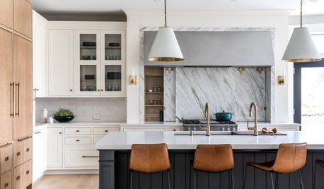
KITCHEN MAKEOVERSKitchen of the Week: White, Wood, Gray and a Backsplash Surprise
A Maine couple with three young daughters ask a designer to help them create a clean space with custom style
Full Story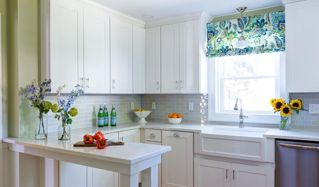
INSIDE HOUZZWhat’s Popular for Kitchen Counters, Backsplashes and Walls
White is the top pick for counters and backsplashes, and gray is the most popular color for walls, a Houzz study reveals
Full Story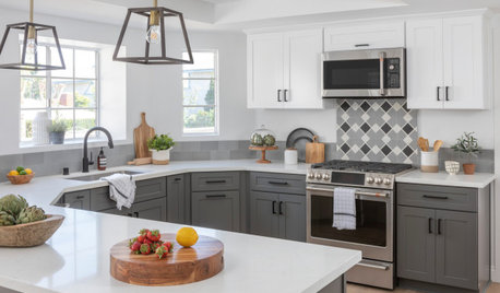
KITCHEN DESIGNTop Colors and Materials for Counters, Backsplashes and Walls
Neutral colors and engineered quartz reign in kitchen remodels, according to the 2020 U.S. Houzz Kitchen Trends Study
Full Story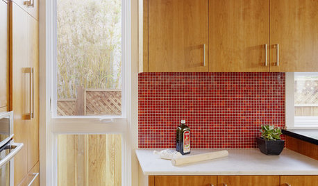
KITCHEN DESIGNKitchen Color: 15 Ravishing Red Backsplashes
Bring some zing to your kitchen with a backsplash of ruby-colored tiles or back-painted glass
Full Story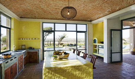
KITCHEN DESIGNKitchen Color: 7 Sensational Yellow Backsplashes
Warm up a white kitchen or add some zing to wood tones with a backsplash that glows
Full Story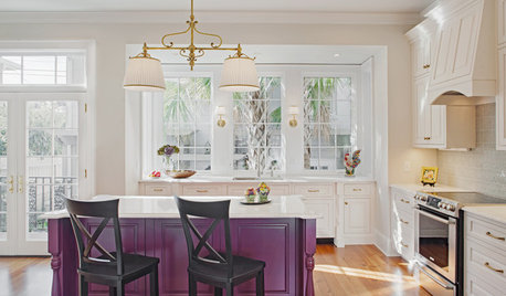
KITCHEN OF THE WEEKKitchen of the Week: Bye-Bye, Big Red Wall
An in-the-way wall disappears to bring in a large island, built-in cabinets and lots of light
Full Story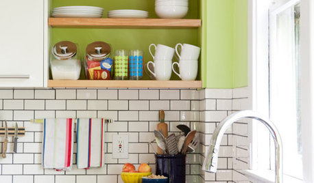
KITCHEN DESIGNSubway Tile Picks Up Gray Grout
Heading into darker territory, subway tile offers a graphic new look for kitchens, bathrooms and more
Full Story
MOST POPULARRethinking Beige in a World Gone Gray
Gray, the ‘it’ neutral of recent years, has left beige in the shade. But is it time to revisit this easy-on-the-eyes wall color?
Full Story
GRAYColor Guide: How to Work With Light Gray
The hottest new neutral can be cool or warm, formal or casual, and feminine or masculine. Talk about versatile
Full Story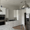


Debbi Washburn