


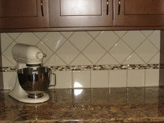
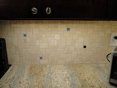
New Magma Gold granite countertops. - backsplash?
jmombo
11 years ago

Featured Answer
Comments (58)

suzanne_sl
11 years ago
localeater
11 years agoRelated Discussions
What to use for a backsplash with a granite countertop?
Comments (12)My bathroom is similar to what you are describing. Our granite in New Venetian Gold, which is very similar to Giallo Ornamental. Our vanity is 6 feet, and we have beige tiles along the walls, floor and tub/shower. We are very happy with our square decorative tile back splash. It extends throughout the bathroom. We chose to move the decorative boarder up to eye level in the shower/tub to avoid the plumbing fixtures, so it is not one continuous row throughout the room, but breaks to a different height once it gets to the shower....See MoreNeed Help Choosing Backsplash & Sink For New Venetian Gold Granit
Comments (7)Without seeing the slab it's hard to know for sure but here's one from Jeffrey Court's Antico Portugese line color Country Gray: These are kinda cool. I know nothing about the pricing. These are cement mosaic tiles by Villa Lagoon Tile. The colors are complements to Sherman Williams colors. I like the Pearl Gray below. It's a match to SW Mindful Gray. Last one for now, a more traditional 6x6 Italian Tile: This was from http://www.ceramic-tile4u.com/ . Budget tile too at $4.04 sq. ft. It was their Arpa Star tile in gray. That site has HUNDREDS of tiles to look at. May be WAY time consuming but worth a look. Good luck!...See MoreBacksplash Material for New Venetian Gold Granite
Comments (9)I have new venetian gold and selected tumbled stone for the backsplash in a chiaro color. You can see it in my thread entitled "Finally Finished (Well Almost)". Because New Venetian gold is pretty neutral, I think there are lots of styles/colors of tile that would look nice. I didn't want anything too dark or brown because MY cabinets are more mid tone and I didn't want the backsplash to look cave-like (I think the brown glass tile looks nice with jackiemcg's cabs but would have seemed very dark with mine)....See MoreBacksplash/Granite Countertop question
Comments (6)I prefer without the 4" backsplash and we will not be tiling for a few months yet. It's not problem to leave it. I personally find a 4" backsplash draws your eye - especially if it's black and does cut the room in half. It makes the room feel smaller too and decided against it for that reason. If you go with the backsplash - I would do it all the way around - not have it in one area, and not in another. I found the latest kitchen magazines really helped me decide. It really is personal preference. Good luck!...See More
jmombo
11 years ago
williamsem
11 years agosmiling
11 years agoherbflavor
11 years agokatz.3
11 years agohosenemesis
11 years ago
eam44
11 years agodeedles
11 years agopurplepansies
11 years agoellendi
11 years agojmombo
11 years agojmombo
11 years agojuliet11
11 years ago
a2gemini
11 years agoMizLizzie
11 years agojmombo
11 years agojmombo
11 years agojmombo
11 years agoellendi
11 years agoa2gemini
11 years ago
gr8daygw
11 years agoislanddevil
11 years agojmombo
11 years agochispa
11 years agohosenemesis
11 years agojmombo
11 years agonosoccermom
11 years agodeedles
11 years ago
Kathy Rivera
11 years agosuzanne_sl
11 years agojmombo
11 years agojmombo
11 years agoannkh_nd
11 years agojmombo
11 years agojmombo
11 years ago
Hogette-gw
11 years agoruthie51
11 years agojmombo
11 years ago
Jancy
11 years agoraehelen
11 years agojmombo
11 years agoJancy
11 years agoMizLizzie
11 years agojmombo
11 years agoheidihausfrau
11 years ago
jojo100
9 years agoteritwo
8 years agogr8daygw
8 years ago


Related Stories
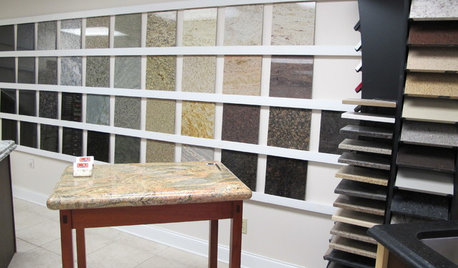
KITCHEN COUNTERTOPSWalk Through a Granite Countertop Installation — Showroom to Finish
Learn exactly what to expect during a granite installation and how to maximize your investment
Full Story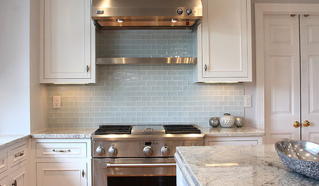
KITCHEN DESIGN5 Favorite Granites for Gorgeous Kitchen Countertops
See granite types from white to black in action, and learn which cabinet finishes and fixture materials pair best with each
Full Story
KITCHEN BACKSPLASHESHow to Choose a Backsplash for Your Granite Counters
If you’ve fallen for a gorgeous slab, pair it with a backsplash material that will show it at its best
Full Story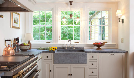
KITCHEN COUNTERTOPS10 Top Backsplashes to Pair With Soapstone Countertops
Simplify your decision-making process by checking out how these styles work with soapstone
Full Story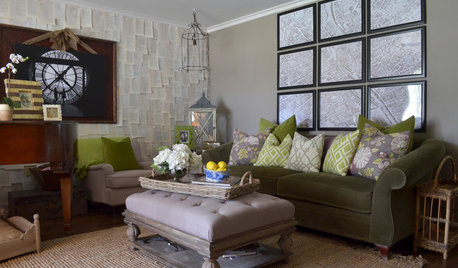
HOUZZ TOURSMy Houzz: A DIY Gold Mine in the Heart of Texas
From a sawn-down sleigh bed to book pages as wallpaper, the projects in this home are a testament to the homeowners' ingenuity
Full Story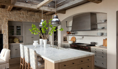
KITCHEN DESIGNHouzz Quiz: What Kitchen Countertop Is Right For You?
The options for kitchen countertops can seem endless. Take our quiz to help you narrow down your selection
Full Story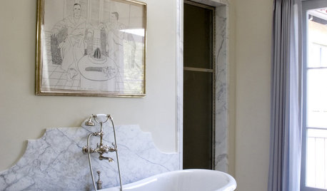
MATERIALS10 Modern Marble Looks
Marble has broken free of the standard kitchen countertop slab and is showing up on bathtub backsplashes, modern dining tables and more
Full Story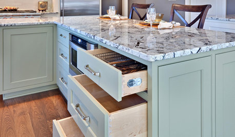
KITCHEN DESIGNWhat Goes With Granite Counters?
Coordinate your kitchen finishes beautifully by choosing colors that complement granite’s natural tones
Full Story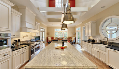
KITCHEN COUNTERTOPSKitchen Countertops: Granite for Incredible Longevity
This natural stone has been around for thousands of years, and it comes in myriad color options to match any kitchen
Full Story
KITCHEN COUNTERTOPSKitchen Counters: Granite, Still a Go-to Surface Choice
Every slab of this natural stone is one of a kind — but there are things to watch for while you're admiring its unique beauty
Full Story


jmomboOriginal Author