


Farrow and Ball - Help
Kerry Jewell
5 years ago
Featured Answer
Sort by:Oldest
Comments (29)

sloyder
5 years ago PRO
PROTimeless Designs by Melissa LLC
5 years agoRelated Discussions
Farrow and Ball Concerns - Help!
Comments (5)I LOVE Farrow & Ball. To me, expensive but worth it! I find I just don't paint as often since the depth of color changes allows me experiment with different decorating ideas. I'm an oil based primer gal so I just use Kilz (oil based!!). It's more a clean up for sure but over the years I figure it's been worth it more then having to do *over*. If you have problem (like patched areas) or glossy surfaces go with the oil based primer. If your current paint is glossy, you really need to sand it down some or the paint will eventually peel. I've NEVER had F&B take more then 2 coats with the second coat usually being because I missed a few spots with the roller. I've never had the primer tinted but I don't see how that would be a bad idea at all. I haven't had any wear problems with the Estate emulsion. It is a flat so if you touch it with moisturizer on your hands, it's going to show like any flat paint. My house is a old/new construction one so I wanted the historic look of the flat that's the reason I use the estate. The house that I'm selling is old so the estate hides very well too so I used it here. But by all means try the modern! That said I'm sorry, I've never used F&B trim paints. I found Fine Paints of Europe Eurolux satin (non yellowing white, my fav) (also come in high gloss) very, very nice so I'm sticking to it. If you are painting exterior parts & want a super high gloss the exterior oil in Brillant finish is to die for!! It goes on almost like a factory finish. (just had to fit that in! Haha) Of course this is another expensive paint at 90 a gallon or so. That's just my experience. :) KAT...See MoreHelp with Farrow and Ball paint, or just colors in general
Comments (31)I've used F&B in two houses now and basically only use that brand. It is not easy to work with because of the color shift and the undertones. The thing with F&B is the number of pigments used in the paint -- anywhere from 6 to 16 in some colors. It's also factory mixed. The other paints generally use 4 pigments and are mixed in stores. Also, F&B is a clay based paint with an exceptional surface quality in both the flat (estate) and eggshell finishes -- when we went to sell our apartment there were continual comments about the paint, how beautiful etc. It's essential to have the fan deck as the colors on the accordion card are not accurate. That saves a lot on sample pots. Anyone using sample pots should be sure to paint big, big swatches and take care not to put the colors side by side as they will shift and the eye will mix them. For me, rather than try to color match, just go with Ben Moore another of the better brands. They have way more colors, no shift and are easy to work with. They are more accessible and 1/3 the price. Pointing is an excellent all purpose white with a red undertone. It's not the slightest bit yellow. I have it on most woodwork in my house and used it on our our ceilings in our apartment with White Tie on the molding, doors & trim. White Tie is a true ivory with a slight red undertone -- as I found out when I used it on the picture molding in our bedroom that was painted in Skylight, a soft blue. At times during the day it looked pinkish. Pirula is absolutely correct when she says this paint will look different depending on latitude. The colors are formulated in England. They will look very different (and washed out) in stronger light in So Cal or Texas. It was very smart to use the darker primer in California for Teresa's Green, which can be minty in some light, and which otherwise might have looked washed out. Perhaps the OP has solved the whole house color scheme she was trying to do. In general it works best if you stick with one color for all the ceilings, one for all doors, moldings and other woodwork and keep the same color value (lightness or darkness) from room to room. But it also depends on the style of the house....See MoreFarrow & Ball color for bedroom -pls help me fix my mistake
Comments (13)Palimpsest - will the pinkish hues work well with the dark beams? DD has never been into pink.. Any other pale neutrals that can work with the beams? I used pale powder on the ceilings in the master bedroom with theresa's green on the walls. Like it there as the room is facing east and the color just seems to morph with the light. Abundantblessings - I will check out cabbage white and borrowed light.. From the website, I too prefer borrowed light. Liriodendron- frankly when I was uploading the picture, I too was surprised at the amber color.. But IRL it feels loud, hot and brash. The painter knew I was planning to change the color so he was not very careful during staining:( The louvred doors are just primed and need to be panted. I was planning to paint it the same color as the walls in eggshell finish. That way, I hope it will just blend in. The ceiling currently is BM cream in regal select matte. I know what you are saying about the ceiling colors. In the other bedroom that is similar to DD's room, I painted the walls in BM HC-1 Castelton Mist and ceiling in HC-3 Greenmount Silk. They work well with the dark wood beams. F&B is expensive but they seem to give a matte appearance similar to lime wash which is the traditional finish on the adobe bricks. FB actually makes an excellent excellent lime wash but they do not sell it in North America. The other lime wash options I have tried did not work well.. These walls had been painted many times before, so I am OK with painting it....See MoreColor match Farrow & Ball’s De Nimes
Comments (5)Do you have a sample of the De Nimes paint color? If so you can have BM create a custom color match to the sample. They may also have a formula to match the F&B colors already in their computer system. The closest colors I have found to De Nimes paint color are The numbers just under the brand line are the Delta E measurement (AC-24 Charlotte Slate is showing 1.7) Delta E is the measurement of the difference between two colors. Less than 1 is usually not detectable by the human eye unless they are right next to each other. The difference between De Nimes and Steep Cliff Gray is only a 3, would look close but it is a good deal more gray and less colorful. Benjamin Moore can color match SW colors. Color matching between brands is never going to be absolutely perfect, but can be close enough that no one will be able to see the difference....See More PRO
PROLori A. Sawaya
5 years agolast modified: 5 years ago
Kerry Jewell
5 years ago
Val Davidson
5 years ago- PRO
Lori A. Sawaya
5 years agolast modified: 5 years ago 
Rita / Bring Back Sophie 4 Real
5 years agoKerry Jewell
5 years agoKerry Jewell
5 years agoKerry Jewell
5 years agoKerry Jewell
5 years agoKerry Jewell
5 years agoKerry Jewell
5 years ago- PRO
Lori A. Sawaya
5 years agolast modified: 5 years ago Kerry Jewell
5 years ago- PRO
Lori A. Sawaya
5 years ago - PRO
Timeless Designs by Melissa LLC
4 years ago  PRO
PRODiana Bier Interiors, LLC
4 years ago
ksd4423
3 years ago
Serenity N
3 years agoHU-738807630
3 years agoMarylee H
3 years agolast modified: 3 years agoHU-738807630
3 years agoMarylee H
3 years agoJennifer Marrelli
3 years agoSerenity N
3 years agoMarylee H
3 years ago


Related Stories
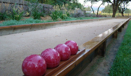
GREAT HOME PROJECTSWhat to Know About Adding a Backyard Bocce Ball Court
A regulation court in a relaxed setting helps you get the most from the Italian pastime. Here's what it takes to build one at home
Full Story
COLORPaint-Picking Help and Secrets From a Color Expert
Advice for wall and trim colors, what to always do before committing and the one paint feature you should completely ignore
Full Story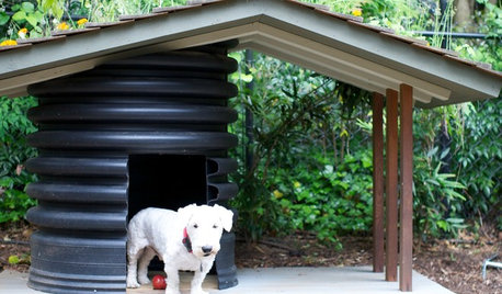
PETSHow to Help Your Dog Be a Good Neighbor
Good fences certainly help, but be sure to introduce your pup to the neighbors and check in from time to time
Full Story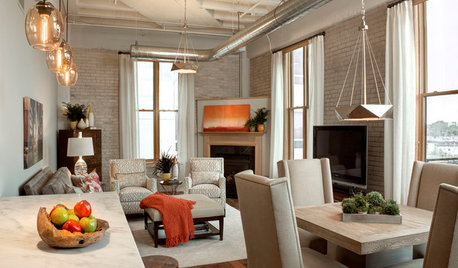
LOFTSDesigner Helps a Couple Adjust to Loft Living
A careful balancing of refined and industrial touches creates an inviting home in downtown Milwaukee
Full Story
COLORPick-a-Paint Help: How to Quit Procrastinating on Color Choice
If you're up to your ears in paint chips but no further to pinning down a hue, our new 3-part series is for you
Full Story
DECORATING GUIDESHouzz Call: What Home Collections Help You Feel Like a Kid Again?
Whether candy dispensers bring back sweet memories or toys take you back to childhood, we'd like to see your youthful collections
Full Story
DISASTER PREP & RECOVERYHurricane Harvey: How You Can Help
Want to donate or volunteer to aid victims of the storm? Here are groups assisting with disaster relief and recovery
Full Story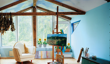
LIFE10 Ways Your Home Can Help With Your Resolutions
Eating healthier, getting in shape and finding a creative outlet are among the common resolutions you can tackle at home
Full Story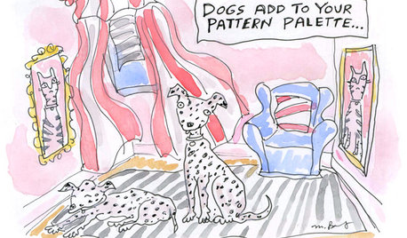
8 Ways Dogs Help You Design
Need to shake up a room, find a couch or go paperless? Here are some ideas to chew on
Full Story
MOVINGRelocating Help: 8 Tips for a Happier Long-Distance Move
Trash bags, houseplants and a good cry all have their role when it comes to this major life change
Full Story


Kerry JewellOriginal Author