


Looking for a nice complimentary color for accessible beige. Help!
Tony Howard
5 years ago
Featured Answer
Sort by:Oldest
Comments (6)

Saypoint zone 6 CT
5 years ago
Tony Howard
5 years agoRelated Discussions
I am looking for a nice beige color, Any ideas?
Comments (9)Ostrich by Behr; did my living and dining room with it...and get so many compliments on it. It just seems the right level and clean looking. I did the exterior of my home with Linen by Sherwin Williams. I know what ya mean. Beige, seems like a color that couldn't go wrong; but if it is too deep or wrong tones, it can be the opposite of the clean look it can bring....See MoreSW Accessible Beige Walls, Help on Cabinet color
Comments (3)Accessible Beige in my whole house. All of my cabinets, built ins, and trim are BM White Dove. I like it a lot. looks nice together....See MoreAccessible beige vs balanced beige for this space
Comments (9)I don't know why sometimes the houzz links work and sometimes they don't but here is the info. So many people ask for advice and I type the same variations of the same theme over and over again. I love color and am often asked to help friends, family members and their friends and family pick colors for their homes. If I am helping someone locally I have about 400 sample boards organized by cool neutrals, warm neutrals and each color that we can use to pick their colors. I have also spent years painting with oils and acrylics and doing arts and crafts involving color. So many homes are drowning in a sea of neutral because somehow we have become convinced that neutrals are safe and we can’t mess up too badly if we have a neutral home palette. But neutrals can be tricky. They are muted colors and discerning the subtle undertones can be difficult to see, especially when looking at a 2 inch square color sample. But when we paint 400 square feet of a subtle color all of a sudden that little bit of pink or blue, green or yellow is screamingly obvious. There are a few tools that can help keep us out of trouble with neutrals. One of my favorites is Maria Killam’s color wheel. It is a simple color wheel with samples of pink beige, orange beige, yellow / gold beige, green beige, green gray, blue gray, violet gray and taupe. The second tool that is affordable for most is the Color Muse. It is a $50.00 color meter. It is not a $10,000.00 color meter and is not as accurate as a $10,000.00 color meter, but it does the job and is reasonably accurate. It will tell you the color values and has a great feature that allows you to compare two color samples. There are also a couple of internet based color tools that I really like. https://paletton.com is a virtual color wheel. If you have a color that you love it will help you find color combinations that work well with that color. We are not all color experts, but our eyes and brains like symmetry. We are naturally drawn to color combinations based on geometric shapes drawn on a color wheel. This tool allows you to pick a color and play with the geometric shapes until you find a combination that speaks to you. The choices are limitless – letting you pick two or three or 4 colors and changing the angles, but always ending up with a balance between the colors. https://www.design-seeds.com – Allows you to select a color from a color set and see color palettes pulled from images. Design seeds is great source for inspiration. EasyRGB.com – this site is great for finding paint colors that are similar to another color. It also has a section that provides very accurate readings of colors based on the printed color fan decks produced by the various paint manufacturers and some color combinations that work well together. I would also like to give you a dose of confidence. You have playing with color your entire life; from coloring as child to picking out clothing and makeup and hair color as an adult. For both scientific reasons and through life experience women are generally better at discerning color differences than men. (If your husband says that two similar colors look the same to him it may be that he really can’t see the difference.) As a woman, you probably know exactly what shade of foundation you use and that one that is too pink or too green really looks bad on you. You also know that you can wear raspberry lipstick, but coral just does not work. You know that you look good in muted fall colors or clear saturated colors or pastels. You know that an ash based brown hair dye makes your hair look green or that auburn hair color makes your skin look green. These are the same color concepts that we use to pick colors for our homes. You can do this! Step 1 – Determine what must stay. Most of us do not have the finances to gut our homes, replace all the finishes and furniture. There will be things that function fine and are not in budget to change. There are also the things that we love and don’t want to change or that we want to use in a new home. Step 2 – Gather samples of everything that must stay. If you don’t have an extra piece of flooring or Countertop or other finishes you may have to go to a few stores and pick up similar samples and take them home to find one that is a pretty good match to what you have. Step 3 – Figure out what colors that make your heart sing. We all have different life experiences and although we don’t consciously pick out colors surrounding us when we are happy or sad, we subconsciously note these colors and they imprint a connection between a color and an emotion. We tend to be attracted to colors that are associated with happy memories. We also tend to like colors that look good on us. Consciously or subconsciously, we like feeling like a 10. The colors we love will be found in our wardrobe and jewelry, in artwork that we have purchased, in our dishes, linens, shower curtains and bedspreads. Gather pictures of rooms that have colors that speak to you. Look on Houzz, Pinterest and Zillow (or other real estate sites). Zillow tend to have a lot of designer photos that may not reflect real life. Most of us don’t really want a white on white house and don’t always have the architectural features needed to give interest to a very bland color palette. Concentrate on what will work in your home and with your lifestyle. At this point I am talking about actual colors – not neutrals (Reds, blues, greens, yellows . . . not beige, gray or white) Step 4 – Gather samples of the colors that you love. Pick out both saturated and muted samples and lighter and darker samples of the colors that you love. Step 5 – gather a variety of neutral color samples. These can be the small paint samples or the Maria Killam Color wheel. We will purchase larger samples once we have narrowed down our choices. Step 6 – get a large white sheet or table cloth (can be an inexpensive plastic table cover) and a table or boxes or something where you can lay out samples in natural sunlight. Step 7 - Walk through your home. Note what rooms you pass through as you walk from one room to the next and what rooms are visible from each room. Think about how you will be using the rooms and what feeling you want the room to evoke. (Do you want a bright and invigorating master bath to help you wake up and be ready to tackle the day or a relaxing retreat that allows you to wash away the tensions and problems encountered throughout your day?) Step 8 – Place a large table or several boxes in a place where the colors can be viewed in direct sunlight. Place your white table cloth or sheet over the table or boxes. I like to do this step outside. I have sometimes done it next to a large unobstructed window. The best light for viewing color is around 2:00 in the afternoon on a clear day. Get as close to this ideal as possible when picking the color palette for your home. Step 9 – Place the colors that have to stay on your table. Lay them out from one end to the other in the same order that you will see them when walking through your home. Step 10 – This step is the hardest step and may take a couple of hours. Pick out the colors that you love and start placing them on the table one at a time, looking for colors that will work with the colors that have to stay. When working with others I often find that during this step there is a single color or a pair of colors that jumps out and bites the person I am working with. They simply need to have this color in their home. For my sister It was a deep orange red color by Devine Color called “Orangutan”. For another friend it was Eggplant and for my sister in law it was Cornflower Blue and a Coral Pink. I generally try to narrow the color choices (Actual color – not gray, beige or white) to 3 to 5 hues. The number of colors will be dictated by the number of rooms in the home. Open concept spaces can’t use as many colors as closed concept spaces. I always try to have at least one warm color (red/orange/yellow) and at least 1 cool color (blue/green/violet) when narrowing the selection to 3 to 5 hues that look nice next to each other. (If you found one or two colors the internet tools I listed above can help you find colors that go well with the color you picked.) As you narrow your choices think about the emotions that the colors you love make you feel. Think about the rooms and how you want to feel while you are in each room. Your warm colors are generally more relaxing and warm colors more energizing. Pick out the core color for each room. Don’t forget that the colors you are picking have to work with those colors that must stay and with the colors in the rooms that are visible from that room. Now dull those colors down a few notches. The brighter, more saturated colors will work great for accent colors and in dark rooms where we don’t have enough light to reflect weak colors, but when painting 400 square feet of wall or buying a large sofa in a room with average lighting the brighter and more saturated colors will be too loud. The larger the territory covered by a color the more we see the color and the more subdued we should make the color. Step 11 – Picking your neutral. I target a ratio of about 60% neutral, 30% muted color and 10% accent colors for most homes. This is just a rule of thumb – not a hard and fast rule. Once you know the 3-5 core colors that are going to be the basis of your color palette and you know what colors/neutrals that must stay you will want to pick out a neutral that works with all of these colors. Pink beige and pinker tones of taupe and browns and tans with pink tones will be the most limiting neutral selections. They are not bad choices, but they do not play well with yellow beige/orange beige or gold beige and will tie your hands when trying to mix and match neutrals. The other neutrals are all pretty versatile and will allow you to more easily mix in other neutrals and colors. Remember, this is your home. It should reflect what you love, not the current trend or what your neighbor used in their home. Pick the neutral that you love with the colors that are going to be in your home. Again, we are looking for neutral color families, not a specific wall color or flooring. Step 11 – Picking a white. Whites can be the most difficult to work with. There is so little color and it highly reflective, so the trees outside of your window may make your white appear green. Right now we are simply looking for the general shade of white that works best with your colors and neutral. Benjamin Moore Chantilly Lace is a very neutral, true white. It can be stark in many homes, but my favorite white to use to compare to other whites see if they are blue or creamy or a bit pink. Benjamin Moore White Diamond is my test color for blue whites. Works well in homes with a lot of light blue grays, but is stark against most other colors. Benjamin Moore Ivory White is my test color for creamy whites. Works well in homes with warmer color palettes. Cloud White is my go to white. Nice and clean without looking stark against most other colors, but can be bright against dark, saturated subdued colors. Dove White is a bit dirtier than Cloud White, but often a good choice when Cloud White feels too white. At this point you have a whole home color palette from which to work. I like to keep all of my sample colors in a notebook that I can take with me when I shop. I like samples that are about 8 ½ x 11. If I don’t have a sample of my fabric that I can put in the notebook I will get color matched samples from the paint store or pick up some fabric with the same colors at the fabric store. But I need to be able to take the colors with me so I can see them next to things I may want to purchase. I do agree with most designers that before you paint your walls you need to buy furniture and area rugs and flooring and counter tops. These items don’t come in every color, but if you know what colors you plan on using in your home you can select flooring that works with those colors. You can refine your selections as you decorate. I shop for flooring, counter tops, cabinets and appliances first. Move on to upholstered furniture, bathroom wall tiles and kitchen back splash next. I also tend to work from the entry of my home through the common living spaces and end with the bedrooms or bedroom wing bathrooms. I keep to my color pallet – making each purchasing decision based on my color scheme and the items I have already purchased and added to my color notebook Periodically I will take my white sheet and my samples and head to the backyard to layout the items and make sure I am happy with my decisions. It also helps me visualize where I may need more color where the flow isn’t quite working and I need to balance the colors between two rooms. Once the big decisions are made I can move on to picking wall colors, bedding, shower curtains, throw pillows, and window coverings. This is where I begin really refining the color selections. Picking the perfect hue for each color, neutral and white based on those things that I purchased where the color selection may have been limited. I will go to the paint store and pick up 2 dozen samples of each color and of my neutral that are slight variations from my original theme. I will usually pick up the brochure of white paint colors. Unless I am doing a white on white color scheme I will pick one white for trim throughout the house. By this point either my cabinets or counter will dictate the exact shade of white that I will be using. I take everything outside and place all the colors that are now part of my design on my white sheet. I pick out the blue that works best with the blue in my sofa or the green that will accent perfectly against the coral chair. I go through each room and pick out the wall color and determine what accessories I will need to bring in additional color and create the energy level I want for that room. To be perfectly honest – I know before I start that the living room and hallways in my home are going to be painted with my neutral. I will have purchased a sofa and chairs that are color, not neutral. The bedrooms, bathrooms and laundry room will be color and the dining room and kitchen and entry could go either way depending on what else I selected for the rooms and where there are architectural breaks between the rooms. This isn’t the case for all homes and I have helped others pick colors for their living room walls and helped others pick out a neutral that they used throughout the home. Once I have found the perfect colors (or what I believe will be perfect) I paint large samples of those colors and place them around the rooms where the color is going to be painted. I usually live with these colors for several days, looking at the color in the morning, afternoon and evening. Then I tweak my selections, maybe making the color a bit brighter or a little more subdued or little lighter or darker. I live with the new colors for a few days and make sure I am happy with the color before I buy my first gallon of paint....See MoreHelp! SW Accessible Beige
Comments (6)Thank you! We decided on SW High Reflective White for the ceilings and SW Accessible Beige for this room, as during my research, High Reflective White appeared to actually play well with others lol...no tint. Some of our rooms are gray and some greige so I didn’t want it to clash at all. What isn’t so obvious is that the color on the walls in this room are actually SW Urban Putty which in person actually has more yellow tint than I’d like. We have Accessible in our master bath and have for a few years and I still like it....See More
mark1993
5 years agoTony Howard
5 years agoTony Howard
5 years ago
Related Stories
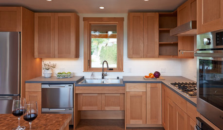
UNIVERSAL DESIGNKitchen of the Week: Good Looking and Accessible to All
Universal design features and sustainable products create a beautiful, user-friendly kitchen that works for a homeowner on wheels
Full Story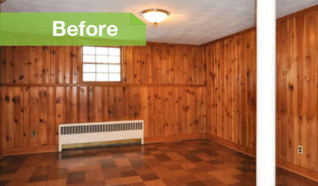
PAINTINGKnotty to Nice: Painted Wood Paneling Lightens a Room's Look
Children ran from the scary dark walls in this spare room, but white paint and new flooring put fears and style travesties to rest
Full Story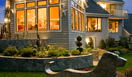
PETS6 Ways to Help Your Dog and Landscape Play Nicely Together
Keep your prized plantings intact and your dog happy too, with this wisdom from an expert gardener and dog guardian
Full Story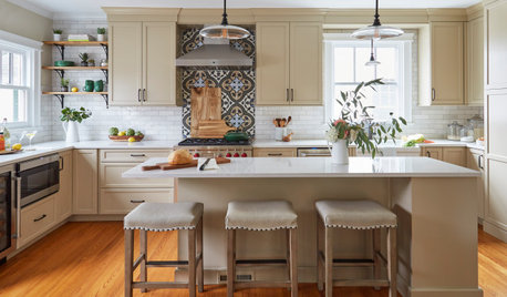
KITCHEN MAKEOVERSKitchen of the Week: Beige Cabinets and a Vintage Vibe
A designer found on Houzz helps a couple update the kitchen in their 1897 home with modern function and old-world style
Full Story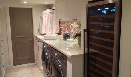
LAUNDRY ROOMSLaundry Room Redo Adds Function, Looks and Storage
After demolishing their old laundry room, this couple felt stuck. A design pro helped them get on track — and even find room to store wine
Full Story
SELLING YOUR HOUSE10 Tricks to Help Your Bathroom Sell Your House
As with the kitchen, the bathroom is always a high priority for home buyers. Here’s how to showcase your bathroom so it looks its best
Full Story
DECORATING GUIDESGot a Problem? 5 Design Trends That Could Help
These popular looks can help you hide your TV, find a fresh tile style and more
Full Story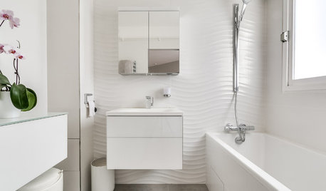
BATHROOM DESIGN12 Ways to Make Any Bathroom Look Bigger
These designer tricks can help you expand your space without moving any walls
Full Story
ECLECTIC HOMESMy Houzz: From Beige and Bland to Eclectic and Moody in Austin
Colorful graphic wallpaper and eclectic finishes help transform this 1970s Texas home
Full Story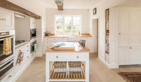
KITCHEN DESIGNKitchen of the Week: A Fresh Look for a Georgian Country Kitchen
Whitewash and understatement help turn the kitchen in this period home from a tricky-shaped room into a stylishly unified space
Full Story


mark1993