


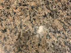
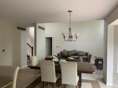
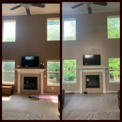
Accessible beige vs balanced beige for this space
Em
4 years ago
last modified: 2 years ago
Featured Answer
Sort by:Oldest
Comments (9)

Em
4 years agolast modified: 4 years agoRelated Discussions
Sherwin Williams Accessible Beige
Comments (3)We bought a new construction spec home in Fall 2007. The builder used Accessible Beige as the main wall and ceiling color. The home was painted by the time we saw it for the first time. With respect to the above poster- It's not all gone yet, but I am working on it. Can't stand it. Here is why- It's not beige enough to be beige and not gray enough to be gray. It is right in between but not in a good way. It sucks the light out of a room. The home is "cozy" to begin with (not overwhelmed with natural light) but what is strange is that we have used colors with the same or lower LRVs to paint over it and in every case the room came "alive" once the Accessible Beige was gone. Just a dreadful color....See MoreSW Balanced Beige or Accessible Beige with warm yellow?
Comments (1)This may help....See MoreLooking for a darker shade to go with Accessible beige?
Comments (5)Abbey1223, what did you decide to go with? We paired Accessible Beige with an accent fireplace surround (until we can remodel our insert and fp) in a darker greige from Hirshfield’s AKA Diamond Vogel brand paint in ‘Rain Barrel’. I’m also looking for a dining room color to pair with it in an open floor plan and considering a deeper dusty blue gray....See MoreBM Manchester Tan vs SW Realist Beige? Kilim Beige?
Comments (8)Hope all goes well with baby. When is h/she due? In answer to your question, what I meant is these colors are less "light reflective" than the off-whites more popular today. If you kitchen has a lot of windows, then any of the colors you mentioned would be OK. Realist Beige has an LRV of 59 (on a scale of 0-100; 100 being most reflective of light, ie. brighter to the eye); Manchester Tan has an LRV of 64; and Kilim Beige has an LRV of 57. Colors to consider are SW Natural Choice LRV 74; SW Egret White LRV 70; and SW Creamy LRV 81. All need to be compared to your cabinet color to ensure the right tone is achieved. You can order samples of the colors in 12x12 sheets for around $6.00 each from samplize.com. I use them all the time, because in the long run it is cheaper and no bottles of paint to dispose of and no purchase of foam boards, brushes and making the samples up. Plus, you get a real true sample of the color. Might try at least say 2-3 of your favorites if you can. Our SW store is taking call ins for chips for curb pick up. You could get all those chips and then decide what few to get the larger samples of so you can contrast and compare. Best of luck with the baby! I can't imagine being pregnant right now and I hope everything goes really well....See MoreEm
4 years ago
Jennifer Hogan
4 years ago
suedonim75
4 years agoEm
4 years agoEm
4 years agoJennifer Hogan
4 years agoKate Laura
3 years ago
Related Stories
ROOM OF THE DAYRoom of the Day: Cool Grays Replace Beige in a Glam Space
A West Hollywood living room goes from drab to fab to match the lively personality of its owner
Full Story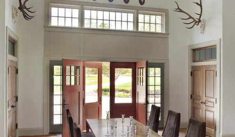
NEUTRAL COLORSColor Guide: How to Work With Beige
If you yawn and dismiss it, you're missing out on beige's infinite subtleties and the possibilities it brings to room designs
Full Story
MOST POPULARWhat’s Your Neutral: Beige or Gray?
A designer shares 10 tips for using the neutral shade that works best for you
Full Story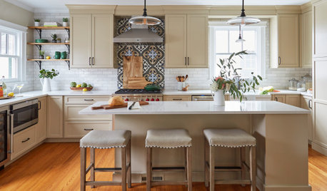
KITCHEN MAKEOVERSKitchen of the Week: Beige Cabinets and a Vintage Vibe
A designer found on Houzz helps a couple update the kitchen in their 1897 home with modern function and old-world style
Full Story
MOST POPULARRethinking Beige in a World Gone Gray
Gray, the ‘it’ neutral of recent years, has left beige in the shade. But is it time to revisit this easy-on-the-eyes wall color?
Full Story
COLORBeige Is Back: Designers Share 10 Beautiful Warm Paint Colors
Enthusiasm for cool grays has waned, and warm neutrals have returned. See which beige and greige tones designers prefer
Full Story
NEUTRAL COLORSRunway to Room: Pink-Kissed Beiges and Golds
The new neutral colors from the spring 2012 fashion runways may just make your rooms blush
Full Story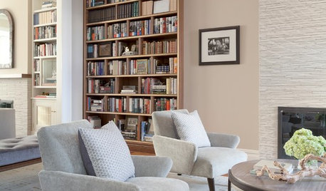
COLORThe Beiges Are Back in Town
These examples just might make you reconsider this comeback hue
Full Story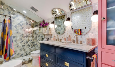
BEFORE AND AFTERSBeige Windowless Bathroom Gets a Fun, Colorful Makeover
A designer transforms a 1980s bathroom in Austin, Texas, for 3 sisters
Full Story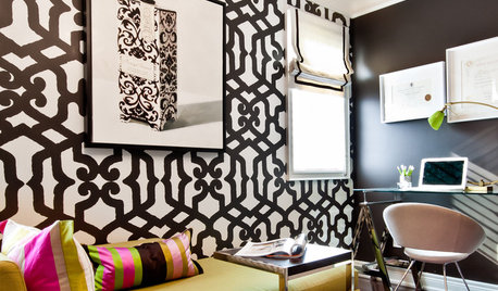
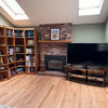
HOUZZ TOURSHouzz Tour: Builder's Beige Gets a Makeover
Home goes from boring to lively with color, furniture and textures to fit a family's personality
Full Story

suedonim75