


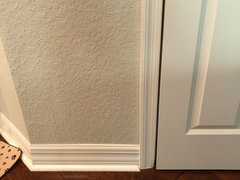
Need help choosing light gray color to go with reddish orange floors!
jolynne28
5 years ago


Featured Answer
Sort by:Oldest
Comments (51)

jolynne28
5 years ago
Mary Elizabeth
5 years agoRelated Discussions
Need Help Choosing the best neutral gray paint color
Comments (10)There really is no substitution for testing the colors in your space and different light through the day. For a suppposedly neutral color, greys can be tricky. Fact of the matetr is that a greyy can be any color plus black or some canceling tones. Revere Pewter goes violet on me and Edgecomb grey a bit green in some rooms. I wound up going to Sherwin Williams and trying their colors. Agreeable Grey was the right tone for my living areas, but I am doing them at 150% to get a little deeper color. I am using Anew Grey in my entry and stairwell -- that hasn't been done yet. . More important to your question about going with cool and warm colors -- the Agreeable Grey in my FR had to work with red brick, cherry hutch and dark wood floors as well as blue, green and white in the upoho;stery, rug and kitchen cabinets and counters. Anything that tended green made the red brick fireplace more intense and anything too warm made it pinker/orangier. Agreeable Grey at 100% was too light -- was too close to my grout and looked chalky, so we just added more color and went to 150%. SInce it is a light color to begin with, it is still light, just richer. The result was amazing -- my red brick calmed down. No more orangey, purpley/brown red. And it is so soft and neutral with the blues,, green and white. We did the ceiling at a reduced value. It was the first time I had used SW paints and as much as I liked BM, I was just as pleased with this job (DIY)....See MoreNeed Help - Wall paint to tone down Orange/Red Floors
Comments (6)Look at SW Evening Shadow (SW 7662) it is a nice light grey. The problem is if you are looking at a sample in a room that still has that some of that yellow/orange paint on the walls it will reflect the color and make the grey look different that what it will look like when the entire room is painted. Your floors will look better when all that yellow and orange are gone....See MoreTrying to choose gray paint to go with my Tavern Gris flooring
Comments (4)Thanks Karen, that looks very nice! I like the darker gray furniture, and also are the cabinets in the living room black or a very dark brown?...See MoreWall color to go with dark reddish wood (cherry?) cabinets
Comments (39)My feeling is that you may be in color overload. It is easy to get there, especially with the thousands of colors offered. Truth is out of all the colors there are really a handful of popular colors that work. There is a paint company called C2. They don't have a ton of stores, but you can order samples online. You don't need to paint your own samples - they sell huge samples ( 18" x 24" painted color samples (not printed paper). The samples are about $5 or $6 per sample.if purchased in a store, $9.00 online. They have smaller painted cards that run $1.00 online and are free in stores. Their full fan deck is only $50.00 They have a limited selection of colors, just the "Best in Class". Using EasyRGB to look up colors that are similar to Revere Pewter in Benjamin Moore Paints I get this: 10 colors with very little variance. Using the same program but looking for colors that are similar to Revere Pewter in C2 Paints I get this: 10 colors that are similar in depth of color but have quite discernibleundertones. You are pretty much guaranteed that one will look good with your cabinets and floors. More isn't always better. Sometimes it is simply more confusing. If I were you I would probably start with the lighter colors, closer to C2 Archival For $11.00 you can get the small paint sample of all 11 colors - pick the 3 you like best and for another $30.00 get big samples and make a final decision. Easy peasy done!...See Morejolynne28
5 years agotoxicdoll
5 years agojolynne28
5 years agojolynne28
5 years agojolynne28
5 years agojolynne28
5 years agolast modified: 5 years agojolynne28
5 years agopalimpsest
5 years agojolynne28
5 years agolast modified: 5 years agojolynne28
5 years agojolynne28
5 years ago
Elle
5 years agojolynne28
5 years agojolynne28
5 years agojolynne28
5 years agojolynne28
5 years agojolynne28
5 years agojolynne28
5 years agojolynne28
5 years agoElle
5 years agojolynne28
5 years agojolynne28
5 years agoElle
5 years agojolynne28
5 years agojolynne28
5 years agojolynne28
5 years agolast modified: 5 years agojolynne28
5 years agoElle
5 years agojolynne28
5 years agolast modified: 5 years agojolynne28
5 years agoKay Jay
2 years ago


Related Stories

GRAYDesigners Share Their Favorite Light Gray Paints
These versatile neutrals can help create a range of moods in any room
Full Story
GRAYChoosing Color: Give Me More Gray Days
Layer On the Grays for a Sophisticated Look in Any Room
Full Story
GRAYChoosing Paint: How To Pick the Right Gray
Which Version of Today's 'It' Neutral Is For You?
Full Story
GRAYColor Guide: How to Work With Light Gray
The hottest new neutral can be cool or warm, formal or casual, and feminine or masculine. Talk about versatile
Full Story
GRAYGoing Greige: Tips for Choosing This All-Around Neutral
Here are some ways to highlight and complement your home with this elegant hybrid of gray and beige
Full Story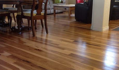
MATERIALSWhat to Ask Before Choosing a Hardwood Floor
We give you the details on cost, installation, wood varieties and more to help you pick the right hardwood flooring
Full Story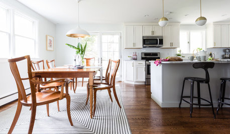
DECORATING 101How to Choose a Dining Table Light
Stumped about which chandelier, pendant or other lighting to choose? These design and installation guidelines will help
Full Story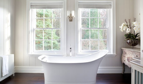
BATHROOM DESIGNWhich Flooring Should I Choose for My Bathroom?
Read this expert advice on 12 popular options to help you decide which bathroom flooring is right for you
Full Story
PENDANT LIGHTINGChoose the Right Pendant Lights for Your Kitchen Island
Get your island lighting scheme on track with tips on function, style, height and more
Full Story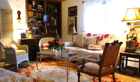
DECLUTTERINGDownsizing Help: Choosing What Furniture to Leave Behind
What to take, what to buy, how to make your favorite furniture fit ... get some answers from a homeowner who scaled way down
Full Story


JudyG Designs