


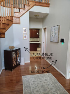
Why does SW Repose Gray look blue?
dgarstang
6 years ago
Featured Answer
Sort by:Oldest
Comments (25)
 PRO
PROPatricia Colwell Consulting
6 years agodgarstang
6 years agoRelated Discussions
SW Repose grey- too dark and gloomy for a small room?
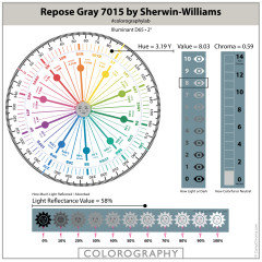
Comments (10)This is a Light Reflectance Scale (LRV). LRV tells you how much light a color will reflect and how much it will absorb. Sherwin Williams includes LRV on their paint chips. Repose Gray has an LRV of 58%. The average guideline for interiors is 50%. So, Repose Gray is brighter than the average guideline for visually functional and supportive wall color. Technically, it's not too dark but how you perceive it is the only thing that matters. If it is too dark, then you know you want a different color that has an LRV greater than 58%. Cutting the formula by 50% affects every dimension of the color - hue/value/chroma/LRV - not just the brightness/lightness. Changing the formula in any way whatsoever basically creates a new color and you won't know what that brand new color looks like until you have it mixed and you have to buy the paint whether you like it or not. A smarter strategy than playing the game of cutting formulas and buying paint you don't want is to just look for a different color....See MoreCan I use Sw Mindful Gray and Repose Gray together?
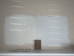
Comments (3)I know this was a month ago but wanted to share my experience. I had mindful gray throughout my downstairs except on an accent wall. Because I have a charcoal sectional, I felt that mindful gray was just too dark for me so I repainted in repose gray. Both are muddy colors in my house depending on the time of day. Usually mornings, they are a nice crisp neutral gray but by evening, they are more taupe gray. On the second part of my stairway it’s mindful gray on both sides and I don’t feel it’s too dark but i still want to eventually lighten it to repose as well. The bottom of the stairs you can see where i didn’t finish painting. One wall is mindful the other is repose. Here’s a pic of my wall with two different shades. Excuse the horrible pic. It’s my iPad. if you’ve already painted, would love to see what you chose. Happy holidays!...See MorePaint Help - SW Agreeable Gray vs SW Anew Gray
Comments (52)I have anew gray currently in my bedroom on the walls and alabaster on the trim. I think it would be beautiful to have the trim and perhaps the door also sw anew gray and the walls alabaster. Another look depending on the height of your ceilings, you could paint the ceiling anew gray with alabaster walls....See MoreIs there a PPG color that is very similar to SW Repose Grey?
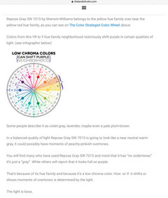
Comments (19)How do I know how it will look on the wall as far as what the color it portrays? Is there a value for that? Excellent question. The hue/value/chroma color notation is a fact. That's why it's called factual color. It's derived from following a set of standards to measure the color. It's repeatable. You and I could both follow the same process and measure a swatch of the same color in different locations and get very similar results. How a color actually looks in a space is actual color. Everyone guesses about how a paint color is going to show up in a specific space. There's no such thing as fool proof paint colors. Which is why everyone has to follow some kind of a process to test color in context of the space, inherent lighting, and contents of the room We can use use factual color notations - hue/value/chroma/LRV - as a framework to anticipate how it will actually show up in a space. For example, we use the notations to make sure the paint color relates to some important element. Like a rug or even the floor. Because if there's a level of relationship between the paint color and one or more elements, then odds are excellent the paint color is going to be perfect. We also use each channel of hue, value and chroma to find paint colors with specific characteristics. For example, based on your comment that you're looking for a color similar to Swirling Smoke only lighter I'd suggest you take a look at: Silent Smoke PPG1025-2 Dogwood Blossom PPG14-24 Paraffin PPG-14.31 I don't want to say "undertones" because from what I read that word is overused and cringey. Is that hue? The problem with "undertones" is everyone is making it up as they go. Undertones are just someone's subjective opinion about what a color actually looks like - according to their color acuity - in whatever context and light source they happen to be lookin' at it. Which is why you'll find dramatically different opinions on the internet about what a paint color actually looks like. Whereas hue family is, as mentioned, a factual, measurable attribute of color....See More
prairiemom61
6 years agoadyess25
6 years agoscott_beautifulbutterfly
6 years agoartistsharonva
6 years agomommyniki
6 years agoSJ McCarthy
6 years agoUser
6 years agoSJ McCarthy
6 years agosuseyb
6 years agoSJ McCarthy
6 years ago
laurie1865
4 years agoK H
4 years agolaurie1865
4 years ago PRO
PROGold Coast Shutters and Blinds
3 years ago- PRO
Gold Coast Shutters and Blinds
3 years ago 
Alisa H
2 years agoMarylee H
2 years ago
chloebud
2 years ago PRO
PROArielle Adams Realty & Co.
2 years agoAlisa H
2 years agoMarylee H
2 years agolaurie1865
2 years ago
Related Stories
GRAYColor Guide: How to Work With Light Gray
The hottest new neutral can be cool or warm, formal or casual, and feminine or masculine. Talk about versatile
Full Story
DECORATING GUIDESColor Guide: How to Work With Charcoal Gray
The most modern neutral, charcoal gray looks great in dining rooms, living rooms and even nurseries. Here's how to use it best
Full Story
GRAYDesigners Share Their Favorite Light Gray Paints
These versatile neutrals can help create a range of moods in any room
Full Story
MOST POPULAR50 Shades of Gray
Gray is hotter than ever, thanks to a hit novel full of risks and dark secrets. Tell us: Which paint shade possesses you?
Full Story
DECORATING GUIDESColor of the Week: Decorating With Warm Gray
Tired of tan? Getting gloomy from cool gray? Make warm gray your new go-to neutral
Full Story
MOST POPULARRethinking Beige in a World Gone Gray
Gray, the ‘it’ neutral of recent years, has left beige in the shade. But is it time to revisit this easy-on-the-eyes wall color?
Full Story
DINING ROOMSColor Feast: When to Use Gray in the Dining Room
The right shade of gray pairs nicely with whites and woods to serve up elegance and sophistication
Full Story
MOST POPULARWhat’s Your Neutral: Beige or Gray?
A designer shares 10 tips for using the neutral shade that works best for you
Full Story
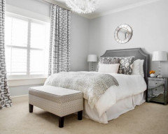
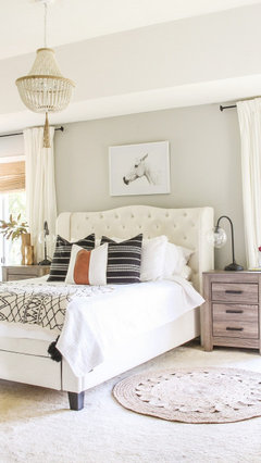
COLORDreaming in Color: 8 Gorgeous Gray Bedrooms
With this versatile hue, you can go dark and bold or slip into something more soothing
Full Story
EXTERIOR COLORExterior Color of the Week: 7 Ways With Warm Gray
See why this hue can be the perfect neutral for any house
Full Story

mustangnola