


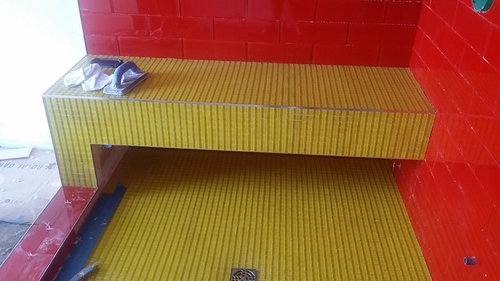
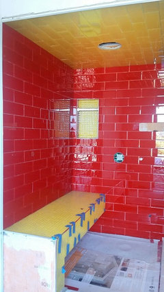
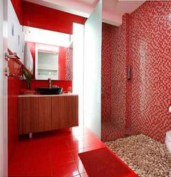
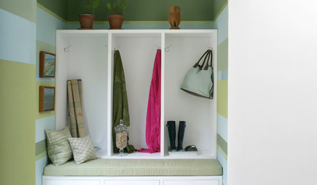
Is this too busy?
uscpsycho
7 years ago
Featured Answer
Sort by:Oldest
Comments (53)

Linda Doherty
7 years ago
MongoCT
7 years agolast modified: 7 years agoRelated Discussions
Counters and Island Too Matchy or Too Busy?
Comments (2)I personally don't think there is a right or wrong way to go. I like the contrast look, but I didn't do it (primarily because of the size of my kitchen and the size of my island). In my case, my perimeter cabs are off-white and my island is brandy with black accent. I went with verde butterfly everywhere (it's very dark) because my island is pretty large in relation to the kitchen and I did think it would look busy. IF my island had been much smaller OR I had a huge kitchen, I probably would have done contrasting counters. Now that they are in, I am very happy I chose to match them. It was the right call in my space. GOOD LUCK!...See MoreToo Busy ?Too Many Colors ? what should I add if anything ?
Comments (15)It seems to me most of the busyness is from the huechera you have mixed with the hosta and not the hosta themselves. Once the hosta get bigger and more emerge they will tone it down rather than become busier. It is true that if you mass a lot of similar hosta together it mutes the beauty of each individual plant. If a variegated plants are surrounded by green or blue they will draw the eye and become the 'specimen' plant. Vice versa is true as well. I think if you picture the huechera out of the picture, the hosta are spaced a good distance apart and will look fine. Right now the huechera are causing the eye to dart from one bright color to another not the hosta. The huechera are the reason you feel the planting may be too busy not the hosta; at least until the hosta become more prominent.......in my humble opinion anyway. Jon...See MoreIs this backsplash too busy?
Comments (16)the inspiration pics are very formal/classical /traditional. You can go matte or glossy but the style trumps the sheen as an issue. You will have an extremely light space with uv bouncing all over the place with white on every surface. I dont think the sheen really matters. the mango tile on your first board would be fine now that your vision is more revealed. It's all going to be a swathe of white....when you get in close the mango tile has some nice detail...better than the lacey arabesque. Pick the mango then....See MoreProvensa At Ease too busy? And other Provensa to try?
Comments (3)STOP right now . You go shopping find 2 you like get a box of each bring home layout in your house that is how you decide color .Not here wit too many choices to even begin to figure out what you need....See Moreuscpsycho
7 years ago
localeater
7 years agoroarah
7 years agogrannysmith18
7 years ago- PRO
User
7 years ago H B
7 years agoUser
7 years agolast modified: 7 years ago PRO
PROMint tile Minneapolis
7 years agolast modified: 7 years agoMongoCT
7 years agolast modified: 7 years agokudzu9
7 years agochispa
7 years ago
pamghatten
7 years ago
hoovb zone 9 sunset 23
7 years agoroarah
7 years agolast modified: 7 years agouscpsycho
7 years agouscpsycho
7 years agokudzu9
7 years agoLinda Doherty
7 years ago
Fori
7 years agonosoccermom
7 years agoleela4
7 years agomrspete
7 years agolast modified: 7 years ago- PRO
User
7 years ago H B
7 years agomaries1120
7 years ago
kats737
7 years ago
enduring
7 years agoL H
7 years agonosoccermom
7 years agoenduring
7 years agolast modified: 7 years agouscpsycho
7 years agolast modified: 7 years agogrannysmith18
7 years ago
FeatherBee
7 years agolast modified: 7 years agouscpsycho
7 years agolast modified: 7 years agosouthofsa
7 years agoenduring
7 years agoMongoCT
7 years agoenduring
7 years agoMongoCT
7 years ago PRO
PRODragonfly Tile & Stone Works, Inc.
7 years ago- PRO
User
7 years ago uscpsycho
7 years agohousequester
7 years agoenduring
7 years ago


Related Stories
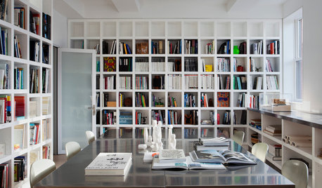
ARCHITECTUREDesign Practice: How to Start Your Architecture Business
Pro to pro: Get your architecture or design practice out of your daydreams and into reality with these initial moves
Full Story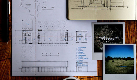
ARCHITECTUREDesign Practice: The Basics of Marketing Your Business
Pro to pro: Attract clients and get paying work by drawing attention to your brand in the right places
Full Story
DESIGN PRACTICEContracting Practice: Marketing Your Business
To keep those projects rolling in, combine old-school techniques with the latest in high-tech networking
Full Story
HOUSEKEEPINGCan-Do Cleaning Strategies for Busy People
While you dream of having a maid (to go with the cook and chauffer), this simplified cleaning routine can keep your real-world home tidy
Full Story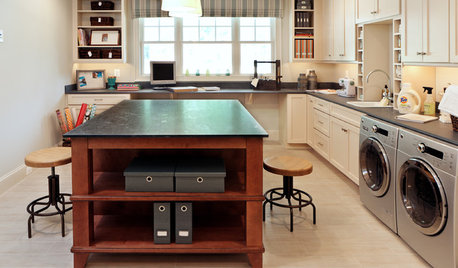
HOME OFFICESSmall-Business Savvy: Set Up a Shipping Station
Packaging and shipping products efficiently is an essential part of your creative business. Is your studio up to the task?
Full Story
INSIDE HOUZZHow’s Your Business Doing? A Houzz Survey Shows a Positive Outlook
Revenues grew for 70 percent of home design professionals last year, and many are expecting continued growth
Full Story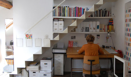
THE ART OF ARCHITECTUREDesign Practice: Why Saying No Can Be Good for Business
When talking with potential clients, ask yourself these questions to determine whether you should accept — or pass on — the job
Full Story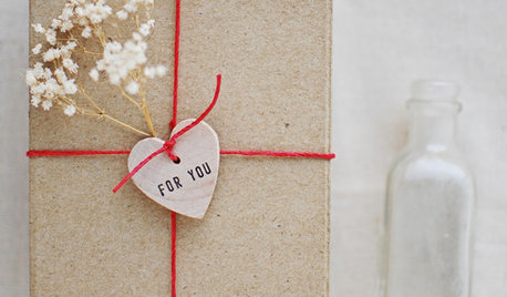
CRAFTSSmall-Business Savvy: Personalize Your Packaging
Leave boring boxes to the big stores. Creative, personalized packaging sends a message to customers that you care
Full Story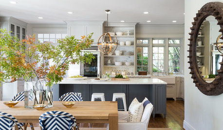
KITCHEN DESIGNKitchen of the Week: Classic Style Creates Calm for a Busy Family
Fresh take on traditional lightens up a kitchen in a large, open space
Full Story


MongoCT