


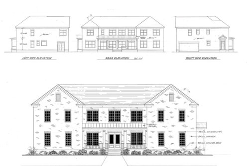
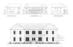
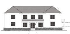
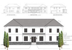
Help - with or without dormers?
hkaimono
7 years ago

Featured Answer
Sort by:Oldest
Comments (48)

missouribound
7 years ago
millworkman
7 years agoRelated Discussions
Where to put the dormer(s)? Anyone with PhotoShop skills?
Comments (15)I agree and so does DH, the shed looks best. Thanks to robo for the mock up! Eld6161, my boys' room has one small porthole-style octogon window. I think it's because my second floor probably originally had only two very large bedrooms upstairs. At some point, a previous owner added a wall between one if the rooms to make a third bedroom upstairs. As a result my DD's room on the back dormer has two big windows and no windows in the front room which is the boys....See MoreWindows with or without grid for dormer in craftsman cottage?
Comments (12)Nope. 3 single hung windows. The pictures are just examples as I'm trying to figure out what would look the best. My husband does NOT like the idea of grids downstairs. I was wondering if windows with grids upstairs would look good and give the space more character. BUT, it appears it would be the same elevation so maybe that's not a good idea. Thanks for the help....See MoreHelp! Off-Centered Dormers Drive Me Crazy!
Comments (20)It looks so much better without them. Lindsey is right though, the door itself is not centered on the house. A lot of houses have doors that are not centered, but, most of those houses, do not have the type of roof you have. To make the door look centered with the roof, you would have to move the door over to the left quite a bit. I am sure you really dont want to do that, so just remove the dormers that draw more attention to it, and enjoy your home. :-)...See MorePLEASE HELP! Dormers or arch over front door with a front car garage?
Comments (29)#3. All brick with siding under porch. Get rid of faux stone accents on corners at foundation. Do not pay extra for those. They are awful. If you have to have stone, only do it along the base of the foundation. Paint the garage doors as close to the color of the brick that you select to remove emphasis of huge garage doors. There is no hiding them, but you don't want them to be the focal point. Why #3? It has the most simple elevation and avoids most of the McMansion from Hell elements. That's why. If it were me, I'd do all brick. Then, I'd paint the brick and garage door the same color....See More PRO
PROVirgil Carter Fine Art
7 years agohkaimono
7 years ago
One Devoted Dame
7 years agohkaimono
7 years agoSt561 W
7 years agomillworkman
7 years ago
just_janni
7 years ago- PRO
Virgil Carter Fine Art
7 years ago hkaimono
7 years agohkaimono
7 years ago PRO
PROMark Bischak, Architect
7 years ago
worthy
7 years agolast modified: 7 years agohkaimono
7 years agogeoffrey_b
7 years agoscone911
7 years ago
done_again_2
7 years agoUser
7 years ago- PRO
Virgil Carter Fine Art
7 years ago One Devoted Dame
7 years agohkaimono
7 years ago PRO
PROAnglophilia
7 years agolast modified: 7 years agojust_janni
7 years agoOne Devoted Dame
7 years agolast modified: 7 years agohkaimono
7 years agojust_janni
7 years ago
Naf_Naf
7 years agohkaimono
7 years agohkaimono
7 years agoOne Devoted Dame
7 years agoNaf_Naf
7 years agolast modified: 7 years ago- PRO
Virgil Carter Fine Art
7 years ago One Devoted Dame
7 years agolast modified: 7 years agomillworkman
7 years agomillworkman
7 years agoOaktown
7 years agohkaimono
7 years agohkaimono
7 years agojust_janni
7 years ago- PRO
Virgil Carter Fine Art
7 years ago hkaimono
7 years agochisue
7 years agoOne Devoted Dame
7 years agoworthy
7 years ago- PRO
Mark Bischak, Architect
7 years ago 
cpartist
7 years ago


Related Stories
REMODELING GUIDESAsk an Architect: How Can I Carve Out a New Room Without Adding On?
When it comes to creating extra room, a mezzanine or loft level can be your best friend
Full Story
ARCHITECTUREHouse-Hunting Help: If You Could Pick Your Home Style ...
Love an open layout? Steer clear of Victorians. Hate stairs? Sidle up to a ranch. Whatever home you're looking for, this guide can help
Full Story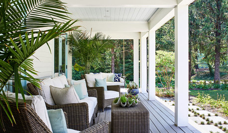
STANDARD MEASUREMENTSThe Right Dimensions for Your Porch
Depth, width, proportion and detailing all contribute to the comfort and functionality of this transitional space
Full Story
WORKING WITH PROS3 Reasons You Might Want a Designer's Help
See how a designer can turn your decorating and remodeling visions into reality, and how to collaborate best for a positive experience
Full Story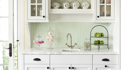
KITCHEN DESIGNModernize Your Old Kitchen Without Remodeling
Keep the charm but lose the outdated feel, and gain functionality, with these tricks for helping your older kitchen fit modern times
Full Story
GARDENING AND LANDSCAPINGRaise Backyard Chickens Without Ruffling Neighbors' Feathers
Before you build a coop in the backyard, follow these strategies to help keep your neighbors from squawking
Full Story
DECORATING GUIDESHow to Go Geometric Without Going Overboard
If your home decorating isn’t adding up, consider angles and shapes to help solve the equation
Full Story
LANDSCAPE DESIGNWhat the Heck Is a Ha-Ha, and How Can It Help Your Garden?
Take cues from a historical garden feature to create security and borders without compromising a view
Full Story
REMODELING GUIDESWiden Your Space Options With a Dormer Window
Small wonders: Bump out your upper floor with a doghouse, shed or eyebrow dormer — we give you the benefits and budget tips
Full Story
LIFE6 Ways to Cool Off Without Air Conditioning
These methods can reduce temperatures in the home and save on energy bills
Full Story

worthy