


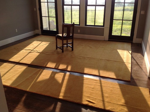
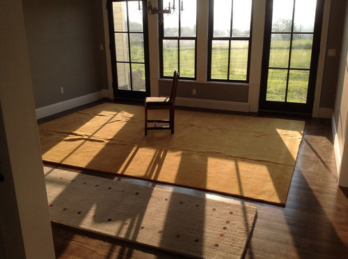
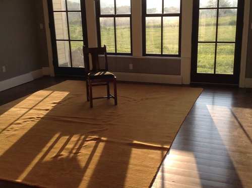
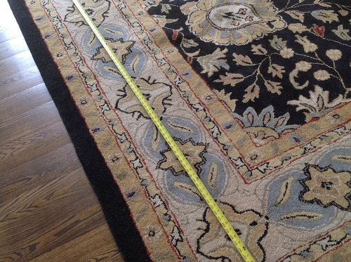
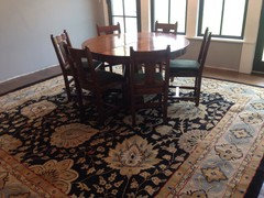
So I bought 7 rugs...now I need your opinions please.
missymoo12
8 years ago
Featured Answer
Sort by:Oldest
Comments (32)
Related Discussions
Am I insane? Seriously, I need your opinion. (Kinda long)
Comments (11)Calistoga, I know I wont get a full coverage in only a year I just want it to look less like an empty lot and more like a recently planted semi-cared-for area. Empty spaces will get filled in (mulched!) with fallen leaves. If I start seeds now (I actually do have some creeping thyme and rosemary), IÂll have 4-5 months to grow them out in flats. Isn't that enough time? Or are you saying I should be planting outside from flats right NOW? That would be difficult, because the "soil" stays pickaxe hard until it starts raining regularly. Cagary, I briefly looked into hydro-seeding, but it would be quite expensive. A homeowner a few miles up my road did it last year and I didnÂt really like the effect it looked vaguely industrial/unnatural somehow. Besides, I love to garden, so that would take all my fun away! (And believe me, until we get to interior decorating, this will be the ONLY fun part of this project for me.) SusanC, indeed, when I realized how overwhelming the eucs were, I started to do research on eucalyptus understory. (The Australian National Botanic Gardens website is incredible!) I found a lot of promising plants, but most of the seeds were really hard to find, and I donÂt know how successful they would really be. If we were going to stay in this house for longer, IÂd be more willing to experiment, but at this point I think it's safer to go for plants IÂve seen growing well in the area. BTW, thanks so much for the referral to the Winter Sowing forum! I didnÂt even know it existed. IÂve been gardening my whole life, but grew up in NYC, so IÂve never had the seasons (or the space) to try winter sowing before. I'm inspired! Thanks to for taking the time to reply you guys; I really appreciate it!...See MoreI am RIPPED -- need your opinion on how to handle it.
Comments (16)I always add a little onto yardage when I purchase it to compensate for unraveling, distortion, poor cuts...but better fabric stores should do this automatically. Have you measured your material to see if they may have added some extra to compensate for a less than aesthetic margin ? I am fairly new to quilting, but not seamstessing, and the lay of the grain can be very important when making clothing. We were taught in sewing classes to 'square up' a new piece of material to establish the grain before cutting by ripping a clean edge. You may be very surprised at what you find. I was really shocked the first time I bought some cottons at "the" box store. The design ran uphill and upon closer checking, it was because the grain did too. What this causes is the material to stretch in ways you may find affects the fit of a garment, or how a seam lays. If the edge of the material is distorted, pressing usually restores it to a decent block. ( Not that you should be expected to repair newly purchased cloth.) No, I don't think most stores rip their goods anymore, but I have purchased more than a few yards of cloth where they'd have gotten a lot closer to a clean cut if they had. One piece I bought once was four inches off square, when it was carelessly scissor cut. So, I guess it probably would not have bothered me to have it ripped instead. Of course, not all fabrics can be ripped, and common sense should prevail. I think the management should appreciate your opinion. I own a business and whether I want to hear how a customer feels about a certain practise, I know I need to hear it....See MoreI need opinions please, please, please!
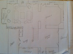
Comments (10)All right, I'll answer as a buyer. Assuming all else in the house was what we wanted and needed, I would buy it, with a couple changes. I would have the DR right there by the kitchen, as you do, and it would be elegant DR. I would have a couple wingback chairs at that DR table because if I were going to sit in there and watch TV (that is a TV at the head of the table?) I'd want to be in a comfy chair. The only thing is that in order to please me, the kitchen would have to look fairly fabulous since it is right there by my living space. The kitchen seems a little light on cabinets and counter space. Just two straight lines... can you do anything to make it very interesting? As I said, I'm different. In our last house we had the family room/kitchen as one big room. We remodeled the kitchen to be droolingly gorgeous and put our cherry DR set in the family room with two big wingback chairs, kicked all living room furniture out. Had the TV in there. It was the room in which we spent all our time and was a great room for parties as well. Warm, inviting, friendly. So, in a nutshell, if I liked the way everything looked, I like the idea, and I'd buy it. BUT, now, to be realistic, when we went to sell that house (and it was just over a year ago so was in the days of real estate decline), despite its gorgeous kitchen and the fact that the decorator had assured us that women would be begging their husbands to buy them the house because of it... nobody wanted it. We finally ended up selling it at a big loss to an investor. So, others are right when they say there are no guarantees, and there is no accounting for or being assured of other peoples' taste....See MoreI need your opinion, please!
Comments (11)Have you checked Craigslist in your area? WouldnâÂÂt be hard to paint a couple of nightstands. Could even change out the hardware if you got them cheaply on CL. You might also consider adding a piece of dark granite or marble on the top, to give them more visual heft and balance for the massive look of the other pieces. Honestly, tho, I would hesitate to have matching nightstands in white, and the rest of the furniture in the wood tones. I think having two of them that match will make it seem like you are using a set of nightstands from an old bedroom set, rather than buying new ones. Have you considered doing two different nightstands? Perhaps a white painted cabinet on one side, and a mirrored piece on the other, or a round skirted table. or a small secretary desk....See More
missymoo12
8 years agomissymoo12
8 years agomissymoo12
8 years ago
jakabedy
8 years agomissymoo12
8 years agomissymoo12
8 years agomissymoo12
8 years agomissymoo12
8 years agomissymoo12
8 years ago
MtnRdRedux
8 years ago
theclose
8 years agolascatx
8 years agomissymoo12
8 years agomissymoo12
8 years ago
Related Stories
LIGHTINGSo You Bought a Cave: 7 Ways to Open Your Home to Light
Make the most of the natural light your house does have — and learn to appreciate some shadows, too
Full Story
DECORATING GUIDESNo Neutral Ground? Why the Color Camps Are So Opinionated
Can't we all just get along when it comes to color versus neutrals?
Full Story
FUN HOUZZEverything I Need to Know About Decorating I Learned from Downton Abbey
Mind your manors with these 10 decorating tips from the PBS series, returning on January 5
Full Story
REMODELING GUIDESSo You Want to Build: 7 Steps to Creating a New Home
Get the house you envision — and even enjoy the process — by following this architect's guide to building a new home
Full Story
KITCHEN DESIGNSo Over Stainless in the Kitchen? 14 Reasons to Give In to Color
Colorful kitchen appliances are popular again, and now you've got more choices than ever. Which would you choose?
Full Story
HOME OFFICESQuiet, Please! How to Cut Noise Pollution at Home
Leaf blowers, trucks or noisy neighbors driving you berserk? These sound-reduction strategies can help you hush things up
Full Story
BATHROOM DESIGNUpload of the Day: A Mini Fridge in the Master Bathroom? Yes, Please!
Talk about convenience. Better yet, get it yourself after being inspired by this Texas bath
Full Story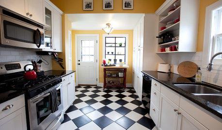
FLOORSChecks, Please! 13 Choices for Checkered Floors
Checkerboard Patterns Go From Casual to Ritzy, From Marble to Grass
Full Story
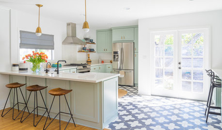
KITCHEN DESIGNTrending Now: 25 Kitchen Photos Houzzers Can’t Get Enough Of
Use the kitchens that have been added to the most ideabooks in the last few months to inspire your dream project
Full Story


lascatx