


Advice on paint color for north facing room
brenda_md
8 years ago
Featured Answer
Sort by:Oldest
Comments (42)

tibbrix
8 years ago
brenda_md
8 years agoRelated Discussions
Looking for paint advice for north facing dining room...
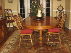
Comments (4)I wouldnt paint your oak trim. It looks good the way it is, and its maintenance free. Also no paints with yellowy tones. That will not look good with your oak floors and trim. The rug you have is not large enough, and is actually the wrong color for the paint you have. I also do not like the blue up on the tray ceiling. Your room would be brighter if the ceiling and was all white. A lighter shade of blue, or aqua, or even a light green would brighten the room up considerably. I do like your wall art, but, I dont think it is right for your room. Once you have finished painting, look for a nice painting with some color in it. You could also use some accessories and some draperies, even if they are only side panels, that you leave open way to the side. The room, has a very bare feeling right now. It needs to look homey and comfortable to be in....See MoreSOS. paint color dark north facing room
Comments (1)Did you paint and what did you choose? I am in the same predicament!...See MoreNeed help with neutral paint color for North and South facing room.
Comments (3)I would consider painting the two rooms two different shades of white, yes even though they are connected. Even if you paint both rooms the same color they are going to look like two different colors of paint anyway because of the difference in light. So why not just pick two different shades that actually look good in each space? Who knows, because of the difference in light, they might end up looking more like the same color next to each other than actually using only one color. I just painted my home in all neutrals using Farrow and Ball. (If you don't want to pay that much for the paint, you can have it color matched in Benjamin Moore.) Their neutral colors are stunning and fewer to choose from, which actually makes it easier to select a great color. They break the colors up into 6 different neutral groupings. Check it out. I swear I don't work for them. I'm simply enchanted with the colors of my home!...See Moreneutral paint color help-north&south facing rooms
Comments (8)First make sure all your lighting is the same I like LED4000K but you can do 3500K then choose wall color understanding that everything in the space affects wall color so post pics of the spaces after you get the lighting done....See Moretibbrix
8 years agoUser
8 years agobrenda_md
8 years ago
anele_gw
8 years agovioletwest
8 years agoanele_gw
8 years agotibbrix
8 years agolast modified: 8 years ago
prettybluehouse
8 years agolast modified: 8 years agoanele_gw
8 years agotibbrix
8 years agoanele_gw
8 years agotibbrix
8 years agobrenda_md
8 years agoanele_gw
8 years ago
Bonnie
8 years agotibbrix
8 years ago
gramarows
8 years ago
Bunny
8 years agoleemiller
8 years agotibbrix
8 years agolast modified: 8 years ago
BirchPoint
8 years agobrenda_md
8 years agotibbrix
8 years agomassagerocks
8 years ago
Honu3421
8 years agolast modified: 8 years agobrenda_md
8 years agolast modified: 8 years ago
Dorothy Harris
7 years agobrenda_md
7 years agolast modified: 7 years agodecormyhomepls
7 years ago
divecaribbean
6 years agolast modified: 6 years ago
Marta Juchniewicz
6 years agoanele_gw
6 years agoSchmidt Heather
4 years agoSchmidt Heather
4 years agoSchmidt Heather
4 years agoSchmidt Heather
4 years ago
Terri Lewis
3 years agoTerri Lewis
3 years agobrendarai
3 months ago


Related Stories
MORE ROOMS8 Colors for North-Facing Rooms
Have a room with little sunlight? One of these vibrant, saturated paint colors will warm it up
Full Story
REMODELING GUIDESContractor Tips: Advice for Laundry Room Design
Thinking ahead when installing or moving a washer and dryer can prevent frustration and damage down the road
Full Story
DECORATING GUIDES10 Design Tips Learned From the Worst Advice Ever
If these Houzzers’ tales don’t bolster the courage of your design convictions, nothing will
Full Story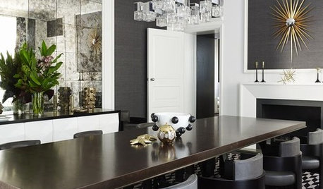
TASTEMAKERSBook to Know: Design Advice in Greg Natale’s ‘The Tailored Interior’
The interior designer shares the 9 steps he uses to create cohesive, pleasing rooms
Full Story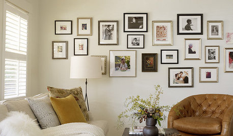
LIFEEdit Your Photo Collection and Display It Best — a Designer's Advice
Learn why formal shots may make better album fodder, unexpected display spaces are sometimes spot-on and much more
Full Story
LIFEGet the Family to Pitch In: A Mom’s Advice on Chores
Foster teamwork and a sense of ownership about housekeeping to lighten your load and even boost togetherness
Full Story
BATHROOM DESIGNDreaming of a Spa Tub at Home? Read This Pro Advice First
Before you float away on visions of jets and bubbles and the steamiest water around, consider these very real spa tub issues
Full Story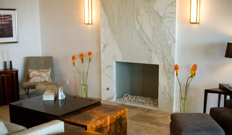
FIREPLACES12 Hot Ideas for Fireplace Facing
From traditional brick to industrial steel, there’s a fireplace cladding here to light up your design
Full Story
MORE ROOMS8 Colors for South-Facing Rooms
Choose one of these soft, cool colors to tone down the sun shining in
Full Story
DECORATING GUIDESFace Time: Creative Ideas for Decorating With Portraits
Put your rooms head and shoulders above the rest with portraits styled in unexpected ways
Full Story


Lori A. Sawaya