


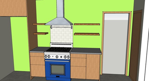
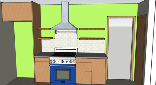
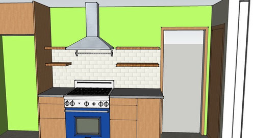
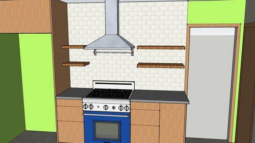
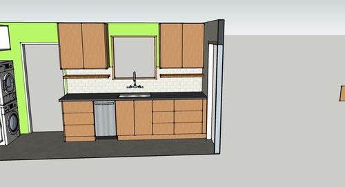
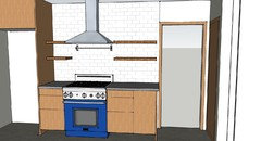
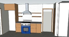
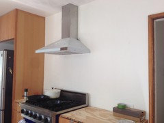
Backsplash with floating shelves?
amg765
9 years ago
last modified: 9 years ago

Featured Answer
Sort by:Oldest
Comments (47)
Related Discussions
Backsplash? No backsplash? What kind of backsplash?
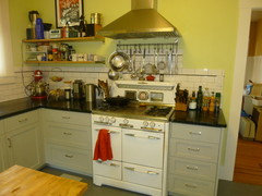
Comments (25)didn't have time to read all the answers. I have no backsplash and have never regretted it...been over 6 yrs. It is painted with BM matte...which has ceramic in it. It is as beautiful now as it was when first painted. I love the fact that I can showcase other things ...art etc in my kitchen and no competition. Also if I ever want to change it is as quick as a paint brush...expense is minimal..paint only ! All in all I think it is serene as you point out . Here is one pick. Since I have a lot of high heat cooking in my kitchen..built in deep fat fryer as well as gas cook top I can definitely speak to the longevity of paint only. c ( more at this album )...See MoreShelves or no? Need to decide before backsplash
Comments (22)Sophie - a cabinet was originally drawn but as usual I second guessed it. My dream kitchen is to have no upper cabinets at all but that’s not practical for us. We are both tall and I need the storage. So with this big window I thought to eliminate the cabinet on the left to create a nice open feeling. The cabinet would be fairly small anyway. My cabinets are custom so I certainly could get another made if I chose. CP - thanks for the mock-up. I don’t think I like them sideways like that. Thanks for the feedback on having them go the other way. I appreciate your opinion!...See MoreBacksplash design with floating shelves
Comments (7)I would probably lower both sets of shelves. As is, the top shelf is higher than the over-the-fridge cabinet (which would make it at a completely inaccessible height for me)....See MoreTo backsplash, or not to backsplash - that is the question...
Comments (4)From the glimpse you've given us, you have a really nice kitchen. Your countertop is a "busy" pattern. Really like the painted wall (in lieu of high backsplash) you have with it -- that wall color is as perfect as it gets. Are you changing the countertop; if not, definitely would not add a backsplash. If your fridge is running well, would NOT replace it for a smaller (counter dept) one, the full opening of which could be impeded by the countertops, making it difficult or impossible to remove the veggie drawers for a thorough cleaning as needed. Would NOT b ox in the fridge -- you'd need to lose cabinet space to do that. Instead, invest in a few more magnets and fully embrace having the sides exposed. Dollar Tree sells some wide magnetic clamps that would let you hold a tablet for an ongoing grocery list, etc. Similar to this but black ... and a lot less expensive. The work and last every bit as well. I've had to glue the magnet back in to both the more expensive one and a less expensive one after dropping them. Still work well....See More
ediblekitchen
9 years ago
funkycamper
9 years ago
amg765
9 years agolast modified: 9 years agoamg765
9 years agolast modified: 9 years agoamg765
9 years agoamg765
9 years agosjhockeyfan325
9 years agoamg765
9 years agolast modified: 9 years ago PRO
PROMDLN
9 years agoamg765
8 years agoamg765
8 years agoamg765
8 years agolast modified: 8 years agoweaver2
8 years agolast modified: 8 years ago


Related Stories
MOST POPULAR8 Beautiful Ideas for Floating Shelves
Get clean-lined storage and display on walls, over windows and in nooks using versatile floating shelving
Full Story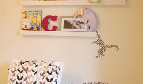
SHELVESFloating Shelves: Minimal Design, Maximum Flexibility
Spare your walls with a shelf that holds an ever-changing collection of the stuff you love
Full Story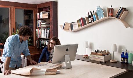
STORAGEBookcases and Floating Shelves That Break the Mold
Linear horizontal shelves have their place, but you can also get creative. Here are some ideas to spark inspiration
Full Story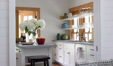
KITCHEN DESIGNIdea of the Week: Float Shelves in Front of Windows
Let in Light — and Let Guests Easily Find the Wine Glasses
Full Story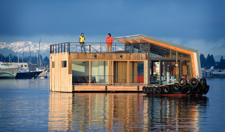
HOUZZ TOURSHouzz Tour: Big Bay Views Buoy a Seattle Floating Home
Two glass sides bring spectacular scenes into this newly industrial modern home on the water
Full Story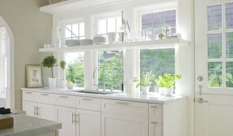
KITCHEN DESIGNReaders' Choice: The Top Kitchens of 2010
The Year's Most Popular Kitchens Had White Cabinets, Black Accents, Floating Shelves or Uber-Organized Pantries
Full Story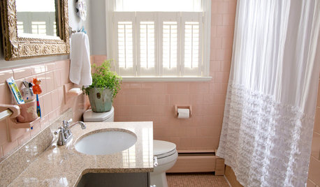
BATHROOM DESIGNHouzz Call: Have a Beautiful Small Bathroom? We Want to See It!
Corner sinks, floating vanities and tiny shelves — show us how you’ve made the most of a compact bathroom
Full Story
SMALL SPACESLift Off! Floating Features for Small Spaces
Take Furniture Off the Floor to Maximize a Home's Available Space
Full Story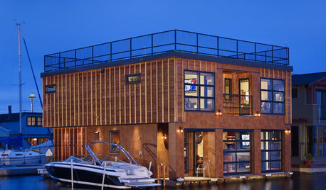
HOUZZ TOURSHouzz Tour: Industrial Floating Home in Seattle
A Seattle couple downsizes to a dreamy floating house on Lake Union, with a putting green, local artwork and an industrial aesthetic
Full Story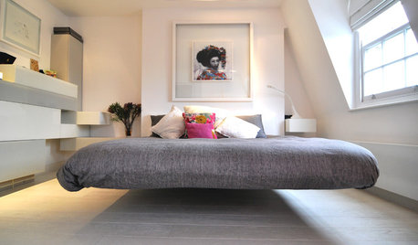
BEDROOMSThe Floating Bed: Sleeping on Air
Remake your bedroom with the minimalist look of a bed that seems to float off the floor
Full Story

User