SHOP PRODUCTS
Houzz Logo Print
hzdeleted_22590553

BM Kendall Charcoal - what color undertone?

User
9 years ago

Can anyone please solve this mystery for me. Is it brown? Green?

Thanks!

Comments (39)

  • caminnc
    9 years ago

    I see green.


  • Annie Deighnaugh
    9 years ago

    Maybe a hint of green, but it is pretty gray.


    Sherwood · More Info


  • Bunny
    9 years ago

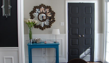
    It's a beautiful gray. I don't even notice an undertone and it looks fabulous with that door.

  • jlc712
    9 years ago

    I'm not a huge fan of the grays that are everywhere right now. But, I really like this one. It looks richer, if that makes sense. I think it leans a teeny bit green/brown, rather than the blue you see in a lot of grays.

    What are you thinking of using it for?

  • User
    Original Author
    9 years ago
    last modified: 9 years ago

    I'm finally starting to like grays a bit more, but I really just think it's all in how they're used. I've been wanting to use this color somewhere for quite a while now. Sometimes I think I see a little green. I even thought it had a red undertone at one point, but maybe that was brown I was really seeing.

    I'm going to repaint the laundry room next week and I didn't want to make a big project out of analyzing paint colors, but then I dug out the decks and my samples...

    The cabinets, drying rack, & washer and dryer are all white. The room is off to the side before you come into the kitchen area. Small - 8'x6.5'. No window, but the room gets light from the side door window. The floor is splotchy vinyl and dictates a lot. There are various shades of pinky beige, blue grays, browns grays, and taupes (though I think taupes are technically a mix of brown and gray?). I want to go more dramatic for color because I like the contrast with the white and I think pulling a richer color from the flooring will help make it look better. I've narrowed down to Kendall Charcoal or Chelsea Gray. The color in the room is currently BM Northampton Putty. I like the color, but greeny/brown doesn't relate to the flooring.

    I think I'm going to use the KC. It's certainly has a lot more gray than the current color, and I really like the richness.

    (Has Houzz been acting buggy/slow for anyone else?)


  • busybee3
    9 years ago

    I haven't seen this color in person, but I don't see green in the color... I would guess there might be a slight blue undertone...

  • the_foxes_pad
    9 years ago

    I love this grey! I painted some chairs in it & they were perfect.

  • User
    Original Author
    9 years ago

    Lori - Hi! I was hoping you'd pop in here and give your expertise.

    "Which is why it's so important to have and use color notations at benchmarks..."

    Feeling stupid, but...??? Only pros have access to that right?

  • PRO
    Lori A. Sawaya
    9 years ago

    Don't even feel stupid.

    Some paint brands do share Munsell color notations right in the index of their fandeck. Dunn-Edwards is one example.

    Also, The Master Palette available at The Home Depot uses a color system with notations too. PPG just bought out Glidden. So, I don't know what brand of base paint the Home Depot is mixing The Master Palette colors in these days. Doesn't matter because the notations still stand.

    Every brand should provide a hue/value/chroma color notation, Munsell or otherwise, but they don't.

    And, yes, I can work up a notation for 95% of the paint colors out there. But, again, no one should have to do that. It should be on the back of every paint chip.

    Figure if I talk about it enough, brands might start paying attention and choose to follow the lead of Dunn-Edwards' and The Master Palette and provide notations.

    They have their reasons for not wanting to do it, but they need to get over it and do what's right for the consumer - and that's divulge their color system and provide notations.

  • avamom2012
    9 years ago

    Just popping in to show a photo from HOUSE TWEAKING BLOG of BM Kendall Charcoal. I do like this color, yes.


    HOUSE TWEAKING BLOG

  • User
    Original Author
    9 years ago
    last modified: 9 years ago

    Ah, ok. Thanks for the explanation Lori! It would be definitely nice to have notations for all the lines.

    Avamom - That's one of the photos where I'm seeing the green.

    Here's another pretty one. Love the white with it. I still think I'm just going to go for it.


    dear lillie kendall charcoal dining room

  • jlc712
    9 years ago

    It sounds like it would be really nice in your laundry room. I say go for it. It looks great with white and wood tones!

  • robo (z6a)
    9 years ago

    I was looking for another color online and ran across the Encycolorpedia - it is an interesting resource (it identifies yellow undertones). It also gives somewhat closish matches from other paint lines.

  • PRO
    Lori A. Sawaya
    9 years ago
    last modified: 9 years ago

    I don't consider encycolorpedia a color resource.

    To the average person, it looks like terrific stuff. If I didn't know better I'd think so too!

    But here's what most people don't know.

    It's more like a regurgitation of color information, arguably misinformation. Because - last time I asked - they don't control where their color data comes from. Sometimes they download info directly from manufacturers (each measures to their own standards). Sometimes they just copy RGB values from other websites (an eyedropper tool is not a reliable color measurement tool). And that's what they use to do conversions to various color spaces/values they list.

    Consistency is super crucial for color measurement, color space conversion, etc. Garbage in = garbage out applies in this case really hard.

    That's why encycolorpedia is a lot of numbers that don't mean anything, IMO.

    However, the encycolorpedia conversation is pretty much the same as the viewing paint swatches online conversation or the malarkey that another human being can declare a color's "undertones" and it be deemed factual.

    Nobody wants to hear and process the truth which is it's all crap.

    Signed,

    funcolors

    The bringer of hard truths about color that often are not fun.

  • robo (z6a)
    9 years ago
    last modified: 9 years ago

    It's nice that in this particular case they correctly identified the yellow undertone :) How fortunate to have so many resources such as your expertise and many others out there! At the end of the day I guess it's all about how the color looks in someone's particular home and lighting situation which I understand can vary greatly regardless of where we start.

  • PRO
    Lori A. Sawaya
    9 years ago

    Robo, curious what piece of info you're looking at over there to determine that it has a yellow undertone? TY!

  • robo (z6a)
    9 years ago

    It's the first line of the description: "The hexadecimal color code #686763 is a medium dark shade of yellow."

  • User
    Original Author
    9 years ago

    Hmm.. Not disagreeing here, but I'm trying to wrap my head around why someone would take that much time to put together a website based off info that wasn't accurate. I mean there's a heck of a lot of stuff stuff on those pages!

    Out of curiosity, does Chelsea Gray have a yellow undertone? I only see brown with that one.

  • caminnc
    9 years ago

    But yellow and blue = green, plus a little red = greenish brown undertones. But what do I know :-))


  • PRO
    Lori A. Sawaya
    9 years ago
    last modified: 9 years ago

    Thanks, Robo. :)

    That's the HTML color description - meaning in the RGB digital color space you have to mix three color channels of light (red, green and blue) to mimic in real life colors. The red, green and blue values for a mimicked, digital, on-your-monitor-version of Kendall Charcoal results in a HTML color that is recognized as a medium dark shade of yellow -- again, on your illuminated monitor. Has nothing to do with what it looks like analog, in real life.

    If you scroll down you'll see that encycolorpedia also lists a Munsell notation as 10GY 4/2. Which means according to encycolorpedia Kendall Charcoal belongs all the way over to the end of the Green-Yellow hue family on the cusp of Green.

    When we eyeball the Kendall Charcoal chip, some of us sense a little browness, some a little greeness, some of us see both. Which indicates that the notation placing Kendall Charcoal at 6.26 Y is pretty spot-on. Emphasizing the encycolorpedia Munsell notation is way off.

    It's off because garbage in = garbage out. There's probably a simple algorithm they use that spits out all those numbers. A lot of noise, little effort, even less substance.

    As far as why someone would put so much time and effort into perpetuating crap color information, people have been making up all kinds of crazy stuff about how color works forever.

    In my opinion sometimes it's because they really believe they are right - or close enough. So, even tho it's a half-baked concept with zero references or provenance, in their book close enough is good enough to publish and share. Good intentions but blinded by ego.

    Sometimes it's a Snake Oil salesman kinda situation. Everybody loves color because it's pretty and it's fun. Which mans it can be a lucrative business. Many marketers have figured out that understanding color is a lot of freaking work. But the color-loving general public wants something that makes it fast and easy. So, they create methods and systems that are just that - fast and easy.

    Correct and accurate isn't a consideration. It just has to look legit enough and maybe even work up to a certain point in order to get people to buy into it. When challenged with hard questions or examples of voids or failures in their method/system, they have crafted strategies at the ready to redirect or confuse the people asking questions enabling them to avoid answering.

    And it keeps happening because the pool of people with the skill sets needed to call out the crap methods and systems is very small. The marketers know the vast majority of the population doesn't know any better when it comes to color so the odds are totally in their favor.

    The pool is small PLUS no one likes to be the Negative Nelly bad guy to point fingers and call people out on their sh!t info. I pretty much only point stuff out here on the forum because it is provocative and in certain circles it will start conversations that can get involved and contentious. And who has time for that? As a rule, I don't ever point out anything as being incorrect unless I can thoroughly back it up with legit references.

  • westleyandbuttercup
    9 years ago

    We used Kendall Charcoal for our home's exterior and I love it! I love it so much I seriously contemplated painting our master bedroom the same color. :) I think it will look wonderful in your laundry room with all the white.

  • PRO
    Lori A. Sawaya
    9 years ago

    Out of curiosity, does Chelsea Gray have a yellow undertone? I only see brown with that one.

    Chelsea is in the yellow hue family too. In order to determine a color's undertone, or if it even has one, you have to spread a sample of the color at different thicknesses on a white or gray background. The undertone, if there is any, is revealed in the thinnest areas. Undertones are truly a moot point since architectural coatings are spread as an even film with an average film thickness of 1.5 to 2.0 mils.


  • User
    Original Author
    9 years ago

    Lori - Thanks for the info and all the details. I figured then it was in the yellow family too. I will say this whole process of picking a new color had me seriously considering changing out the flooring, but then I'd have to change out the small counter/sink and that's beyond my DIY skills. Plus, I'd have to make a decision on flooring. And, after all, this was supposed to be a simple 'repaint the room'. Funny how that can happen!

  • lalalalane
    9 years ago
    last modified: 9 years ago

    I painted my stairs this color and it does seem a bit more bluish than I expected (in person) but I am assuming that has to do with the adjacent wall color & lighting -- I do love it!

  • PRO
    Lori A. Sawaya
    9 years ago

    The bluishness could absolutely be because of context and lighting.

    Could be you - could be just they way your eyeballs process color. Again, I'll reference the infamous #thedress incident a few weeks back where some saw gold/white while others saw black/blue.

    Could be how the color was mixed. The slightest difference in base or colorant load can shift a color off the original target chip/formula.

    But this is a good opportunity to highlight why color notations/profiles are so handy. They tell us everything we need to know about the original color and what it looks like when measured according to a controlled, consistent standard, and then plotted in to a logical, organized color space. In a word, benchmark. A consistent, reliable benchmark against which we can compare visual experiences and samples.


  • bignogginsfarm
    6 years ago
    last modified: 6 years ago

    O.M.G. I have, for nearly 15 years of painting projects, always tried to ask about the colors I see in the swatch since the swatches are deceptive. Sometimes they pull out the formula, sometimes they "help", but most of the time I sit in the store for hours, comparing chips and buying loads of samples. I am not a professional, but knew there had to be a way to assess a color to better understand it, and only now I discover - accidently - this little "colorgraphy" wheel? Why on earth is this not available to any and all customers? Or why wouldn't the swatch have this info on the back?? Or why wouldn't the employees at paint stores pull this out when you have a customer analyzing formulas? My head is exploding. I am so happy to know this. I just got my house painted Kendall Charcoal and now I know why the color worked for me, unlike the others I trialed...

  • bignogginsfarm
    6 years ago

    P.S. would love to understand BM gray cashmere is all about. It's my favorite wall color and works with everything...sometimes it's gray, sometimes green, usually sparrow egg blue. I have played with 50% formula too which works when rooms don't get enough light.

  • Melissa Kroger
    6 years ago

    My island and fireplace are both painted Kendall charcoal. I do not see any green undertones.


  • PRO
    Lori A. Sawaya
    6 years ago

    :)

    The reason hue/value/chroma color notations are not on the back of every paint chip is because the paint manufacturers are paint experts, they're not color experts. People who work in a paint store have a very basic understanding of how color works - oftentimes even that basic know-how is peppered with misinformation.

    And many believe that whole undertones b.s. - it's wrong and it's not how color works.

    Legitimate, professional color systems are based on the function of the human vision system - the psychological dimensions of color which are hue, value, and chroma.

    That's how we see color and that's the right way to speak to color. Thru the science of colorimetry, we can QUANTIFY those psychological dimensions. Once they are quantified they are then called psychophysical dimensions of color.

    It's all very orderly and logical. And that's why the phrase "the art AND science of color" is important.

  • bignogginsfarm
    6 years ago

    So awesome. Thank you. I just LOVE this stuff. Oh but the CUBIC YARDS of paint that I have wasted based on poor information when my eyes knew better. We could only hope there are people behind the paint counter with a little more than kindergarten color theory experience. Art and science, indeed. So who or how is the colorimetry determined?

  • PRO
    Lori A. Sawaya
    6 years ago

    So who or how is the colorimetry determined?

    We use a special device to measure the spectral power of the color - think of it like 'color DNA':

    · - wavelength determines HUE

    · - wave amplitude determines a color’s VALUE

    · - wave purity determines its saturation or CHROMA

    So, undertones vs. hue family. Undertones are subjective - just someone's opinion which means they will be inconsistent and erratic.

    Hue family is objective and consistent because it's derived directly from the color DNA which is captured per international standards for color measurement.

    That's how color works and it's where/how color comes from across every industry you can name - paint, plastics, textiles, etc.

  • PRO
    Lori A. Sawaya
    6 years ago

    would love to understand BM gray cashmere

    Ok. Will post in a minute...

  • PRO
    Lori A. Sawaya
    6 years ago

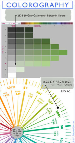
  • bignogginsfarm
    6 years ago
    last modified: 6 years ago

    WOW. I would have guessed that it was more toward blue than green - the color looks like a very light blue. But I guess the kind of blue is due to some yellow, which causes this. Thank you so much for sharing your skills with all of us. I really appreciate it.

  • PRO
    Lori A. Sawaya
    6 years ago
    last modified: 6 years ago

    It helps to understand this: All color wheels, like the one I use, are a slice from the middle of three-dimensional color space like you see in this video of the Munsell color space. Tints, tones, shades, muted, near neutrals - they're all accounted for in a color space as you can see.


    Also important:The definition of overtone is when you sense two colors at the same time.

    It's a compound color experience. The overtone color in the combination is the one that's sensed more intensely compared to the other. Overtone precisely describes compound color experiences by identifying the bossier of the two colors.

    So, now on to your comments about Gray Cashmere...


    WOW. I would have guessed that it was more toward blue than green - the color looks like a very light blue.

    Plotting a color on a color wheel like I did here, illustrates where the color and its entire family "lives" in its color space. Specifically, we can see what hue families it lives next to. Colors that belong to the green-yellow hue family can have yellow or green overtones.

    In the case of Gray Cashmere, we can see by looking at where it's plotted on the color wheel that it 'lives' OVER near the green hue family so we know to expect OVERTONES of greeness - more so than overtones of yellow.

    But Gray Cashmere is also very low in chroma (colorfulness) - it's a grayish color. It's nearer a true neutral gray than it is its saturated green-yellow hue parent. That means it's a near neutral.

    Again, near neutrals don't have a lot of their saturated hue parent chroma, they're grayer. That means they are easily influenced by light and context and as a result, near neutrals like Gray Cashmere can shift in certain qualities of light. Color shift is different from overtones.

    Colors from Gray Cashmere's hue family neighborhood are known to shift and look blue -- but that doesn't mean they belong to the blue hue family.

    It's important to remember that they still belong to the green-yellow hue family. Because when we know what hue family a color belongs to according to its spectral data (its color DNA) we can anticipate, predict, and most importantly explain WHY.

    We can explain WHY a color from the green-yellow hue family has a yellow or a green overtone. We can explain WHY it shifts and looks blue.

    But I guess the kind of blue is due to some yellow, which causes this.

    The colorants in the formula provide zero information about what a color will look like. Because there is more than one way to mix a single color - several combinations of different colorants can result in the same color. That's why the only thing that matters is what the color looks like when it's dry.

  • Debra Hindman
    6 years ago

    I am looking to paint my home exterior in Kendall however I need another color to go with it and having the hardest time...something in a lighter gray...and a door color...leaning toward Navy or Plum. Anyone's thoughts?

  • User
    Original Author
    6 years ago
    last modified: 6 years ago

    It would be best to start a new thread. People will open an old thread and read the top and your comment could get lost. Plus it's an old one.

  • barnettlw
    3 years ago

    The exterior of my home is BM Kendall Charcoal HC-166. Its a deep natural color, verging slightly to the warm side and has a dark green-grey tint according to my searches.

Sponsored
EK Interior Design
Average rating: 5 out of 5 stars5 Reviews
TIMELESS INTERIOR DESIGN FOR ENDLESS MEMORIES