


7 Inky Colors to Use Instead of Black
Is black too stark and dramatic for your taste? Try navy, charcoal, chocolate or another alternative for a deep, moody space with character
tidgboutique
August 11, 2015
Toronto Interior Design Group is a trusted one-stop-shop residential interior design concierge boutique-style firm crafting timeless interiors.
Toronto Interior Design Group is a trusted one-stop-shop residential interior design... More
Want a deep, inky color that brings the high-fashion appeal of black but without the attitude? Try one of these soft and sumptuous alternatives with plenty of personality to suit your mood and your space.
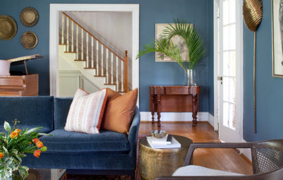
Navy
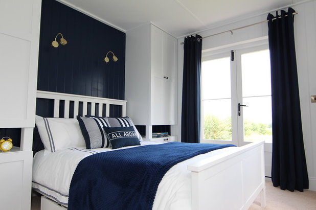
For inky appeal with a nautical twist, classic navy can’t be beat. It makes white look especially bright and fresh. In fact, the two of them together can be all you need. Plus, it balances masculine and feminine appeal, making it a great choice for a bedroom, especially a guestroom.
For inky appeal with a nautical twist, classic navy can’t be beat. It makes white look especially bright and fresh. In fact, the two of them together can be all you need. Plus, it balances masculine and feminine appeal, making it a great choice for a bedroom, especially a guestroom.
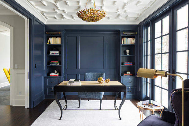
Despite having a large amount of navy surface, this study doesn’t feel dark and depressing the way it might if the walls were black. Rather, it’s studious and sophisticated.
Navy is a great shade for spaces where you need to concentrate, because it’s not too somber and not too stimulating.
Paint: Hale Navy HC-154, Benjamin Moore
See more on decorating with navy
Navy is a great shade for spaces where you need to concentrate, because it’s not too somber and not too stimulating.
Paint: Hale Navy HC-154, Benjamin Moore
See more on decorating with navy
Charcoal and Warm Gray
Gray is the truest “off-black.” It’s essentially black mixed with white. Warm gray, with a slight hint of brown, is an excellent choice for making a bedroom feel peaceful and cozy when black is too stark and dramatic for your taste.
Paint: Rogue Blue, Valspar
Gray is the truest “off-black.” It’s essentially black mixed with white. Warm gray, with a slight hint of brown, is an excellent choice for making a bedroom feel peaceful and cozy when black is too stark and dramatic for your taste.
Paint: Rogue Blue, Valspar
Warm grays can help make a modern space feel more inviting, even when mostly hard materials are used. They mix well with nearly any hue, but especially warm metal tones and soft shades like yellow and peach.
See more on decorating with warm gray
See more on decorating with warm gray
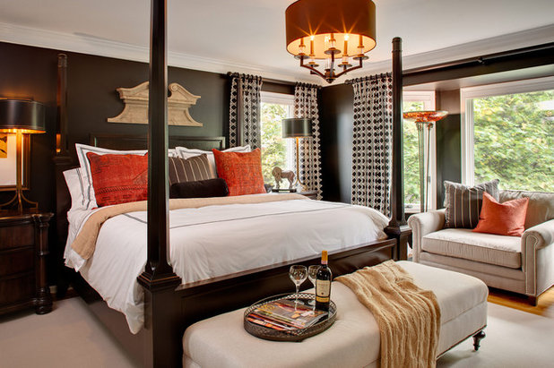
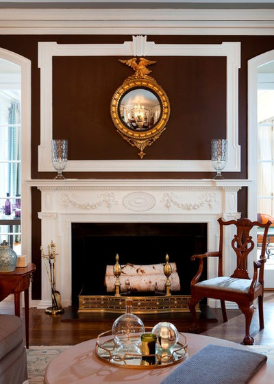
Chocolate
Deep chocolatey brown has been a little off the radar in the modern gray-obsessed world, but it’s more than possible to make this classic shade work for traditional or modern spaces. It pairs well with espresso woods, allowing the sense of warmth to carry through the entire space, and it helps tone down wild shades like orange.
Paint: Beluga, Behr
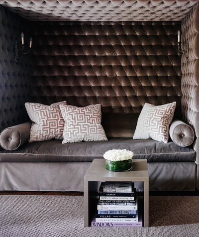
Chocolate also works quite well on dramatically textured surfaces like velvet or tufting, which keep it looking modern and elegant. Mix it with a little warm gray for contrast and you’ve got the look of a high-end boutique or cafe.
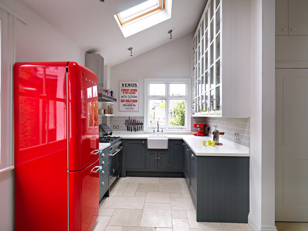
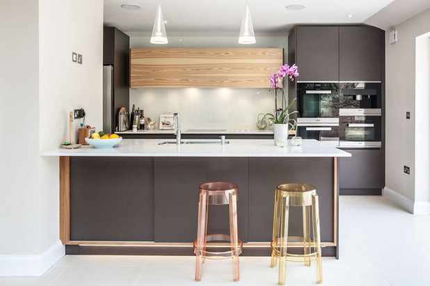
Cool Gray
In kitchens and bathrooms, a cool gray with slightly blue and green undertones is a smart choice because it carries a sense of cleanness. It still works well with hot colors like vivid red, and it suits the glossy finishes typically found on appliances and fixtures. That it is less stark than black also helps the space feel a little more open, especially when used just on lower cabinets to anchor the space.
Base cabinet paint: Mercury, by Fired Earth
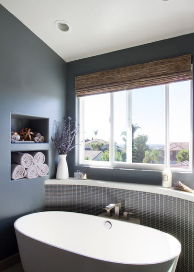
This bathroom feels calm and spa-like with the mid-dark cool gray. Look for a cool gray with hints of lavender or aqua to give an extra sense of freshness to white fixtures, similar to the effect of navy but with much less undertone, for an even more “clean and serene” atmosphere.
See how to pick the right gray
See how to pick the right gray
Forest and Emerald
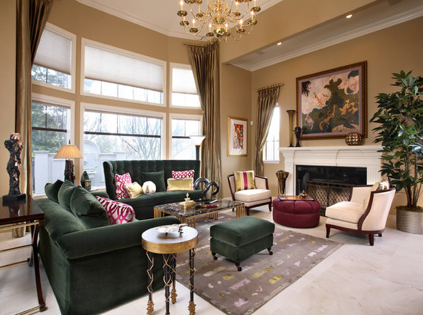
Deep forest or emerald greens are trendy new off-black shades with a classic upscale appeal that can feel traditional or modern depending on what they’re mixed with. Paired with a variety of warm colors and materials, they feel neutral while adding an extra layer of complexity, making them a great upholstery color for must-sit sofas.
Sofas: Swaim; chairs: Lexington; wall paint: Sandy Brown, Benjamin Moore
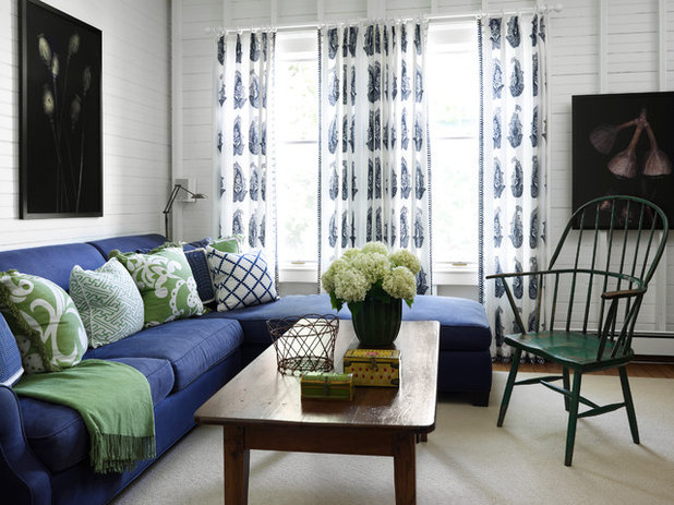
Forest green is especially effective as a worn-in paint treatment for woods. This chair appears almost black at first glance, but the rustic green gives it a much softer, cottage-inspired vibe that looks beautiful even in an urban apartment.
Curtains: Robbins Hill paisley admiral fabric, Ralph Lauren
Curtains: Robbins Hill paisley admiral fabric, Ralph Lauren
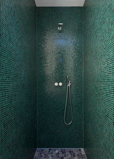
Vivid emerald is a great option for bathrooms. It creates a moody shower space that cocoons you while maintaining that clean and fresh appeal, and not shocking you awake in the morning like a deep black might.
See more on decorating with emerald
See more on decorating with emerald
Burgundy
Possibly the ultimate in stately appeal, burgundy is no shy shade. But despite its red undertones, it can be just as easy, if not easier, to decorate with than true black. By pairing it with white, browns, golden metallics and woods, you can create a moody but welcoming scheme without the extreme contrast of black, for a true curl-up-by-the-fire vibe.
Possibly the ultimate in stately appeal, burgundy is no shy shade. But despite its red undertones, it can be just as easy, if not easier, to decorate with than true black. By pairing it with white, browns, golden metallics and woods, you can create a moody but welcoming scheme without the extreme contrast of black, for a true curl-up-by-the-fire vibe.
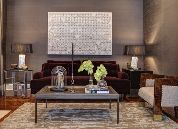
Burgundy may not match with every shade, but if you choose it for upholstery, you won’t need any accent pillows. Pair it with warm neutrals in clean lines and classic materials and you’ve got a timeless look that will outlive color trends.
See more on decorating with burgundy
Coffee table: Bradley Hughes; wallpaper: Sinkiang, Wolf Gordon
See more on decorating with burgundy
Coffee table: Bradley Hughes; wallpaper: Sinkiang, Wolf Gordon
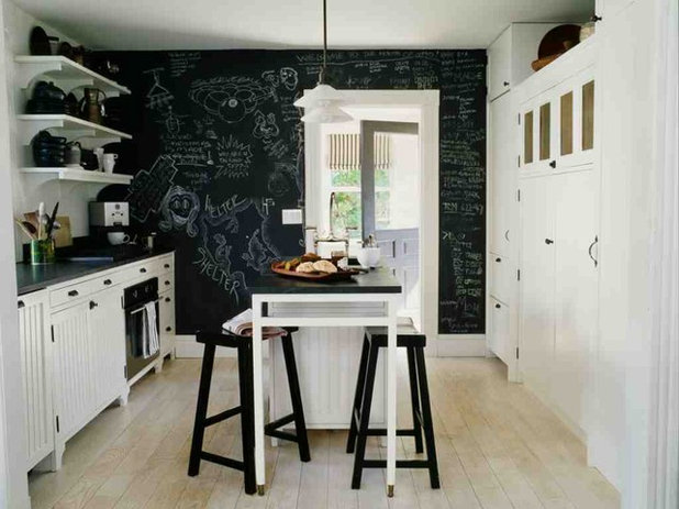
Chalkboard
If you want to soften the look of black without settling for a different shade, try a chalkboard finish. It gives an opportunity to add plenty of white and provides a more touchable, casual feel that cuts black’s seriousness and brings a sense of you back into the space, offering the best of both worlds.
See how to make your own chalkboard paint
More: What Goes With Dark Walls?
What are you working on?
Related Products
Related Stories

Decorating Guides
Design Pros Share 10 Favorite Creamy White Paints
By Becky Harris
These off-white color choices include versatile tones, warming hues and pleasingly soft shades
Full Story

Kitchen Countertops
What Kitchen Countertop Colors Should You Choose?
By tidgboutique
Consider these popular colors and styles to get the look you want — no matter what material you use
Full Story

Colors of the Year
Pantone Picks a Peach for Its 2024 Color of the Year
By Jennifer Ott
See how to use this juicy hue to create calm yet flourishing spaces inside and outside the home
Full Story

Decorating Guides
5 Ways Designers Are Working With Rich Warm Tones Right Now
By Becky Harris
Interior designers describe their strategies for using rich warm colors to create an inviting home
Full Story

Colors of the Year
10 Paint Colors Ready to Take Over in 2024
By Jennifer Ott
Blue is huge, but dark hues and warm tones also find favor among major paint companies’ 2024 Color of the Year picks
Full Story
Decorating Guides
How to Mix Colors and Make It Work
By tidgboutique
Don’t want to confine yourself to neutrals but lack the confidence to embrace colors? Check out this pro advice
Full Story

Events
7 Color Trends for 2024 at Maison & Objet
By Claire Tardy
New harmonies and unexpected pairings at the fall 2023 trade fair set the tone for next year’s interiors
Full Story

Decorating Guides
9 Ways to Layer Warm Neutral Colors for Comfortably Refined Rooms
By Becky Harris
Design pros share advice for building an inviting palette, introducing high contrast and mixing textures
Full Story

Decorating Guides
How to Create a Cohesive Color Flow Throughout Your Home
By Erin Carlyle
Designers share eight techniques for avoiding a choppy feeling in your spaces
Full Story

Decorating Guides
How to Get Your Ceiling Paint Color Right
By tidgboutique
Here’s how to tweak the shade of your ceiling paint to get the effect you want
Full Story
Navy and white in the bedroom has always been a favourite of mine, but forest green and white will win every time. Not that I have either - just plain white walls.
I love this blue wall in our living dining area. It’s a Resene paint that is not overwhelming....