


Barely there font
User
9 years ago
last modified: 9 years ago
Sort by:Oldest
Comments (3)
Related Stories
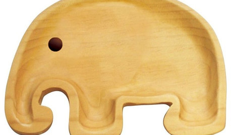
PRODUCT PICKSGuest Picks: Cool Dinnerware for Kids
Games, animals and movies barely scratch the surface of what’s available in kids’ plate designs
Full Story
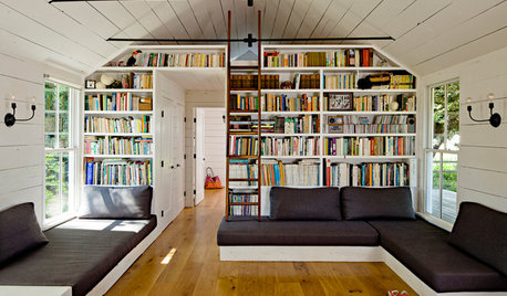
LIFE'Not My Precious Books!' — Pain-Free Ways to Declutter Your Library
Have your books and neatness too, with these ideas for paring down and straightening up a beloved collection
Full Story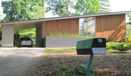
MIDCENTURY STYLEFollow One Man’s Midcentury-Mailbox Dream
An ill-fitting mailbox leads a determined dad on a quest — and possibly to a new business
Full Story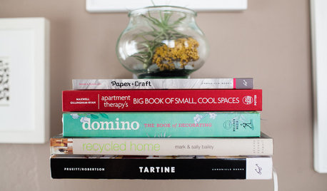
DECORATING GUIDES8 Reasons to Jump Off the DIY Bandwagon
You heard right. Stop beating yourself up for not making stuff yourself, and start seeing the bright side of buying from others
Full Story
ACCESSORIES8 Low-Cost Luxuries With a Big Payoff
Consider the small stuff — like switch plates and throw pillows — to give your home a touch of class
Full Story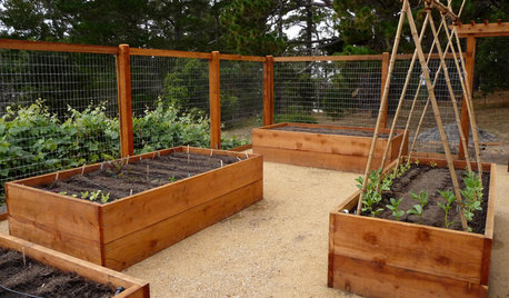
GARDENING GUIDESHow to Install a Drip Irrigation System
Save time and water with a drip watering system in your vegetable garden — a little patience now will pay off later
Full Story
INSIDE HOUZZHow Much Does a Remodel Cost, and How Long Does It Take?
The 2016 Houzz & Home survey asked 120,000 Houzzers about their renovation projects. Here’s what they said
Full Story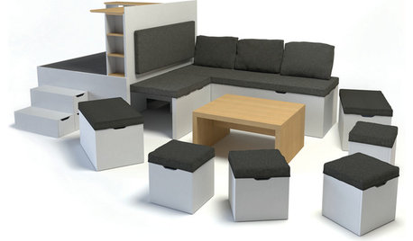
SMALL SPACESHow Portability Can Make You Happier at Home
Downsizing your stuff and going for maximum mobility can actually make your home feel bigger and your life feel fuller
Full Story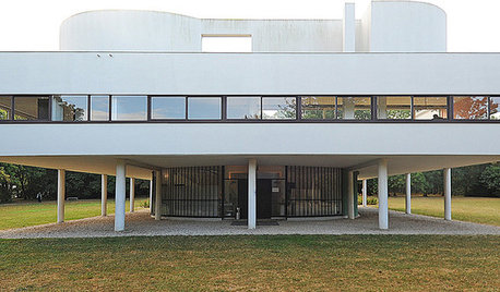
GREAT DESIGNERSDesign Icons: Le Corbusier, Pioneer of Modern Architecture
'Prolific' and 'influential' don't do him justice. Learn about the legendary architect and MoMA's new Le Corbusier exhibition here
Full Story
violetwest
UserOriginal Author
Related Discussions
Firefox 6.02 screwed up my font setting
Q
Is it just me, or is this font hard to read?
Q
New MAC owner with font size problems
Q
Computer question
Q
violetwest