


Paint two uppers? What color, please?
honorbiltkit
13 years ago

Sort by:Oldest
Comments (19)
Related Stories
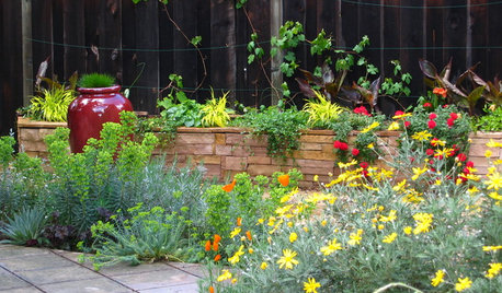
SUMMER GARDENINGHouzz Call: Please Show Us Your Summer Garden!
Share pictures of your home and yard this summer — we’d love to feature them in an upcoming story
Full Story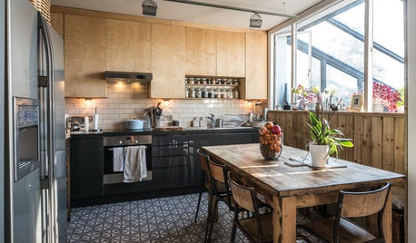
KITCHEN DESIGNA Two-Tone Cabinet Scheme Gives Your Kitchen the Best of Both Worlds
Waffling between paint and stain or dark and light? Here’s how to mix and match colors and materials
Full Story
BATHROOM DESIGNUpload of the Day: A Mini Fridge in the Master Bathroom? Yes, Please!
Talk about convenience. Better yet, get it yourself after being inspired by this Texas bath
Full Story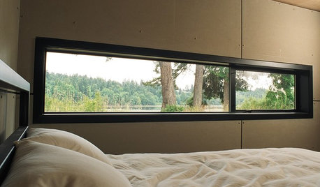
ARCHITECTUREDesign Workshop: Just a Sliver (of Window), Please
Set the right mood, focus a view or highlight architecture with long, narrow windows sited just so on a wall
Full Story
HOUZZ TOURSMy Houzz: Saturated Colors Help a 1920s Fixer-Upper Flourish
Bright paint and cheerful patterns give this Spanish-style Los Angeles home a thriving new personality
Full Story
DECORATING GUIDES10 Bedroom Design Ideas to Please Him and Her
Blend colors and styles to create a harmonious sanctuary for two, using these examples and tips
Full Story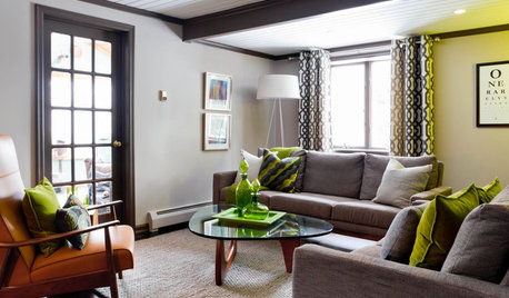
LIVING ROOMSCurtains, Please: See Our Contest Winner's Finished Dream Living Room
Check out the gorgeously designed and furnished new space now that the paint is dry and all the pieces are in place
Full Story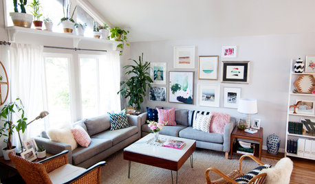
ECLECTIC HOMESMy Houzz: Eclectic Bohemian Style in a 1976 Fixer-Upper
These Southern California homeowners patiently added color, style and function to their outdated home
Full Story
EXTERIOR COLORDynamic Duo: How to Pull Off a Two-Tone Exterior Color Scheme
Why stick to one main house color if you can easily and beautifully combine two?
Full Story
REMODELING GUIDES5 Ways to Protect Yourself When Buying a Fixer-Upper
Hidden hazards can derail your dream of scoring a great deal. Before you plunk down any cash, sit down with this
Full StorySponsored
Columbus Area's Luxury Design Build Firm | 17x Best of Houzz Winner!


dianalo
honorbiltkitOriginal Author
Related Discussions
Painting cabinets two colors- which should be the upper?
Q
Please help with color of tall cabinets in two-tone design
Q
what background colors do you see in these two paints
Q
Dorado Brazillian Duro Soapstone..What color of paint for uppers?
Q
remodelfla
artemis78
lavender_lass
never_ending
dianalo
melissastar
pondlily
honorbiltkitOriginal Author
sabjimata
greenhousems
trailgirl
ideagirl2
lavender_lass
dianalo
honorbiltkitOriginal Author
honorbiltkitOriginal Author
dianalo