


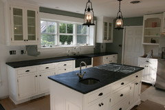
Favorite Benjamin Moore warm white color for cabinetry
judirae
14 years ago
Featured Answer
Sort by:Oldest
Comments (28)

cawfeegirl
14 years agoprill
14 years agoRelated Discussions
Which Benjamin Moore white for my cabinets?
Comments (15)I've been in White Sample World the past week as well. I think I've decided on Dove White, as my kitchen gets western afternoon light (which is warm, right? So I want a cool white to mellow it down...am I correct in this?). But I'm having all the trim and windows repainted too. Do I use the same color on trim in kitchen, even thought it will differ from what is in the rest of the house? I have not looked at Chantilly Lace (or it's pretty face...) yet though, so I will have to add that to my mix. Sorry to hijack the thread...I just thought since people were already thinking about the issue this would be a good place to ask....See MoreNeed Benjamin Moore paint color between Simply White and White Dove
Comments (6)I wonder what she ended up using. I have Simply White kitchen cabinets and I love the white. I’m getting ready to paint the walls in the front of the house (open concept) which is Revere Pewter right now. I love the color but it’s time for a glow up 😀to brighten the space. I’m wondering if going with Simply White on the walls as well as my cabinets will be a mistake. After the Revere Pewter tone for several years I just need some brightness....See MoreBenjamin Moore’s white opulence paint color
Comments (75)It has been a while since the last activity on this thread, and I felt it might be beneficial to give my updated perspective on White Opulence #879 from Benjamin Moore as a paint color for main areas. Having lived with this color for a bit longer now since my last comment, I am beginning to understand how tightly it regulates what other colors can be placed with it for anyone who cares about a homogeneous scheme and also how undeniable the pink tone can be when applied over large surface areas. White Opulence is a tint of red, but it is so light that in ample daylight or under bright white lighting it can "read" as white. In average daylight, it produces a whisper-light pink hue. The effect of this is magnified the larger the area that is covered by it. Using this color on the walls in the main space of a large, open-plan layout with high ceilings, for example, will imbue the area with a light, yet undeniable, pale pink cast in average lighting. It would be a good idea to prepare not only yourself but also any other significant users of the space of the pink tinge before selecting this color because some people truly dislike pink, and it is courteous to work with all regular users of spaces during design planning to try to ensure no one will be overly uncomfortable with the final effect. One thing that hasn't been discussed is how White Opulence can cast a peach tone under warmer lighting colors, especially in the absence of any compensating daylight, meaning nighttime in most home spaces. If peach is a color you want to avoid and you utilize warm lighting -- that is, progressively orange-tinged the further under a 4000K color temperature you go -- then this is a paint color to avoid. The general recommendation is that 4000K is quite cool for home environments, so if you don't know what color temperature your home lighting is, you can probably assume it is warmer than 4000K if you selected average bulbs from your home supplies provider. White Opulence as a red-based white was an attractive choice for my main space because I already had a red accent in a permanent finish and personally prefer the fresh look that a red-white lends versus common alternate choices for main area wall colors like yellow-based beiges or blue-based grays. The problem is that so many home goods available are manufactured in colors that go with beige and gray wall colors rather than the faint red-white of White Opulence that color coordination requires more work than may be expected. Of course, you could decorate using pure white items, but what you really need are options for whisper pink basics which are hard to find. Adding stronger pink or red items is not always the solution either because you cannot feasibly fill the room with accents; you need some basics that blend with the wall tone. Then there is the issue of coordinating White Opulence with colors for auxiliary rooms if you wish to have some variety throughout the home while still maintaining the feel that all of the home's colors work together. Most blues coordinate with White Opulence, but if you have already used red accents in rooms painted with White Opulence, then red is challenging to pair with blue in most instances unless it is a dark, cool blue like navy. Where this has been a dilemma for me has been my hallway colors connecting the main open space to the bedrooms which are all different pastels. The color plan I have will work, and I'll enjoy the variety of colors that I have been able to make flow together, but to be honest, at times I have wondered how much easier the design process might have been if I had picked plain white for the main space. White is the ultimate neutral some might say. At the very least, a basic white for the main area would have given me more freedom in selecting fabrics and other home products for the main space as well as coordinating colors for other rooms. It is all too easy to second-guess decisions that will affect your life long-term. I am using Benjamin Moore's durable Aura formula in a satin finish, so I expect the new White Opulence paint will last decades. Had I selected a plain white or yellow- or blue-based off white, I might be back on this very forum wishing I had gone with White Opulence to add appeal beyond the standard choices. I hope this is helpful to anyone still considering this color....See MoreBenjamin Moore Cloud White close match to Kelly Moore Pickett Fence 46
Comments (13)Patricia - I'm not looking to match an existing color in the room, rather want a Benjamin Moore paint COLOR but for Cabinet Coat (Pro. painter said to pick a color from Kelly Moore). Lori - Thank you for the detailed info. We are getting our (South Faced) kitchen cabinet painted. We have Cloud White (OC -130) on the walls, and looking for a white/off white color for the cabinets. Something that is not to stark, too yellow, or too pink! Some of the folks had suggested we match cabinets to the shutter colors (two windows in kitchen), however we prefer not to as it is an older K.M. paint color (Western Acoustic) which has a lot of yellow in it. We did swatches, and the best colors are Simply White /OC-117 and Could White/OC-130, with Simply White being the nicer of the two choices. However, since due to the base of each different paint manufacturer, paint matching can be a hit or miss, the Sales Reps (with over 20 years of experience. at K.M.) said that Pickett Fence was a close match to S.W. Main- Thank you for that info. It's extremely helpful. Will pass on the info. to our paint guy....See Moremegpie77
14 years agoebse
14 years agofarmhousebound
14 years agoreshal
14 years agobecktheeng
14 years agopeytonroad
14 years agoprill
14 years agocaview
14 years agopaintpanther
14 years agocaview
14 years agocawfeegirl
14 years agornest44
14 years agopeytonroad
14 years agoyesdear
14 years agoUser
14 years ago
Stacey Collins
14 years agolesmis
14 years agogilmoregal
14 years ago- PRO
Snuggle Mug Co
14 years ago danielle_s
14 years agojudydel
14 years ago
msrose
14 years agobeekeeperswife
14 years agornest44
14 years agobeekeeperswife
14 years ago
Related Stories

MOST POPULARMust-Try Color Combo: White With Warm Off-White
Avoid going too traditional and too clean by introducing an off-white palette that brings a touch of warmth and elegance
Full Story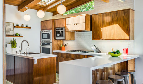
KITCHEN CABINETSNew This Week: 3 Modern Kitchens That Rock Warm Wood Cabinets
Looking for an alternative to bright white? Walnut cabinetry offers the perfect tone to warm things up
Full Story
MORE ROOMSWarm Up Your Rooms With a Beautiful Off-White Paint
White paints warmed with a hint of color create radiant backdrops for countless interior design options
Full Story
COLORBenjamin Moore Floats Breath of Fresh Air as Its Color of 2014
Touted as a new neutral, this baby blue can stand on its own or support bolder colors. Here's how to use it
Full Story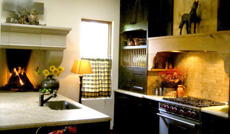
KITCHEN DESIGNKitchen of the Week: Warm Up By the Fire
Dark cabinetry, warm woods, and a counter-height hearth make this Portland kitchen special
Full Story
DECORATING GUIDESColor of the Week: Decorating With Warm Gray
Tired of tan? Getting gloomy from cool gray? Make warm gray your new go-to neutral
Full Story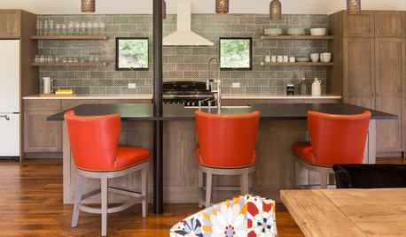
KITCHEN DESIGNKitchen of the Week: Warm and Contemporary in the Mountains
This open, family-friendly space in Wyoming is made for cooking, gathering, dining and lounging
Full Story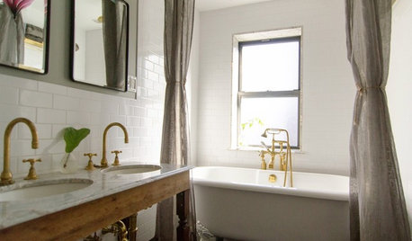
REMODELING GUIDESRoom of the Day: Brass Warms a Brownstone Bathroom
Forget trends. This owner chose unlacquered brass and repurposed pieces for love alone
Full Story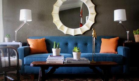
DECORATING GUIDESHot Color Combo: Cool Blues and Warm Brass
It's trending all over, but navy or royal blue with brass or gold just also might become a new classic pairing
Full Story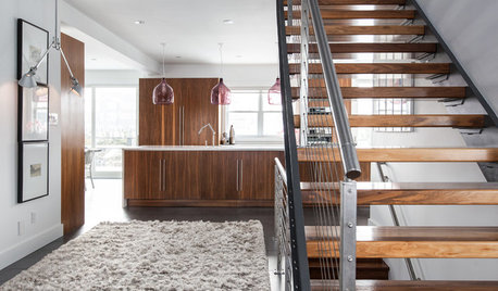
HOUZZ TOURSMy Houzz: Warm Walnut Rules in an Open-Concept Canadian Home
Traditional takes a turn for the modern in this remodeled St. John's home, newly focused on clean lines and sleek finishes
Full Story

fleur222