


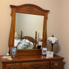
Paint color choice - ceiling is Powell Buff (pics)
11 years ago

Sort by:Oldest
Comments (24)
Related Stories

COLORPick-a-Paint Help: How to Quit Procrastinating on Color Choice
If you're up to your ears in paint chips but no further to pinning down a hue, our new 3-part series is for you
Full Story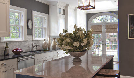
KITCHEN DESIGNReaders' Choice: The 10 Most Popular Kitchens of 2012
Citing savvy organizational solutions, gorgeous lighting and more, Houzzers saved these kitchen photos in droves
Full Story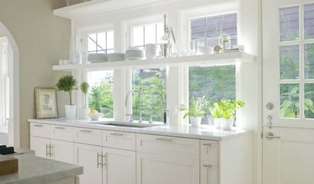
KITCHEN DESIGNReaders' Choice: The Top Kitchens of 2010
The Year's Most Popular Kitchens Had White Cabinets, Black Accents, Floating Shelves or Uber-Organized Pantries
Full Story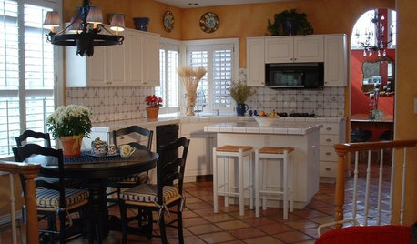
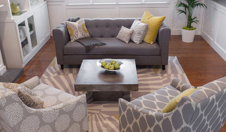
LIVING ROOMSReaders' Choice: The 10 Most Popular Living Rooms of 2012
Every design style gets a shout-out in the most saved living room photos of the past year — see if any elements speak to your own tastes
Full Story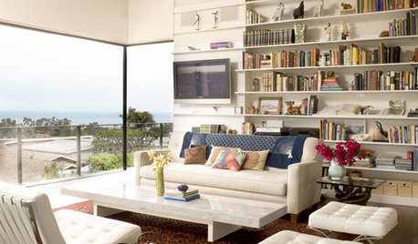
MORE ROOMSReaders' Choice: Best Living Rooms of 2011
Get ideas for your own great gathering room from the most popular living rooms added to Houzz this year
Full Story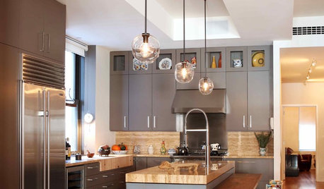
KITCHEN DESIGNReaders' Choice: The Top 20 Kitchens of 2011
Get inspired by the 20 most popular kitchens on Houzz in 2011
Full Story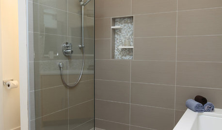
BATHROOM DESIGNReaders' Choice: The 10 Most Popular Bathrooms of 2012
Some commended the colors; others lauded the light. But whatever caught Houzzers' eyes, the features of these bathrooms were in demand
Full Story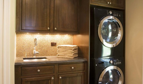
Readers' Choice: The 10 Most Popular Laundry Room Photos of 2012
These washing areas made a clean break with overcrowding and inefficiency, and a tidy number of Houzzers noticed
Full Story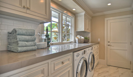
Readers' Choice: The Top 20 Laundry Rooms of 2011
Make doing the wash easier (and even fun) with ideas from the year's most popular laundry room designs
Full StorySponsored
Your Custom Bath Designers & Remodelers in Columbus I 10X Best Houzz

seegayeOriginal Author
seegayeOriginal Author
Related Discussions
Any pics of Powell Buff
Q
What's a good in-between of Pittsfield Buff and Shelburne Buff?
Q
Lady Finger, Powell Buff, Sandy Brown, or Nantucket Green?
Q
Does anyone know of a color very close to Powell Buff with no und
Q
bronwynsmom
seegayeOriginal Author
seegayeOriginal Author
seegayeOriginal Author
Annie Deighnaugh
bronwynsmom
seegayeOriginal Author
seegayeOriginal Author
seegayeOriginal Author
seegayeOriginal Author
Annie Deighnaugh
Annie Deighnaugh
bronwynsmom
seegayeOriginal Author
Annie Deighnaugh
bronwynsmom
seegayeOriginal Author
Annie Deighnaugh
seegayeOriginal Author
Annie Deighnaugh
seegayeOriginal Author
Annie Deighnaugh