


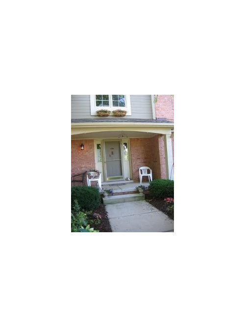
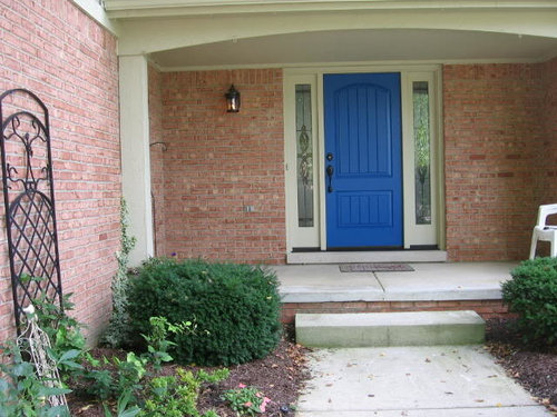
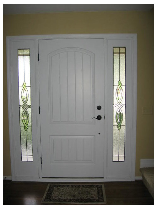
new door in! yikes-too bright?? pics
massagerocks
12 years ago


Sort by:Oldest
Comments (91)
Related Stories
CURB APPEAL5 Bright Palettes for Front Doors
Splash bold green, blue, orange or red on your front door, then balance it with a more restrained hue on the rest of the house
Full Story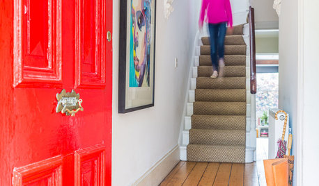
DECORATING GUIDESHouzz Tour: Bright Hues Energize a Light-Filled Victorian
A vintage home gets dressed to impress with pops of color and eye-catching modern artwork
Full Story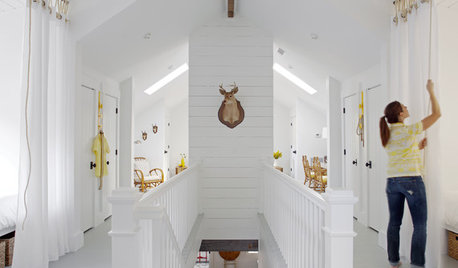
DECORATING GUIDESColor Guide: How to Work With Bright White
There's a reason clean, crisp white is the eternal standard for walls. See how it can take your rooms from pallid to pleasing
Full Story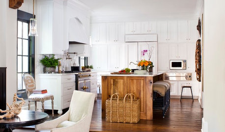
KITCHEN DESIGNKitchen of the Week: Going Elegant and Bright in a 1900s Home
Dark and closed off no more, this Atlanta kitchen now has a classic look, increased natural light and a more open plan
Full Story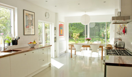
KITCHEN DESIGNDark Kitchen Gets a Bright New Look
When a graphic designer and an architect put their heads together on a kitchen redesign, the result is a stylishly simple space
Full Story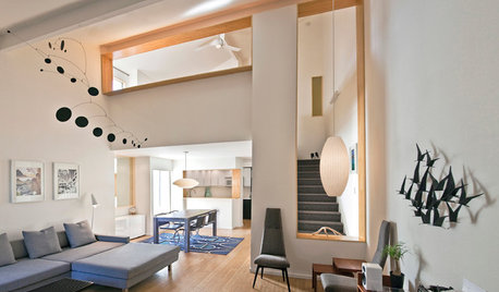
BEFORE AND AFTERSHouzz Tour: A San Diego Townhouse Gets a Bright Update
Savvy shopping and warm bamboo accents help California architects give their home a fresh, high-end feel
Full Story
HOUZZ TOURSMy Houzz: Going White and Bright in Montreal
White lacquer and wider doorways help create an airer backdrop for colorful contemporary art in a 1910 Arts and Crafts home
Full Story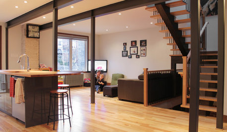
HOUZZ TOURSMy Houzz: Duplex Now a Bright and Spacious Single-Family Home
An open-concept design turns small, dark rooms into a contemporary space for a growing family in Montreal
Full Story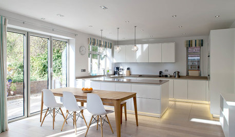
KITCHEN DESIGNBright Modern Kitchen With Smooth Lines and a Relaxed Vibe
A peninsula separates zones in this open-plan family kitchen and dining area with a streamlined design
Full Story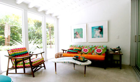
HOUZZ TOURSMy Houzz: Bright Island Style for a Florida Vacation Home
Hand-me-downs and new pieces mix happily in a midcentury home on a sunny South Florida island
Full Story


kitschykitch
IdaClaire
Related Discussions
Bright Orange curtains - too much? pics
Q
New Garage Door (with pics!)
Q
New Construction Kitchen Quandries-Yikes!
Q
Last minute kitchen redesign for new build? Yikes
Q
lisa_mocha
nancybee_2010
Jeane Gallo
norasnews
kitchentime
deborah1950
Valerie Noronha
cindyloo123
massagerocksOriginal Author
awm03
franksmom_2010
InteriorStylist
itltrot
natal
work_in_progress_08
dalmadarling
nancybee_2010
awm03
User
suero
cyn427 (z. 7, N. VA)
cyn427 (z. 7, N. VA)
bleigh
User
homeagain
les917
htnspz
cindyloo123
massagerocksOriginal Author
tfm1134
kiki_thinking
busybee3
cyn427 (z. 7, N. VA)
natal
InteriorStylist
cindyloo123
cindyloo123
cindyloo123
awm03
mtnrdredux_gw
natal
awm03
massagerocksOriginal Author
awm03
cindyloo123
cindyloo123
natal
InteriorStylist