


Part 2 - Need help with countertop color for this kitchen please
squirrelheaven
16 years ago
Sort by:Oldest
Comments (22)
Related Stories

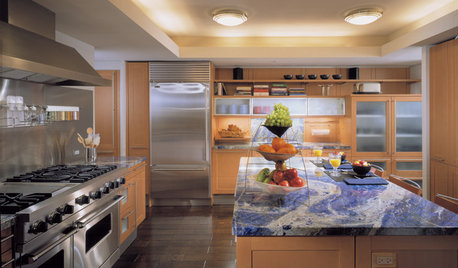
KITCHEN DESIGNAlternatives to Granite Countertops, Part II
Still looking for a new kind of countertop? Try sodalite, zinc, limestone, onyx and more
Full Story
KITCHEN DESIGNAlternatives to Granite Countertops, Part III
9 more reasons to rethink the granite kitchen counter
Full Story
KITCHEN DESIGNDesign Dilemma: My Kitchen Needs Help!
See how you can update a kitchen with new countertops, light fixtures, paint and hardware
Full Story
TRANSITIONAL HOMESHouzz Tour: Part Traditional, Part Modern and All Family Friendly
With clean lines, vintage touches and durable surfaces everywhere, this Los Angeles home balances tastes and needs beautifully
Full Story
KITCHEN DESIGNKitchen of the Week: A Part-Time Space Fully Satisfies
A scaled-down approach doesn't mean sacrificing, in this heavenly white kitchen with all the modern conveniences
Full Story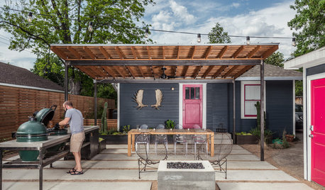
OUTDOOR KITCHENSHouzz Call: Please Show Us Your Grill Setup
Gas or charcoal? Front and center or out of the way? We want to see how you barbecue at home
Full Story
MOST POPULAR7 Ways to Design Your Kitchen to Help You Lose Weight
In his new book, Slim by Design, eating-behavior expert Brian Wansink shows us how to get our kitchens working better
Full Story
SELLING YOUR HOUSE10 Tricks to Help Your Bathroom Sell Your House
As with the kitchen, the bathroom is always a high priority for home buyers. Here’s how to showcase your bathroom so it looks its best
Full Story
HOME OFFICESQuiet, Please! How to Cut Noise Pollution at Home
Leaf blowers, trucks or noisy neighbors driving you berserk? These sound-reduction strategies can help you hush things up
Full Story


squirrelheavenOriginal Author
squirrelheavenOriginal Author
Related Discussions
Need to remove kitchen countertop(s) ... help!!!
Q
first pass at a kitchen moodboard, need countertop help please
Q
help! need to select counter top and sink/faucet asap
Q
Please help me select counter top color
Q
squirrelheavenOriginal Author
iwantakitchen
iwantakitchen
squirrelheavenOriginal Author
iwantakitchen
momto4boys
squirrelheavenOriginal Author
iwantakitchen
iwantakitchen
squirrelheavenOriginal Author
iwantakitchen
iwantakitchen
squirrelheavenOriginal Author
iwantakitchen
squirrelheavenOriginal Author
iwantakitchen
squirrelheavenOriginal Author
iwantakitchen
iwantakitchen
squirrelheavenOriginal Author