


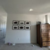
More Help Needed (PICS)
jan_in_wisconsin
12 years ago


Sort by:Oldest
Comments (68)
Related Stories


LIFEDecluttering — How to Get the Help You Need
Don't worry if you can't shed stuff and organize alone; help is at your disposal
Full Story
KITCHEN DESIGNDesign Dilemma: My Kitchen Needs Help!
See how you can update a kitchen with new countertops, light fixtures, paint and hardware
Full Story
ORGANIZINGDo It for the Kids! A Few Routines Help a Home Run More Smoothly
Not a Naturally Organized person? These tips can help you tackle the onslaught of papers, meals, laundry — and even help you find your keys
Full Story
SELLING YOUR HOUSEHelp for Selling Your Home Faster — and Maybe for More
Prep your home properly before you put it on the market. Learn what tasks are worth the money and the best pros for the jobs
Full Story
HOUSEKEEPINGThree More Magic Words to Help the Housekeeping Get Done
As a follow-up to "How about now?" these three words can help you check more chores off your list
Full Story
HOUSEKEEPINGWhen You Need Real Housekeeping Help
Which is scarier, Lifetime's 'Devious Maids' show or that area behind the toilet? If the toilet wins, you'll need these tips
Full Story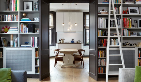
ORGANIZINGGet the Organizing Help You Need (Finally!)
Imagine having your closet whipped into shape by someone else. That’s the power of working with a pro
Full Story
GARDENING GUIDESYou Don't Need Prairie to Help Pollinators
Woodlands, marshes, deserts — pollinators are everywhere
Full Story


cyn427 (z. 7, N. VA)
jan_in_wisconsinOriginal Author
Related Discussions
Back for more help/advise please. . . (pics)
Q
Need more help to post pics
Q
What does this kitchen need cont... more pics
Q
Need more help, Dining Room is starting to belong... (more pics)
Q
lolauren
lolauren
jan_in_wisconsinOriginal Author
jan_in_wisconsinOriginal Author
gsciencechick
jan_in_wisconsinOriginal Author
cindyloo123
cindyloo123
jan_in_wisconsinOriginal Author
kturner
les917
User
jan_in_wisconsinOriginal Author
InteriorStylist
gwbr54
nc_sandyfeet
Diane Smith at Walter E. Smithe Furniture
kristinekr
busybee3
jan_in_wisconsinOriginal Author
erinsean
Valerie Noronha
jan_in_wisconsinOriginal Author
User
cindyloo123
loribee
jan_in_wisconsinOriginal Author
gwbr54
Valerie Noronha
InteriorStylist
jan_in_wisconsinOriginal Author
gwbr54
cindyloo123
InteriorStylist
kimiko232
cindyloo123
jan_in_wisconsinOriginal Author
InteriorStylist
InteriorStylist
gwbr54
Valerie Noronha
InteriorStylist
jan_in_wisconsinOriginal Author
abundantblessings
InteriorStylist
Valerie Noronha
jan_in_wisconsinOriginal Author
Valerie Noronha