


Good design always ages well
Annie Deighnaugh
9 years ago


Sort by:Oldest
Comments (59)
Related Stories
UNIVERSAL DESIGN12 Must-Haves for Aging in Place
Design a home that will continue to be accessible, safe and stylish as the years go by
Full Story
UNIVERSAL DESIGNAging-in-Place Resolutions for the New Year
How to make your home help you age gracefully right where you are
Full Story
KITCHEN DESIGN10 Ways to Design a Kitchen for Aging in Place
Design choices that prevent stooping, reaching and falling help keep the space safe and accessible as you get older
Full Story
DESIGN FOR GOODAt-Risk Teens Get a Well-Designed Home and Real Hope
Designers and other volunteers create an apartment to keep older foster kids off the streets, off drugs and on a path to a better life
Full Story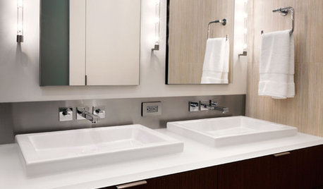
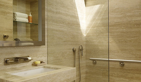
BATHROOM DESIGNUniversal Bath Design: Light Your Bathroom for All Ages and Abilities
Learn about uplighting, downlighting, visual cueing and avoiding glare for a bathroom that's safe and works for all
Full Story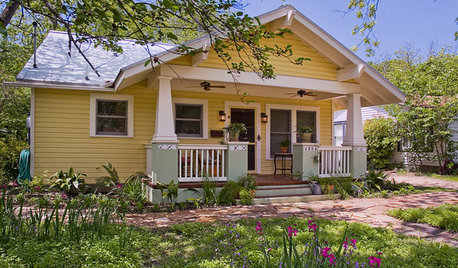
CRAFTSMAN DESIGNBungalows: Domestic Design at the Dawn of the Auto Age
Craftsman details, open floor plans and detached garages make the bungalow-style home an enduring favorite
Full Story
ARCHITECTURETry a Four-Leaf Design That Spans the Ages
No one's sure exactly what the quatrefoil represents, but its striking effect in all kinds of designs is certain
Full Story
ARCHITECTUREWhat the Heck Is 'Good' Design Anyway?
We yearn for it and strive for it, but good home design isn't always easy to grasp. These 8 prescriptions from an architect can help
Full Story
UNIVERSAL DESIGN11 Ways to Age-Proof Your Bathroom
Learn how to create a safe and accessible bathroom without sacrificing style
Full Story


kitschykitch
cyn427 (z. 7, N. VA)
Related Discussions
do totems age well?
Q
We always knew it - playing in the dirt is good for you
Q
Never cared for him, but have to say he has aged well
Q
Speaking of aging well...
Q
palimpsest
Fun2BHere
vedazu
blfenton
teacats
Annie DeighnaughOriginal Author
lindainct
mjlb
rockybird
User
nancybee_2010
Fun2BHere
Annie DeighnaughOriginal Author
nosoccermom
Annie DeighnaughOriginal Author
tinam61
palimpsest
nosoccermom
palimpsest
MagdalenaLee
mclarke
Kiwigem
Kiwigem
mtnrdredux_gw
User
nosoccermom
lindainct
Oakley
arkansas girl
palimpsest
Annie DeighnaughOriginal Author
mtnrdredux_gw
tomatofreak
Errant_gw
Oaktown
palimpsest
Kiwigem
tomatofreak
mtnrdredux_gw
arkansas girl
palimpsest
Annie DeighnaughOriginal Author
palimpsest
palimpsest
amberm145_gw
palimpsest
Annie DeighnaughOriginal Author
palimpsest