SHOP PRODUCTS
Houzz Logo Print
aries61

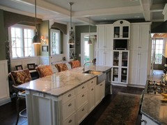
The Biggest Kitchen Design Mistakes on Yahoo

aries61
11 years ago

There is an article on Yahoo that some of you might find interesting.

Here is a link that might be useful: Article on Yahoo

Comments (42)

  • palimpsest
    11 years ago

    Nothing in particular to disagree with there :)

  • rosie
    11 years ago

    No, but I sure was irritated by their illustrating their "do not be boring" with a kitchen in a former barn. They kept the horse stalls. Umhm.

    Actually, at least three of the messages were about RESTRAINT, and I was happily surprised. I don't read a lot of these, so if they've been hitting that message I missed it. And so have a whole lot of people posting here.

    As in:

    "It drives me crazy when a kitchen is over-designed. Knowing when to stop is the real challenge," designer Christopher Peacock says.

    Not overdoing the stainless. "Stainless steel can be a wonderful accent. However, as with all good design, there should be a rhythm with the placement." "Be especially careful with those stainless-steel coffins - giant stainless refrigerators," he warns. "They can quickly overpower a kitchen design if it's not balanced correctly."

    The notion that bigger is always better. How many people create large spaces then come here for ideas on how to fill them all up?

    Love this one, a cardinal issue: "There's rarely a need to completely fill a room with cabinets. A good layout is a balancing act between storage, function, and aesthetics," designer Robert Bakes says. As in, if a plan starts looking like a cabinet brochure, just maybe time to take a fresh look? Especially if it's going in a corner of a living room.

  • Related Discussions

    Kitchen mistake - my refrigerator - what would you do?

    Q

    Comments (17)
    I just had a look at AJ Madison to get some hard numbers about the difference between a 36" built-in and a 42" built-in. It's really not much of a difference at all. Most 36" built-ins have at least 20 cu. feet, and Marvel apparently makes a few 36" built-ins with 23-23.6 cu. feet capacity. Most of the 42" built-ins have 24-26 cu. feet. I think the difference here between what is easy (36") and what you want (42") is not big at all -- the same or less than the capacity of a mini fridge. I'd get the 36", and decide later if I missed the extra few cu. feet enough to get a mini fridge to tuck in another corner of the house. If you have room in the dining room, you could build a mini drink fridge into a buffet. And if it's any comfort, this guide says a family of four needs a combined 18-20 cu. ft. of fridge and freezer storage: http://insideadvantage.com/content.jsp?sectionId=44 This guide also pegged a family of four needing around 20 cu. ft: http://www.cnet.com/topics/refrigerators/buying-guide/ (It said you'd not want much less than 20, might want a little more.) And this says 18-22 cu. ft for a family of four: http://www.overstock.com/guides/refrigerator-fact-sheet So you should be absolutely fine with a 36" built-in fridge.
    ...See More

    Biggest lesson learned while remodeling a kitchen?

    Q

    Comments (45)
    Work with a talented KD. Interview many KDs, and it will become clear who the true professionals are. Make all of your decisions beforehand so you can make the tradeoffs (ie, busy countertop OR backsplash?) consciously, before you are backed into a corner by prior decisions. Don't cut corners on the foundational items in favor of "bling." Think of what features you will really need and use rather than being sold on the latest "must haves." i know many on this forum downplay the usefulness of a KD, but ours was the key to making our kitchen everything we wanted. He coordinated the whole process seamlessly with our GC and save for a few surprises (issues that cropped up with the house itself), the reno was completed on time and without major headaches.
    ...See More

    Kitchen color mistake help ASAP

    Q

    Comments (55)
    I think if you add some natural wood accessories it will really soften the look for the space. For example, a pretty wood cutting board leaning vertically on a counter against the backslash. A split wood or natural fiber shade at the window. Perhaps some baskets on the top of the upper cabinets. Place wooden utensils in a white ceramic pitcher next to the stove. Or even a wood block for knives. I agree with everyone that says you shouldn't be so hard on yourself! Add some personal touches to soften the appearance, cook a few meals, and then see how you feel!
    ...See More

    Kitchen Aid Rangetop - mistakes evident in kitchen now

    Q

    Comments (22)
    palimpsest wrote: "And I don't even want to ask but is there a noncombustible surface behind this range top, Under the marble tile? Like cement board and metal studs? Because if it's just drywall on regular studs, I am not sure just the tile makes in non-combustible, and in that case the space between the back wall and the back edge of the range should be 7-3/4" per the manufacturer. It can only be the 1-3/4" if the wall is non combustible construction. This is in the specs of that cooktop." This is critical. If the wall isn't non-combustible all the way through then the rangetop likely needs a riser/backguard. Island trim only works on islands and significantly deeper than 24-inch counters, at least with gas burners. Tearing out the wall to upgrade it is not what you want to hear. If there is no backguard available, then conversion to induction may work. I fear you have a lot of rework needed. Note to innocent (so far) passerby readers: When it is your time to deal with kitchen design, measure measure measure. Check every dimension both physically and in the plans, doing your own addition of dimensions. Take into account non vertical walls. Be sure that there are enough filler strips to accommodate any issue. Make sure every interface, water, electrical, gas, wood, stone, etc. is where it needs to be. Best is to have appliances on hand if you have a place for them before anything is built. Be the arch skeptic you might not want to be.
    ...See More
  • finestra
    11 years ago

    Well I made one of their cardinal mistakes. Most of my cabinets don't go to the ceiling. With the cabinets being blue, I didn't want to feel like I was looking at a wall of blue. Oh well. And my kitchen may be over designed, but I think Christopher Peacock may be a little pot calling the kettle black!

    I think it comes down to doing what you love and love to look at. I am not looking to resale because I hope I will be in this house for a long, long time.

  • rosie
    11 years ago

    LOL. Maybe he OD'd viewing his own work and started trying to bring it down.

    As for short cabinets, I really doubt you did, agree with you, and will offer my own biggest cardinal mistake: Keeping fickle commercial trend-chasers from dissuading choices built on long-term personal preferences.

    Stopping cabinets short of the ceiling is actually the one I specifically disagreed with. I never cared for it because I'm too lazy to get up and dust and because I've always preferred a more old-fashioned built-in look. It is a totally valid look and has its place, though, including times when it's very, very right. Unfortunately, it is also a way for builders to save money so has been overdone. That's its cardinal sin. Temporarily, of course.

  • pawa
    11 years ago

    What does it mean to "overdesign" a kitchen?
    I know I picked a lot of elements that were all pretty 'loud' (I have since pulled back...) Is that what is meant? Or maybe they're taking about layout?

  • User
    11 years ago

    I saw a great comment about design when I first started reading GW. I'll paraphrase it.

    "You don't want more than one clown in the room. One clown is very entertaining but a roomful of clowns would give you a migraine."

    I think that's pretty succinct.

  • Gigi_4321
    11 years ago

    Does that mean I have to take my collection of ceramic clowns down from atop my wall cabinet? When I read this article I thought the same thing about Christopher Peacock, I mean, even his last name conjures up showing and flashy.
    Going down the list I think I failed.
    1. Boring, possibly with all my slab front drawers
    2. Cabs not going to ceiling: Where else would I display my ceramic clown collection?
    3.My kitchen is boring and overdone at the same time, I try to please everyone.
    4.I have my share of stainless appliances, I thought they were timeless?
    5.Bigger is not always better? I disagree, people only say that when they have small..uh, kitchens.
    6.Huh? I thought a lot of storage was good? I don't have much, so, yay!
    7.My cabs are custom, I think they are good quality.
    8. I escaped this crime: I don't have wall ovens, but that would probably have been #9

  • taggie
    11 years ago

    5.Bigger is not always better? I disagree, people only say that when they have small..uh, kitchens.

    LOL!

  • jgopp
    11 years ago

    My cabinets fall short of the ceiling and I certainly don't mind because I have a boxed ceiling feature which I love. If the cabinets went all the way up it just wouldn't look right. I think that is silly to say that they have to. Sure it looks nice but in the right situation having non ceiling height cabinets can look good too. Here is my non ceiling cabinets...

  • cawaps
    11 years ago

    The cabinets up to the ceiling comment was the one that I immediately objected to. Fine advice if you have 8-10 ft ceilings, but what if you have Cathedral ceilings?

    "There's rarely a need to completely fill a room with cabinets." Truer of large kitchens than small ones. If you've got as 8x8 space, you're probably going to fill it with cabinets.

  • SaraKat
    11 years ago

    jgopp, your kitchen is just beautiful : ) love your counters.

  • sbp59
    11 years ago

    I filled my small kitchen with cabinets and probably too boring but I am loving this new kitchen that gets granite on Monday...hopefully I can figure out how to load pics when done!

  • mpagmom (SW Ohio)
    11 years ago

    I plead guilty to installing a stainless steel coffin. The paneled refrigerator I would have wanted cost as much as my entire appliance budget. Some people live in the real world.

  • Susied3
    11 years ago

    Jgopp, your kitchen, ceiling, everything ROCKS!

    These people need you.....

  • idrive65
    11 years ago

    I think the BIGGEST kitchen design mistake is not being true to your own desires.

    It's great to look for new ideas, but so many people worry about what the neighbors will think, what the resale value will be, what will be "timeless" (the answer? Nothing!) and then make decisions that aren't what they really want in order to fulfill some nebulous standard. Then they have to live with it for 15 years, rendering moot those choices they made for design and resale.

    If people like their cabinets to the ceiling (or not), or cheap cabinets to expand the appliance budget, or cheap appliances and beautiful custom cabinets, or last year's tile trend, then they should get it, and not worry about what a designer on yahoo thinks.

  • jgopp
    11 years ago

    Sara and susie: Thanks for the compliments. I didn't try to conform to any special "type" it was a mix of a bunch of things I liked. I did what I wanted, and believe me it took forever to do. Guides that tell you what to do are too trendy for me.

    I agree with idrive in that I think my kitchen fits my style and my 1922 home. It will last as long as I am in the house, but who knows how much more after that!

    Anyway, I linked to my finished kitchen below if you'd like to see more pictures.

    Any magazine or guide that tells you something is a bad idea is a lot of the times wrong because you just don't know what might fit in someones home. And on top of that it is all personal preferences. Make your home your own.

    Here is a link that might be useful: My Finished Kitchen

  • cakelly1226
    11 years ago

    Ummm I broke almost ALL of them! Cabs that don't go to the ceiling, a double oven without a counter next to them(but a counter that is a step right behind in my narrow galley kitchen), some would consider it boring and others, overdone since the tile is a bit busy with my counters, it is totally filled with cabs since I hate clutter and the open shelf concept. I could go on and on!!! But I still love it and that is ALL that matters!!!!

  • rosie
    11 years ago

    Yup, plus a strong indicator that considering these "rules" rules is bogus. What value they offer is is in considering the design value of restraint. And balance was in there too.

    Fill a small separate kitchen with highly functional cabinetry? Yes! Fill a corner of a white/beige two-story FRM with the entire Regency Windsor Cherries Jubilee line in the dark Java Rum finish? Probably not, not even if you belatedly take dark shoe polish to the beige leather coffee table.

    Stainless steel fridges often blend/go away so much nicer than other finishes, and I bet they do in your kitchens. But stainless fridge, stove and ovens all bunched together facing the front door, making the the back left corner suggest a mouthful of dental fillings--instead of a nice blend with the $30K worth of Cottage Vanilla cabinets?

    Balance isn't actually something we discuss for its own sake nearly enough on this forum. Or restraint, per se. People often argue for a plainer style because they like it better, but that taking away just one of the proposed nine 50-pound corbels would make it absolutely perfect? Not so much. :)

  • EATREALFOOD
    11 years ago

    "and not worry about what a designer on yahoo thinks"
    idrive 65
    I would restate this as not worry what the yahoo designer thinks.
    Can you tell me what justifies a 5K "retainer" for a designer which locks you into buying cabinets before you even decide you want them ?

    rosie
    LOL I think I have those "dental fillings" as my appliances are about 10' away from the front door: fridge,15"cab, DW, sink then 2' from sink the range.My only defense is small space...
    and as far as
    "the whole room has to sing" comment in that article, is right up there with a "dream" kitchen. um barf.

  • formerlyflorantha
    11 years ago

    O.T. to May Flowers,
    I'm the originator of the clown metaphor. Glad the metaphor is worthwhile to you--clowns are look-at-me features. Just need to make a slight correction: it's okay to have more than one clown but you have to know what you're doing.

    Multiple clowns are fine but they shouldn't bring things to the point of being a circus. If each patterned design fabric or accent color is a clown, the backsplash is a clown, the countertop is a clown, the heavily grained wood is a clown, and the chandelier is a clown, you're getting a lot of action into that room.

    If you make the same assumption that I do, that the kitchen environment should define a calm background because the cook will introduce mess and emotions, then a visual circus will compete with the calm.

    On the other hand, some kitchens are so bland that I want to send in a few clowns. Pun intended. Continuing the pun, this makes kitchen design a balancing act.

  • pawa
    11 years ago

    RE: it's okay to have more than one clown but you have to know what you're doing.

    Can you use multiple look-at-me features by using the same colours and varying the scale of the pattern in each?

    Is a wood counter (maple) considered a 'look-at-me' feature?

    I think ultimately, I will be happier with the look of my kitchen if I have some rules and guidelines to follow, so I appreciate the discussion of restraint and balance.

  • palimpsest
    11 years ago

    You don't think these are just meant to be points of discussion about ideas within a certain context? Most of these designers probably do exactly the opposite when the situation calls for it. It's awfully narcissistic to think that this is Mick De Giulio's insult on your own individual kitchen.

  • mamadadapaige
    11 years ago

    I think the list is nice but I find that in design you really can't expect for there to be actual concrete answers to design problems. One designers "rule" will certainly conflict with anothers.

    This reminds me of the May issue of House Beautiful which featured 101 designer's secrets. One designer said "The only time white curtain lining should be used is with white curtains". Another said, "I always line curtains with white or off-white fabric. It helps filter the light in a warm, natural way, and from the outside your house won't look carnivalesque." There were several other examples of conflicting advice. Reminds me of a crossword puzzle i did once which was entirely of conflicing old adages such as: "birds of a feather flock together" with "opposites attract".

    re: cabinets going to the ceiling: I attended the kitchen and bath industry show recently and attended a seminar on European Kitchen Design trends put on by Poggenpohl.... Their thing is to NOT bring the cabinets up to the ceiling for a variety of highly considered reasons. So, just because one designer thinks that's a no-no, doesn't really mean that it is.

    It is my opinion that there really isn't one right answer when it comes to design. OP, I'm glad you posted this as its interesting to hear what others think about it.

  • colin3
    11 years ago

    I don't think a maple counter is a look-at-me feature. Maple has the virtue of being functional and bland. Look-at-me would be boldly-colored granite, exotic wood veneers, tile with an eye-catching design, colorful pendant lights, busy cabinet hardware, artsy backsplashes -- any time you are choosing something for a particular, unusual look rather than mere functionality. And the danger of course is that all of them look really cool by themselves and you want them all.

    I read Johnny Grey's books early on in my design process, and they were fun and supplied lots of ideas, but at a certain point I had to realize that I'm not Johnny Grey and can't pull off the whole circus. It gets harder if your space is smaller -- if you have a big, architecturally-distinguished high-ceilinged room you can get away with a lot more than if you are building a kitchen as a compact workshop.

    So I would agree, to keep the excellent metaphor, that you want at most one clown and you need to decide what it is, and then keep everything else dignified but not flashy.

    Another option to think about is art. I'm looking right now at a highly visible wall where the kitchen transitions to the rest of the house. I went through a lot of ideas to clown it up before, happily, abandoning all of them. Instead I have the same style of cherry cabinets and the same soapstone counter as the rest of the kitchen, and a simple painted wall between the upper cabinets and counter. But on that wall are hanging a couple of framed prints. They provide a focus for the eye and they're easy to change out.

  • rosie
    11 years ago

    Do you feel the prints have sufficient visual weight to balance what's happening to their side, Colin, or is there perhaps a wood staircase or some such thing farther on that balances out the whole picture? What else is working for you?

    It sounds like you have restraint working well for you within your own chosen style, and a lot of people will agree with your technique.

    Restraint applies to all styles, though. Another look might NEED 5 clowns of various sizes, all with sparkly jeweled buttons, the 5 deployed just right to make it all work. You can't pull off a great fantasy-gypsy outfit with a string of pearls, after all; if that's your look, you'll need gold and jewels, and lots of them.

    Or back to kitchens, restraint isn't about deciding that white subway tile is better than a vibrant collection of antique Mexican tiles or that one or two will always be better than 20, it's about knowing how to use just enough and not too much to achieve the look desired. That Christopher Peacock kitchen in the article struck me as a nice illustration of this point. It makes its point calmly without cloying by trying too hard.

  • User
    11 years ago

    Florantha, I read your clown comment way back in August when we started designing our kitchen and got such a kick out of it! It's a small kitchen so this won't be a three-ring circus, but this week we'll be clown-shopping for tile!

    I hope you use it more often on GW and it becomes a classic!

  • colin3
    11 years ago

    We may be thinking about different visual effects, Rosie. For me the "clown" can be a small visual focus: a few exuberant hand-painted tiles, for example. It gives the eye a place to go, and a payoff when it gets there - a little bit of unexpected beauty.

  • pawa
    11 years ago

    I took a look at Johnny Grey's web site. Wow. His rooms are like art...There are lots of ideas here, I agree! And yes, the rooms he's working with are big, so he can use multiple statement pieces and have a little breathing room between them. If you packed all his pieces together in a tight space, I don't think it would work. Mind you, the scale of his clowns is very large. Perhaps in a smaller space, all you need are smaller clowns to get a similar effect.

    The multi-clown look is something I gravitate towards, but I don't think the kitchen is a good place to start experimenting, given that I don't have much experience with decorating. Maybe I'll try this look out in my living room, where I can switch the clowns in and out easily enough.

  • Cloud Swift
    11 years ago

    The thing I object to most is calling that list the "biggest" kitchen design mistakes. There is nothing in their list about functionality of the kitchen except the one about landing space next to the ovens. The barn kitchen looks like a pretty annoying layout to actually work in. I think I'd be taking a saw to those stalls getting in the way in 5 minutes in that kitchen.

    And then some of the "mistakes" in the list are contradictory - one person's not boring will be overdone to another and vice versa. Or one designer saying to avoid too much storage packing the room with too many cabinets vs another saying to maximize storage by putting in cabinets to the ceiling (and illustrated with cabinets that are going up 10 or more feet high overwhelming a very narrow kitchen).

  • Gigi_4321
    11 years ago

    Florantha,
    I wonder how long it will take for some designer to pick up your clown reference
    and claim it as their own?
    Anyway, it just a list. Like the 8 top diet mistakes or 6 things you need to know about whatever. While it gets us TKO all riled up, a normal person would read it and be so mixed up they hire a KD. On another note, as I sit drinking my coffee and listening to a large oak tree being chainsawed to death on my front lawn (with the towns blessing of course) I've decided to use some of the wood for my kitchen island, an idea I would never have thought of if not for GW. Thanks GW!

  • rosie
    11 years ago

    That sounds really nice, Gigi. Looking forward to pictures. Depth of meaning is such a special addition and, being precious and hard to come up with, not usually something in danger of being overdone.

    Whoops. Literally just remembered someone who's inheriting her mom's collection of Thomas Kinkade landscapes and planning how to display them. What constitutes one too many can really be a subjective issue. :)

  • palimpsest
    11 years ago

    This is one of the annoying things about current Editorial Decision-Making (and culture in general). Everything needs to be placed into a Best/Worst; Hot/Not; Biggest/Smallest dichotomy.

    Only one thing can be Best or Worst anyway, by definition--not ten at a time.

    I'm sure the designers were asked something like "How do you generally like to approach X,Y,Z?"

    But a lot of people wouldn't read (or react to--which I think is the bigger editorial ploy, these days) an article titled; "Ten things that several top designers have on their minds at the present time"

  • rosie
    11 years ago

    Most of us making these decisions really, really want to replace confusion and doubt with certainty. As long as that's the case, absolute terms will be an easy sell, even to cynics who know better.

  • palimpsest
    11 years ago

    Yeah good luck with absolutes when it comes to the decision making process. That's what created the kitchens of 1990 that everyone wants to call dated, and creates the kitchen of 2012 that people will want to destroy in 2030.

  • rosie
    11 years ago

    Hollysprings, for sure the input of a good professional is extremely, extremely desirable, or essential in many cases. But how would you suggest working that into the article's theme of restraint? Half a designer? Maybe a shorter one? Hire several, then subtract one by one until you have just the right number? :)

  • Susied3
    11 years ago

    What I read on this forum as one of the biggest design decisions is doing the kitchen in what "goes" with the style of the house. That wasn't addressed in the article.

    It didn't occur to me until finding GW, and it's still a bone of contention with me. A Tuscan/Traditional/Rustic style in a rambling ranch? Probably won't meet approval here.

    Prior to finding GW, I already bought Terracotta flooring, (not wood). Many of my likes are not of the norm here. But, do you do what you like and hope that by the time you are called home that the kitchen will need another update? Or, let the kids deal with it?

    Apparently, I've made every design mistake on the list! But, my grandkids will have fun baking in the side "kitchen" while open to the main kitchen, I'll walk an extra 3 steps to the fridge, rely on timers for the oven, because it won't be visible, (which is the first lesson I taught my kids, timer is important) and 100 other things, but without GW, it would be a real mess!

    So, I get all of my "design" advice here, and to heck with all the other pros, unless they have interviewed you, know your ceiling heights, your cooking style, they just can't tell you what design mistakes you are making, IMHO.

  • pawa
    11 years ago

    re: Yeah good luck with absolutes when it comes to the decision making process. That's what created the kitchens of 1990 that everyone wants to call dated, and creates the kitchen of 2012 that people will want to destroy in 2030.

    Isn't it less to do with rules and more to do with everyone wanting the same kitchen at a specific period in time? I have no idea how this can occur, but it does. Fashion is something I really don't understand.

    Maybe the rules should be:
    1. Pick the most functional layout possible. spend money achieving this.

    2. Exercise discipline when picking finishes for your kitchen. You will want to replace them in the future, so don't spend as much as you really want to. For example, pay less than $300 for a faucet instead of $800 or more. You can get a perfectly good $300 faucet. Or if you really want the $800 faucet, pick less expensive flooring. Just don't go crazy getting the most expensive of everything. (Unless you're rich.)

    3. Buy cabinetry that is easy to update, because you will want to update it in 10 - 15 years. (Inset would be hard to update, no? If so, I would avoid inset.)

    4. Use drawers on the base cabs (I guess this is a sub-bullet under 1.)

    5. In terms of finishes, pick one thing that stands out and everything else should be subdued. If you are experienced, you can pick more than one thing. However, if you like to play it safe, you can't go wrong with just one look-at-me feature. for the one stand-out feature, make sure you pick something that you really love, and try and ignore all the trend-talk, because that will just fill you with self-doubt, and then it becomes Not Fun Anymore. To avoid the NFA factor, you should pick your stand-out-feature without consultation from anybody else except your inner you.

    It's kind of the same principle as not telling anyone your baby's name until he/she is born. You don't need to hear the "oh, that's an interesting choice...hmmmm...." commentary.

    Ok, I'll stop now because I'm starting to ramble :-)

  • formerlyflorantha
    11 years ago

    O.T. to those who find "clown" a useful technical term for planning a design: Your praise is treasured by moi and Yeah, I am sure the term will shortly become a standard in Christopher Peacock brochures and House Beautiful copy. I also am sure that another of my favorite technical terms will also be subsumed by the industry: plunk space, as in "be sure there is plunk space either side of your range and near the refrigerator and the sink and along the route taken by fresh bags of groceries."

  • palimpsest
    11 years ago

    Pawa, it's current fashion being Interpreted as "Rules".
    I am not sure what drives people to want to replace finishes in a kitchen before they are worn out. I think I evolve, but I rarely "hate" something I was enthused about a few years back and I see this behavior a lot. I am not sure what drives people to want to update cabinets, which should be "architecture" as far as I am concerned, or to PLAN for it when they haven't even finished the CURRENT one yet. It's not like a new haircut...we don't put a different-shaped roof on our house because we are tired of the old one. (I had better not put that idea out there, it might catch on).

    These decisions have to be "fashion"-driven, because I don't know where else it would come from.

  • oldbat2be
    11 years ago

    Good post! I've been enjoying.

    Introducing the latest new clown in the kitchen (the light).... one of many. Can't wait to see the clown of a backsplash I end up picking out.... Isn't the key really how things blend in together?

  • angie_diy
    11 years ago

    Testimonial: I have benefitted from Florantha's clown analogy.

    Pal, that is so true. I am not prone to frequent renovations (to say the least), but I had some misgivings in putting in soapstone countertops. Those could last 100 yrs, fer Pete's sake, and do I really think the kitchen won't be renovated long before that? (Even if I can hope it isn't in my lifetime! ;-)