


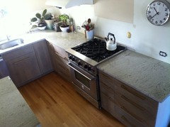
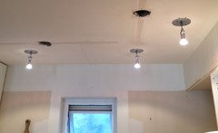
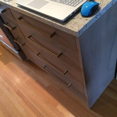
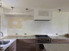
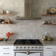
Part II: take a peek at my "soft modern" small kitchen design?
feisty68
9 years ago
Featured Answer
Sort by:Oldest
Comments (165)

feisty68
9 years agobicyclegirl1
9 years agoRelated Discussions
It's April 2014 - Part II1, how is your build?
Comments (150)jdez or shall I call you Jae? :) -are you finished insulating? What is next in your DIY world? So the blasted soffit! Argh! The main hugemongous support beam goes right through there and that is why there is a soffit. Who puts soffits in these days, everyone is busy taking them OUT! Boo! So I *think* the crown will be in front of it and up to it so you won't see a big gap. I hope to find out when I get home from work tomorrow. See, see I told ya! It IS Seattle Mist and it does look gray in the kitchen. Crazy color but I do really love it reading both ways. Island stain is gray but the wood reads through yet. It's called silas and it has a black glaze over it - Shiloh cabinetry. Good grief I hope the floors are life proof but they are wood so they will patina. They are hickory and more rustic with the hand scraping, etc. which I hope will help hide all that 2 boys and a dog have to offer. With it being so open I didn't want a huge transition in flooring so we kept the living/dining/kitchen all wood. So yes, to accommodate the MW and the fridge (or keep it from sticking way out) we pulled those base cabs on the fridge wall forward 6" and the uppers there are 18 or 19" deep, I already can't remember. Doh. Anyhow, with it being so open I didn't want 6" of the side of the fridge hanging out. Bonus that the counter will also be deeper there and that is where I anticipate the toaster and coffee pot to live as well as it being lunch making station. They should all be easily tucked out of view too. I have a very love HATE relationship with FB myself and typically only get on there when prompted by someone else. I have worked in purchasing or materials besides a brief 11 year stint in healthcare when we started a family. Healthcare because they offer part time work and quite a variety of it. So now my kiddos are older and I am back in Purchasing but not in automotive or manufacturing anymore. Breath of fresh air to do something different but still in purchasing. I like numbers and I like variety. I too hope it's happy and long lasting as I am not a job hopper kinda girl. Thanks for not asking, lol. I don't mind. ;) Michelle-thank you. They are pre-finished solid hickory. They had 2 stains and we picked the lighter one (tobacco I think they call it), the other is more a java really deep color. We thought it would show too much dust so we stuck with this one and I like it. It also kind of grounds it as the fireplace and mantle were looking a little formal to me and I think the floor adds back some casual feel. We are not formal people at all. So mini-rant - dh is adamant about wanting cup pulls. 1 - I don't like them as I like to reach from the top not the bottom and 2 - what? why on earth does he care about the pulls and 3 - who uses the kitchen and not just to get a glass for a drink. Pfft. Shaking head. I hope he doesn't mind me going out to the barn when he's building it and insisting on flower boxes or something........turkey. Unfortunately for him I am just as adamant about NOT wanting them. I get his point, they would look nice and I get it he likes the look but they'd drive me nuts to use so it's a no go....See MoreMaking the Most of Small Kitchen Part II - Layout Help Request
Comments (9)I have a bathroom in the kitchen area also and we moved stuff so it wasn't so apparent but anything you can do to dampen the noise would help. Since you have a bump out with the bath can you wrap cabinets around it? I have a bump out in my small kitchen and we wrapped a fridge, ovens and broom closet around it. Behind the ovens is a deep closet and since we also have an older home, you know what a big deal this is. You could have a wall of pantry on the long bath exterior wall and have a shallow closet on the short end, bringing it even with the door jam to the DR. Or vice versa. You could still keep an entry to the exterior in the kitchen and on your main kitchen wall just run the cabinets to the end (on the right), with no corner cabs to lose space with. If you are afraid the cabinets would stick out too much you can make them shallow. On the other side of the table in the picture I have doors that mimic the side you see but are 4'wide and 1' deep pantry cabinets. They are very efficient. The shallow depth eliminates the need for drawers of rollouts and everything is accessible. Below is an idea of how ours wraps around....See MoreUsing Design-Seeds....Part II
Comments (110)No I don't have a design background at all, other than what I learned from watching Christopher Lowell or Lynette Jennings. But my mother was a sewist and she made all my clothes when I was growing up...I used to design my own wardrobe, pick fabrics, mix and match, and she'd make it for me. I was also allowed to decorate my room as I wished (including having the mattress on the floor in my "hippie" days) and it was great fun. I've always been sensitive to my environment and needed my surroundings to feel comfortable and be well balanced. It's so funny as the principles for the exterior are the same as the interior, but somehow decorating porches and patios or landscaping are beyond me. Somehow I do so much better when the space is defined by walls. I had a similar reaction when I was working on this house and had to select tile. I can walk into any fabric store, no matter how large, and feel quite comfortable despite the cacophony of pattern, texture, colors....but when I started selecting tile, I was confused and struggled with where to look and how to put it together. I realized it was because the fabrics are "done" but tiling a room is like designing the fabric...you are selecting the colors, the patterns, the textures to put together to create the "fabric" if you will. Once I realized that, I got a lot more comfortable and did better. So I think applying your color, pattern, texture skills is the same thing, only in reverse...I had to learn to go small, you need to find a way to go big. Once you realize it's all the same thing, you'll be more comfortable with it....See MoreStyling the Kitchen, Part II
Comments (67)ppbenn--that bread bowl is from Home Goods. It's going back on Saturday. Turns out I'm not the only one who "borrows" from Home Goods for photo shoots according to the photographer. I had to give the writer the resource list for the stuff in the kitchen by today. I finally managed to buy a domain name for my little imaginary design consultation/stylist business. I was given a lot of tips from beagles. Of course since it was going into print I wanted it to be just a simple (myname dot com) for now. I believe I can do the technical address that beagles suggested which involved the keywords in the address and then link the two together. The writer said she would include it in the article. Cross all those GW fingers. The magazine is regional (about 5 or 6 counties) in Central PA get the magazine. The magazine is called Susquehana Style....See Morefeisty68
9 years agomgmum
9 years agofeisty68
9 years ago
oldbat2be
9 years agofeisty68
9 years agofeisty68
9 years agofeisty68
9 years agofeisty68
9 years agofeisty68
9 years agolast modified: 9 years agofeisty68
9 years agolast modified: 9 years agofeisty68
8 years agolast modified: 8 years agofeisty68
8 years agofeisty68
8 years agofeisty68
8 years agofeisty68
8 years agofeisty68
8 years agoJillius
8 years ago
funkycamper
8 years agofeisty68
8 years agolast modified: 8 years agofeisty68
8 years agoCindy Breitwieser
8 years agofeisty68
6 years agofeisty68
6 years agofeisty68
6 years agofeisty68
6 years ago

Related Stories
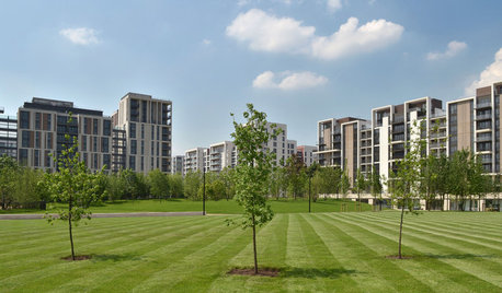
BEDROOMSTake a Peek Inside the Olympic Village Apartments
Comfy, colorful private digs and common areas send a winning design message to Olympic athletes in London
Full Story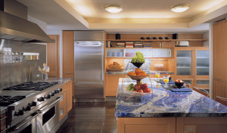
KITCHEN DESIGNAlternatives to Granite Countertops, Part II
Still looking for a new kind of countertop? Try sodalite, zinc, limestone, onyx and more
Full Story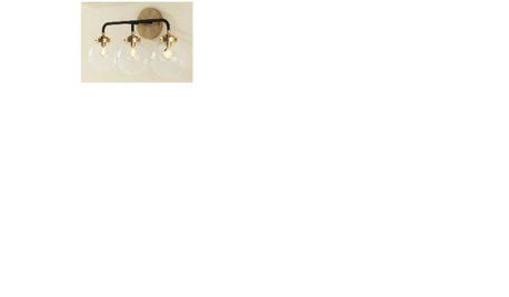
KITCHEN DESIGNNew Year's Resolutions for Your Kitchen, Part II
Here's how to make your new kitchen more functional and fabulous this year
Full Story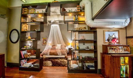
LOFTSHouzz Tour: A Bachelor Pad’s Part II
A designer has a hand in two phases of this movie director’s life and his loft in a landmark Art Deco building in L.A.
Full Story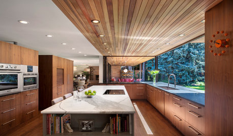
EVENTSSneak a Peek at 7 Homes From Denver’s Modern Home Tour
A wine cube with a glass ceiling, a remodeled Eichler and other structures exemplify modern design in Colorado
Full Story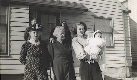
LIFETime Travel to Houzzers' Childhood Homes, Part 1
Peek into home design's past and share the memories of Houzz community members with these personal photos and stories
Full Story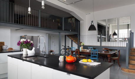
KITCHEN DESIGNKitchen Takes Off in a Former Aircraft Parts Factory
Generous storage and clever carpentry transform a cluttered kitchen into a sleek, minimalist living space with an eclectic heart
Full Story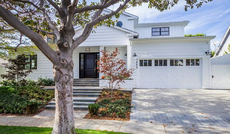
TRANSITIONAL HOMESHouzz Tour: Part Traditional, Part Modern and All Family Friendly
With clean lines, vintage touches and durable surfaces everywhere, this Los Angeles home balances tastes and needs beautifully
Full Story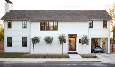
HOUZZ TOURSHouzz Tour: A Modern Take on a Traditional Texas Farmhouse
Contemporary details update the classic form in this Austin home with a kitchen designed for a professional baker
Full Story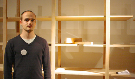
TASTEMAKERSSneak Peek: 10 Visionary Designs That Could Be Coming Your Way
Trust the next generation of designers to think ahead — these promising products from the imm Cologne trade fair take innovation to heart
Full Story

magpier