


opions wanted on paint colors, please! Pictures!
dirtymartini
14 years ago
Sort by:Oldest
Comments (50)
Related Stories
COLORHow to Choose a Paint Color
Designers offer tips for examining your closet, memories and daily life to find the right paint colors for your home
Full Story
DECORATING GUIDES10 Bedroom Design Ideas to Please Him and Her
Blend colors and styles to create a harmonious sanctuary for two, using these examples and tips
Full Story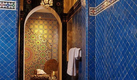
TILEMoor Tile, Please!
Add an exotic touch with Moroccan tiles in everything from intricate patterns and rich colors to subtle, luminous neutrals
Full Story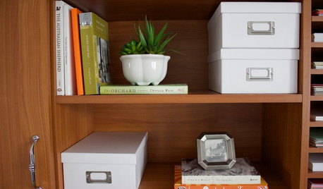
HOME OFFICESRoom of the Day: A His-and-Hers Office They Both Want to Use
Pleasing colors, nature-inspired artwork and better organization give this room a bright, welcoming feel on a tight budget
Full Story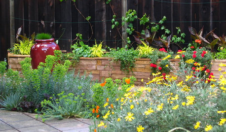
SUMMER GARDENINGHouzz Call: Please Show Us Your Summer Garden!
Share pictures of your home and yard this summer — we’d love to feature them in an upcoming story
Full Story
WORKING WITH PROS17 Things Color Consultants Want You to Know
Dithering over potential palettes for your home? A color pro might be the way to go. Here's how it works
Full Story
LIVING ROOMSCurtains, Please: See Our Contest Winner's Finished Dream Living Room
Check out the gorgeously designed and furnished new space now that the paint is dry and all the pieces are in place
Full Story
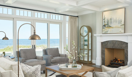
COLORWant Gorgeous Interior Colors? Look to the Light
See how to manipulate natural and artificial light — and learn about those baffling new bulbs — to get the exact room colors you want
Full Story
ART10 Things Artists Want You to Know
Inspiration, costs, commissioned work ... 5 artists share on these subjects to paint you a picture of the creative process
Full Story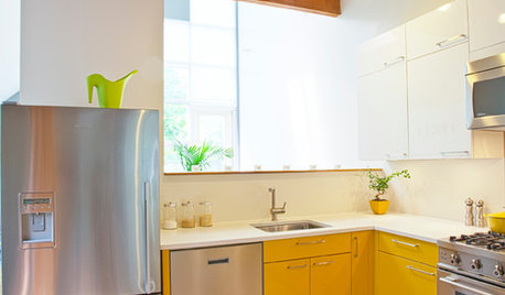
COLORCrazy for Color? Your Kitchen Cabinets Want In
Make over your kitchen in spectacular fashion with just colorful cabinet paint? Now there's a bright idea
Full Story


dirtymartiniOriginal Author
squirrelheaven
Related Discussions
New floor Plan -Opions Please!
Q
China Manufacturers...need your opions, please
Q
Paint Color Help! Please see pictures
Q
cell phone case/covers...opions please
Q
justgotabme
msrose
parma42
Happyladi
dirtymartiniOriginal Author
amysrq
dirtymartiniOriginal Author
randita
oilpainter
User
equest17
mahatmacat1
amysrq
mahatmacat1
equest17
Lori A. Sawaya
dirtymartiniOriginal Author
dirtymartiniOriginal Author
dirtymartiniOriginal Author
marybeth1
dirtymartiniOriginal Author
dirtymartiniOriginal Author
marybeth1
marybeth1
mahatmacat1
mahatmacat1
mimi_2006
Lori A. Sawaya
mahatmacat1
Lori A. Sawaya
parma42
peachiepie
nesting12
mahatmacat1
mahatmacat1
Lori A. Sawaya
msrose
dirtymartiniOriginal Author
marybeth1
equest17
susanlynn2012
readerlearner
dirtymartiniOriginal Author
readerlearner
hoosiergirl
dirtymartiniOriginal Author
equest17
dirtymartiniOriginal Author