


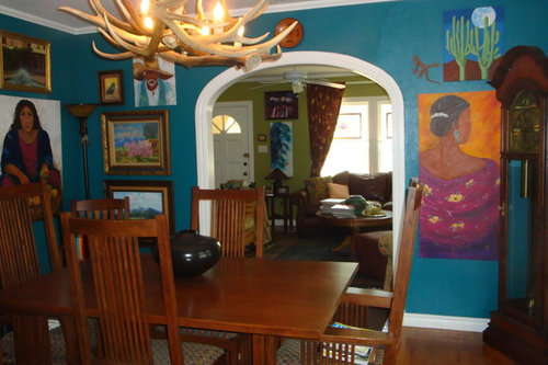
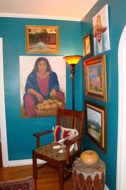
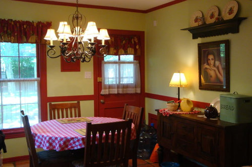
Should I paint my DR the same as LR?
User
12 years ago


Sort by:Oldest
Comments (45)
Related Stories
DECORATING GUIDESThe Case for the Anti-Accent Wall
Go ahead, paint everything the same color (even the trim)
Full Story
FEEL-GOOD HOME12 Very Useful Things I've Learned From Designers
These simple ideas can make life at home more efficient and enjoyable
Full Story
WHITEHow to Pick the Right White Paint
White is white, right? Not quite. See 8 white paint picks for 8 very different effects
Full Story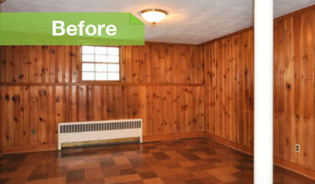
PAINTINGKnotty to Nice: Painted Wood Paneling Lightens a Room's Look
Children ran from the scary dark walls in this spare room, but white paint and new flooring put fears and style travesties to rest
Full Story
MOST POPULARThe Right Way to Test Paint Colors
Here are 5 key steps to take to ensure you're happy with your wall paint color
Full Story
COLOR11 Reasons to Paint Your Ceiling Black
Mask flaws, trick the eye, create drama ... a black ceiling solves a host of design dilemmas while looking smashing
Full Story
RANCH HOMESMy Houzz: Paint and Pluck Revamp a Portland Ranch
A 1930s fixer-upper becomes a cheery and personal home at the hands of an industrious homeowner
Full Story
WHITEWhat to Know Before You Paint Your Walls White
A coat of white paint can do wonders in one room and wreak havoc in another. Here are tips for using the popular hue
Full Story
REMODELING GUIDESInterior Brick: Paint it or Leave It?
Here's how to know if covering that brick is a sin or solution
Full Story
LIFE7 Things to Do Before You Move Into a New House
Get life in a new house off to a great start with fresh paint and switch plates, new locks, a deep cleaning — and something on those windows
Full Story

leahcate
natal
Related Discussions
Small Space. Lower Peninsula? Switch DR(--)LR? No DR?
Q
share your ideas for this part of my DR/LR!
Q
should i paint my entertainment center the same color as my crown mold
Q
Should I paint my pantry the same color as my door?
Q
UserOriginal Author
sloyder
natal
htnspz
ttodd
roarah
palimpsest
B H
User
beekeeperswife
Oakley
Kristi
katrina_ellen
dianalo
jessicaml
kristinekr
UserOriginal Author
dawn25
User
UserOriginal Author
Boopadaboo
User
UserOriginal Author
jessicaml
User
UserOriginal Author
UserOriginal Author
dawn25
katrina_ellen
UserOriginal Author
User
User
UserOriginal Author
User
User
User
User
User
User
User
cyn427 (z. 7, N. VA)
User
B H