


Back Again to FINISH this!!! (pic heavy)
mommyto4boys
15 years ago
Sort by:Oldest
Comments (45)
Related Stories
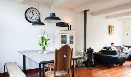
HOUZZ TOURSMy Houzz: Going Heavy on the Metal for Industrial-Style Beauty
Steel and iron pieces mix with antiques and heirlooms in an eclectic Netherlands home
Full Story
DECORATING GUIDESHouzz Call: What Home Collections Help You Feel Like a Kid Again?
Whether candy dispensers bring back sweet memories or toys take you back to childhood, we'd like to see your youthful collections
Full Story
REMODELING GUIDES11 Reasons to Love Wall-to-Wall Carpeting Again
Is it time to kick the hard stuff? Your feet, wallet and downstairs neighbors may be nodding
Full Story
COLORSpring Forecast: Dare to Love Peach Again
8 Succulent Spaces Show How to Welcome Peach Back Home
Full Story
LIFELate Again? Eliminate the Things Holding You Up in the Morning
If you find yourself constantly running late for appointments, work and get-togethers, these tips could help
Full Story
HOUZZ TOURSHouzz Tour: An 1850s Ancestral Home in Texas Rises Again
See how exacting research and meticulous renovations gave a retired couple their dream home on a regained family plantation
Full Story
DESIGNER SHOWCASESSan Francisco Decorator Showcase: Happy Days Are Here Again
Creative ideas, bold colors and inventive materials abound under one (very large) roof
Full Story
KITCHEN DESIGN3 Steps to Choosing Kitchen Finishes Wisely
Lost your way in the field of options for countertop and cabinet finishes? This advice will put your kitchen renovation back on track
Full Story
KITCHEN DESIGNBar Stools: What Style, What Finish, What Size?
How to Choose the Right Seating For Your Kitchen Island or Counter
Full Story
KITCHEN DESIGNStylish New Kitchen, Shoestring Budget: See the Process Start to Finish
For less than $13,000 total — and in 34 days — a hardworking family builds a kitchen to be proud of
Full Story
2ajsmama
Window Accents by Vanessa Downs
Related Discussions
Finished Soapstone Kitchen - Pic heavy
Q
The Official azwildcats70 Finished White Kitchen (Pic Heavy)
Q
My new finished kitchen! pic heavy
Q
Sunny's bright and sunny finished kitchen! (pic heavy)
Q
katiee511
palimpsest
plllog
mommyto4boysOriginal Author
meetmeinthegarden
plllog
chloe_s_mom
mommyto4boysOriginal Author
User
plllog
blondelle
writersblock (9b/10a)
2ajsmama
marybeth1
2ajsmama
chloe_s_mom
mommyto4boysOriginal Author
2ajsmama
blondelle
writersblock (9b/10a)
plllog
shelayne
bethv
mommyto4boysOriginal Author
marybeth1
plllog
blondelle
rosie
lascatx
blondelle
lascatx
mommyto4boysOriginal Author
blondelle
msrose
2ajsmama
rhome410
blondelle
mommyto4boysOriginal Author
blondelle
mommyto4boysOriginal Author
blondelle
marybeth1
suzienj