SHOP PRODUCTS
Houzz Logo Print
bkboston

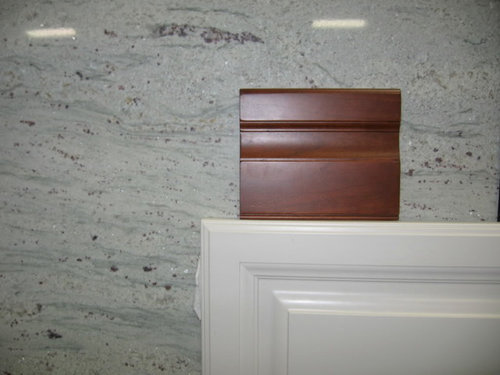
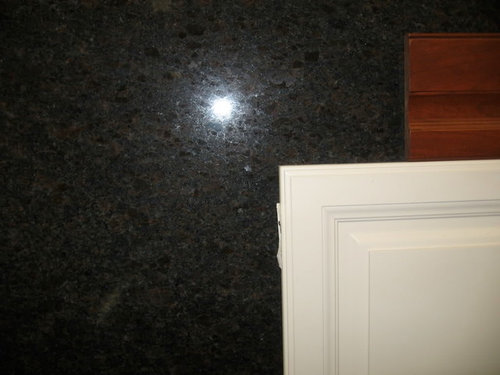
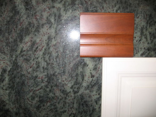
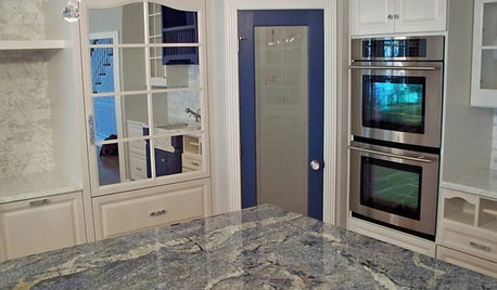
Granite 911: Will you help me narrow the choices???

bkboston
15 years ago

Dark? Light? Gold? Silver? Brown? Green? White? I am in Granite H#@* and need help getting out.

Would you look through these NINE choices and tell me which to completely forget about or which to consider?? I would be so grateful for your help narrowing this down.

Here's the cabinet situation: the perimeter will be the creamy off-white. The island will be cherry. The plan calls for the granite to be on the island and the cooktop area; and then a cherry wood countertop on the rest of the perimeter (refrig/message center area and into an adjacent breakfast room bar/counter area). So hopefully the granite would pull it all together (cherry island, creamy white perimeter, cherry wood countertops-- and stainless fridge/sink).

Knock some out for me...please!

Harvest Cream


Valley White


Ivory Chiffon


Coffee Brown


Kashmir Gold


Silver Sparkle


Tropical Green


Dakota Mahogany


River White

Comments (40)

  • dkitchenreno
    15 years ago

    Ok, so this is only my opinion, but I like (in no particular order):

    Harvest Cream
    Ivory Chiffon
    Kashmir Gold
    Silver Sparkle

  • twogirlsbigtrouble
    15 years ago

    Wow, you are in granite h$#@! Do you know what your doing for a backsplash yet?

  • Related Discussions

    I've narrowed my choices... help me choose?

    Q

    Comments (4)
    I am not a landscaper nor am I known for having good taste, so I will just comment on the plants. Boule de Neige is one of the most beautiful plants 12 months of the year. The bloom period is among the longest of rhododendrons. The plant is great without flowers. The ones I am most familiar with are in partial shade. It is very hardy, will even bloom well in deep shade and likes cold climates. I have Chionoides and like it but Boule de Neige is much better. Yaku Prince is slow growing, but is a beautiful plant with that great yakusimanum foliage with rich indumentum. The flowers open reddish pink but fade to pale pink before finishing. It is moderately hardy. Pohjola's Daughter seems to be almost as nice but much, much hardier. It seems to be new to the trade and doing best in colder climates. It is a member of a Finnish group of super hardy plants. Rosebud has a super flower on an average plant.
    ...See More

    Please help me narrow down my choices for a couple of fig trees

    Q

    Comments (5)
    FWIW: There is a rumor I read once, that Black Jack is just a sport of Black Mission. The main difference between the two is the growth of the trees, Black Jack being a more natural semidwarf, black mission eventually getting rather large as figs go. Or so I understand. My personal experience with Black Jacks and Black Missions is that the fruits look and taste exactly the same.
    ...See More

    Please help me narrow my choices in a FD Refridgerator

    Q

    Comments (7)
    Hi. I'm new here and was enjoying reading everyone's questions and solutions, when I came across this on. We bought a Frigidaire 26' side by side last Saturday at Lowe's, then saw the 20% deal yesterday (LOVE the new fridge!). We took our receipt in yesterday evening and asked if we could take advantage of the 20% discount, since we only bought last Saturday. In less than 5 minutes, we were walking away from the sales counter with $240 cash in hand. I hope someone who maybe just made a purchase will see this and head out to Lowe's, hopefully for some cash back! :-) I would also like to add that I read a lot of customer reviews before we decided on the Frigidaire. GE and Whirlpool both got more poor ratings than the Frigidaire. I'm sure there are occasional lemons in every brand, though.
    ...See More

    Help narrowing down granite choices, any comments?

    Q

    Comments (22)
    We only looked at 3cm; the 2cm seemed too delicate although alot of beautiful colors came in the thinner version. We went with 3cm and it is absolutely solid; I'd go with your husbands recommendation of 3cm on this one. Of your photos, we both like the Desert Dream first and the Saturnia second. We don't like the Copper Canyon or Juperana Columbo at all; too much orange (will look even more orange under incandescent light). We too chose an exotic stone and absolutely LOVE it; would not change it at all; would gladly have paid double to get it (yes, we paid thru the nose for what we got!!) and it was well worth it; NO REGRETS. Every day we find a new section to look at or say to each other, 'Hey, did you see this gorgeous splotch of color here?!" or 'Hey, isn't this just BEAUTIFUL?!!' Ours too had mesh on the back. Our fabricator told us this is for preventing damage during shipping & fabrication; they left the mesh on the backside except where your fingers touch underneath on the exposed areas. Ours was dug up in Brazil, then sent to Italy for processing and finally came to the states; that's alot of moving around. We did not spend extra money on a fancy edge; rather, put all the money into the stone. Our stone is so beautiful it would have detracted from it so we just got a plain edge. Here is a link that might be useful:
    ...See More
  • remodelfla
    15 years ago

    Hmmmm... depends on your flooring?
    But:
    Valley White
    Kahsmir Gold

  • hogar
    15 years ago

    WOW, tough choices...I vote for river white or Ivory Chiffon. These two slabs will tie all the colors of the perimeter into a center focal point. But, I have to admit, I'm biased since I have "Ivory fantasy" in my kitchen and it kind of a blend of these two slabs. Love the colors of the RW and IC (I almost picked IC for my kitchen).

  • nutbunch
    15 years ago

    Okay my choices For what it's worth

    Silver sparkle is lovely and ties it all together.
    Ivory Chifon - the same thing only a little pinker (I don't like pink personally)
    Harvest Cream (adds a nice gold tone)

    I'd definitly remove
    Valley white - I think it will make the white of you cabinets not stand out and be too washed out together.

    Coffee Brown -Might look okay kind of generic looking with the white, but will totally clash with cherry (depending on the stain)

  • bluekitobsessed
    15 years ago

    Your choices sound very pretty! My reasoning would be:
    --First, rule out anything that is too close to either cherry or white: no Valley White, River White, and Dakota Mahogany.
    --Next, rule out the granites that are very yellow, which IMO clashes with the cherrywood and looks muddy/makes the white cabinets look very bright white: no Kashmir Gold and no Harvest Cream.
    --I am not a fan of very dark granites, so I would not pick Coffee Brown, but YMMV.
    --I end up with a tie between Silver Sparkle for its waves and blingy sparkle and Ivory Chiffon for the way it picks up the cherrywood, and then Tropical Green, in that order. That is just my opinion...but I would also want to know your mission statement (aka Sweeby Test) in the Read Me thread and how much natural light you have. HTH.

    Blue

  • Buehl
    15 years ago

    OK, if it were me, I'd immediately nix (eliminate) the following:
    * Valley White
    * Coffee Brown
    * Tropical Green (it looks "pink" on my monitor)
    * Dakota Mahogany
    They don't seem to make the cabinets "pop" like the others do.

    .....That leaves you with five.....

    I definitely like:
    * Silver Sparkle
    * Harvest Cream
    * Ivory Chiffon

    Not sure about:
    * River White
    * Kashmir Gold (I think it may have too much gold...)

  • twogirlsbigtrouble
    15 years ago

    I like the River White (this would blend), Silver Sparkle (this would stand out), and Coffee Brown (for something more neutral).

    I dont like the peachy pink in the Ivory Chiffon. Tropical Green looks blah. Im not really into the golds, but if you like them, I think the Harvest cream is better than the Kashmir Gold. Dakota Mahogany has too much red for me. And I dont like the Valley White as much as I like the River White. I think that covers it :)

  • pupwhipped
    15 years ago

    You know, you MUST know that this is so very subjective and we are seeing all this on a stupid computer screen. That being said, I like the Harvest Cream. No reason, just like it. The only one I don't like is Dakota Mohagany.

    As mentioned already, it would be helpful to know what the flooring will be.

    Now you do this...tell us right now which one you are leaning towards. You don't have to have a reason or a rhyme. Just say which ONE you like right now. I think that would tell us something about you.

    Good luck!

    pup

  • melanie1422
    15 years ago

    I think my favorite is Silver Sparkle...but I also like Harvest Cream, Ivory Chiffon, Tropical Green & River White. I agree with the previous posters that you don't want anything too white or too close to the cherry (you need contrast!). I also like a lot of movement in my stones, and I don't like the very yellow stone, as I think it will be weird with the white cabinets.

  • plllog
    15 years ago

    It's really hard to say look at a photo on a monitor, but given that, and no wall color, flooring, etc., I'd say Harvest Cream. I agree with the lists of yeas and nays others have given. For me, in the photos, it's the first one that really pops.

  • User
    15 years ago

    Wow, what a great selection you have! We just got a half slab of Golden Beach which is a lot like the Harvest Cream, gorgeous! So that would be my first pick.

    Valley White: too white for the cabinet, no contrast
    Ivory Chiffon: not fond of pink/maroon, especially in a kitchen.
    Coffee Brown: good option if your going dark
    Kashmir Gold: good option, looks good with both cabinets
    Silver Sparkle: Ugh more maroon and where's the sparkle?
    Tropical Green: Very different, and I love different
    Dark Mahogany: on the fence, maybe it could work, depends on style of your room
    River White: white won't add any contrast with cabinets so I don't think they're a good option.

    Hope that helps, just my 2 cents, maybe some of the designer folks will chime in, they always have an interesting perspective.

  • azstoneconsulting
    15 years ago

    I vote for you to AGONIZE over using EITHER.....

    Ivory Chiffon

    or

    Harvest Cream.....

    But remember This Process should be "FUN".... Right ?????

    Happy Agonizing...HA!

    kevin

  • aiallega
    15 years ago

    The Ivory Chiffon gets my vote. It gives a warm feeling and ties the colors together. It would be absolutely beautiful!

  • suzp
    15 years ago

    My vote

    Ivory Chiffon
    Silver Sparkle

    I think these two tie the island and remaining cabinets together, but as previous posters indicated, you didn't say what you're using on your floor. This could make a difference.

    Good luck! I think you should determine the type of look you're going for and then narrow it down one by one. Not easy, for sure, but you're certainly not the first that's had to agonize over granite choices!!

  • peytonroad
    15 years ago

    Another Ivory chiffon vote, but what isthe flooring going to be?? Have you considered Juparana Arandis??

  • bkboston
    Original Author
    15 years ago

    FIrst of all - thanks for the quick responses! I am beginning to see the path out of H#(* ... and while it still may be purgatory - it's the right direction. This is supposed to be fun?

    To answer some of the great questions you asked...
    - The flooring will be hardwood (oak; possibly stained...haven't gotten to that decision point yet...).
    - As far as natural light: there are not windows in the kitchen but it opens up to a very bright family room (cathedral ceiling, skylights, lots of windows).
    - The Sweeby Test..the mission statement is an interesting way to put a framework around choices.. Words I'd use to describe my ideal home/kitchen space are: warm, inviting, cozy, cheerful, calming.
    - And pupwhipped - you asked me to say which I lean towards ...aghh...um....ugh...(see what I mean?). I liked the Silver Sparkle but I worry that I might tire of the sparkle/silvery glitter (there's a lot of it). And does glitter and sparkle fit my mission statement? One of the first that drew me in was Ivory Chiffon but I worry about the pinkish tones.

    Here is another slab of the Ivory Chiffon that was pretty dift from the 1st (you see, I have even more than nine!)


    THANKS AGAIN.

  • marybeth1
    15 years ago

    I like the Harvest Cream, I think it looks nice with both cabinets. I just went through the same thing cherry perimeter and creamy island. It's hard enough to find granite to go with one color never mind two. Good luck, those are some pretty stones.

  • dtchgrl
    15 years ago

    Initial reaction, without studying the "whys" too much was that the Harvest Cream enhanced both cabinets and made me say "wow". Big standout for me.

    I also liked Ivory Chiffon at first, but at second look, I didn't care for the "peachy" areas.

    Kashmire seemed nice but on furher study maybe toooo gold.

    Valley White didn't do anything for me - tooo white. Also didn't think Coffee Brown or Tropical Green did much.

  • boxerpups
    15 years ago

    Oh dear everyone is all over the map of choices.
    You have amazing granites to look over.
    No wonder you are stuck.

    Choices
    1# Ivory Chiffon either one.
    2# Harvest Cream

    I can not wait to see the final choice installed.
    Best wishes.

  • clax66
    15 years ago

    What beautiful choices to select from! I can see why you are facing a dilemma!

    I would choose Valley White or River White for your island. The white is a nice contrast to the cherry and can help tie in the cream perimeter cabs.

    But I'm biased because they are very similar to the Blanco Romano that I chose for my island.

  • gglks
    15 years ago

    i guess i'm going to chime in to add some more indecision to the mix. i personally like the valley white or river white. i like monochromatic color schemes. i don't think the granite has to "stand out" next to your white cabinets. i think if it is a pretty slab, it's going to stand out. plus i like white kitchens with marble counters and that's a lot of white on white. just wanted to get the vote in for the white slabs.

    i then like silver sparkle....but......can you template around the maroonish veins? i like the silver/white areas much better.

    good luck....you'll probably end up more confused than you started!!!!!!!

  • daki
    15 years ago

    #1 Harvest Cream - ithas interesting movement and patterns but also has a calmfeel , and it enhances both cabinet colors. That one is definitely my favorite.
    #2 River White - I like the creamy color
    #3 Ivory Chiffon

    I think your Silver Sparkle also goes by the name of Silver Galaxy.

    Your picture has more of the green and less of the reds, but rknee's kitchen uses that granite on the island. That might give you a little bit of perspective :)

    The Valley white looks like it doesn't quite match your off-white. I also tend to prefer granites with a variety of pattern, so am personally not drawn to the darker colors - that's a VERY subjective preference though.

    Here is a link that might be useful: rknee's kitchen with Silver Galaxy

  • daki
    15 years ago

    Oh, here is why I think the Silver Sparkkle slab is also Silver Galaxy...I took a picture when we were granite shopping because I thought it looked cool (tourist picture). This is sort of a cross between your Silver Sparkle and rknee's Silver Galaxy:

    From granites

  • sandsonik
    15 years ago

    My snap reaction was far and away the ivory chiffon, followed by the river white. And this despite the fact that I understand your reservations about it being too "pinky"; it just seemed to compliment both cabs very well. I liked the slab in the first picture much better though.

    On second and third look...

    The harvest cream isn't bad, but a bit yellow for me and doesn't really complement the cherry cab as well as it could. I dunno, it's growing on me.

    The valley white scares me a little with creamy cabs. It's so hard to match whites and this seems quite a bit grayer than the river white which seems to match the white cab better, as well as include some colors from the cherry. I tend to go for contrasts myself, finding it easier than "matching"!

    I really, really dislike the Kashmir gold here, and that's the only one I can say that about.

    The silver sparkle is interesting. I guess I'd just look for a stronger color than grey, but that's just my preference. I think it could work, definitely!

    The coffee brown just seems kind of safe and blah to me. With wood counters on the perimeter I think my inclination is to go lighter than either the coffee brown or dakota mahogany. Prefer the Dakota to the coffee brown.

    The tropical green just doesn't do it for me, no real explanation - sorry! So after multiple looks I'm back to ivory chiffon in first with harvest cream or river white in second!

    I just quizzed my husband and he chose harvest cream easily - and said he really disliked the coffee brown. (He doesn't struggle with these decisions like us, LOL. It was instantaneous!)

    I feel for ya though. That's a hard decision!

  • chloe_s_mom
    15 years ago

    Gosh, not easy to chose! My vote: Ivory Chiffon (gorgeous!) and then Silver Sparkle (only if you are able to have the burgundy/red captured)

  • pupwhipped
    15 years ago

    Okay den, nother question for you. You say that the perimeter with the white cabinets will have the cherry wood as the counter...right? The island and some? area above the cooktop that is cherry will have this granite that you are asking about. My question is which area has the most countertop space? I'm assuming the perimeter has the most. I think we need more info. Would even like to see the wood counter material you are talking about. Maybe you've posted your plan before and I'm clueless, but I do think we need more info. Funny, I never even get involved in these issues, but I seem to be into yours!

  • bkboston
    Original Author
    15 years ago

    Pupwhipped, here is our layout. Hopefully it's easy to read. The island is cherry and will have granite. The cooktop area will also have granite. The island is the bigger of the two(about 100"). Then, the wood countertop (which looks very similar to the cherry island cabinets) will be on the perimeter that swings from the mudroom door around to the bar area in the breakfast room. All of the cabinets other than the island will be the creamy off-white.

    If any of this sounds wacky, please let me know.

    Here's the layout:
    {{!gwi}}

  • kelleg69
    15 years ago

    I don't like Tropical Green, Dakota Mahogany, Coffee, Ivory Chiffon, Silver Sparkle. I like the others pretty well. What are your furnishings like in the other room? What is your trim color throughout the house, etc. Try to think of it with all the other stuff. Just ideas...

  • bkboston
    Original Author
    15 years ago

    Geez - I didn't even think about taking furnishings in the adjacent family room into account...I feel pretty stupid.

    Here is the family room (pre-demolition)-- the island will be about where the kitchen table is now. There'll be some other changes, like the double glass doors becoming windows, but this gives the gist. Not to say we'll be keeping these couches forever, but the way the budget is looking...can't count on replacing or recovering too soon!
    {{!gwi}}

  • buddyrose
    15 years ago

    this is just my opinion based on my color taste -

    IVORY CHIFFON: I like it because it has the garnet accents which look pretty with cherry and white plus light pinkish crystals, soft and sparkly at the same time, and silver for the stainless. ties it all nicely

    SILVER SPARKLE: again has red garnets and grey to pull colors together. another pretty one.

    Coffee Brown: I love the dark granites for contrast but it looks like its got a lot of black in it. too dark.

    Kasmir gold: pretty stone but I don't like gold with cherry at all.

    Harvest cream: way too gold for a red wood stain.

    Valley white: too blue/grey

    Tropical green: don't like green. but that's personal taste. It looks pretty though.

    Dakota mahogany: maybe too dark in color for the white cabs.

    River white: boring. doesn't move me.

  • pluckymama
    15 years ago

    I like the second slab of Ivory Chiffon the best, followed by the Harvest Cream.

  • gglks
    15 years ago

    great suggestion to see the surrounding area. i switch my vote from the whites to the creams.......

  • jejvtr
    15 years ago

    Bk
    wow you are moving at record speed! Hope things are going well w/remodel

    Ok here's my humble op

    #1 Harvest cream - goes well w/both, subtle, classy - works
    #2 Ivory Chiffon - same as above
    #3 River white - because it is creamy - not white & works
    #4 Kashmir Gold - I initially totally ruled it out, because yellows are a very hard color to work with - but now that you have shown your family room - I would def put this in the running - Lots of yellow & golds in there including mantle, flooring

    I find the silver one too cold as most the whites (valley)- & fighting the cream cabs as does the top green

    I would request sample of your top 3-4 as large as you can get & bring them into your space w/ANY other parts of your palette - stainless(if you are using any DW, range,etc), wood flooring, furnishing, paint, backsplash, of course cabs, hardware - leave & "live" with it (even though i think you are in a condo now) - but see it in different lights etc

    The counter stone is just one part of the pallette and a big one - So, any of the palette that is known at this time would be critical to use to make the decision. i.e. I had r/o the kashmir gold until I saw more of the family room.

    Good luck!

  • surveymom
    15 years ago

    Before I saw the picture of the family room, I said Ivory Chiffon 1st slab, Silver Sparkle and maybe River White.

    After seeing the FR -
    1) Harvest Cream
    2) Ivory Chiffon, 2nd slab

  • mcraney
    15 years ago

    You have so many lovely granites to choose from. Some I haven't seen in my area.

    My choices are based totally on what I see on my monitor and my color taste.

    1) Ivory Chiffon - the second slab
    2) Harvest Cream

    I'm anxious to see your finished kitchen. I know whatever you choose will be perfect for you!

  • raenjapan
    15 years ago

    If it was my house, I'd do the river white, but you have a lot of yellows and warm woods going on, and I think Harvest cream might be best in yours, and might match your vision statement best.

    I personally can't stand peachy tones, so the Ivory chiffon is out for me.

  • debbie_2008
    15 years ago

    I love Kashmir gold with DARK cherry. The granite often has garnet flecks.

    I would not do a white or an extreme dark

  • debbie_2008
    15 years ago

    oops I hit submit to early.

    although, I'm not sure I like Kashmir Gold with White. I must say I've not seen it, so maybe?

  • yosarajo
    15 years ago

    I think the Ivory Chiffon and Silver Sparkle really tie the two cabinets colors together without overwhelming them. Have fun and don't let it keep you awake at night!

Sponsored
Davidson Builders
Average rating: 5 out of 5 stars1 Review
Franklin County's Full-Scale General Contractor