


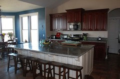
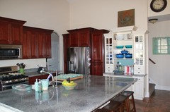
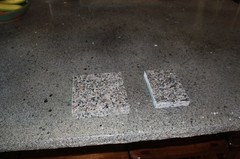
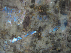
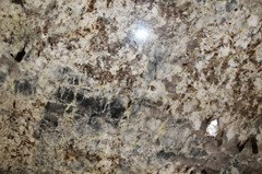
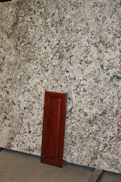
Am I being a coward with the granite?
danceme
11 years ago
Featured Answer
Sort by:Oldest
Comments (46)

islanddevil
11 years agomadeyna
11 years agoRelated Discussions
Am I being too picky?
Comments (14)Some of the posts here remind me of when the tile setters, GC and cabinet maker were here having a confab. After the walls and windows were done, the cabinet maker found an extra inch and wondered where I wanted it. Naturally, I chose countertop! So when we were talking about window trim, they were terribly concerned because I might have that inch more wall showing. Since my priority is countertop, I thought about it too quickly for them to notice and said no problem. They were shocked!!!! One said in surprise to another, "She's so easy!" I'm not. I just know my priorities and what I can live with. So my wish for Firstyear, and all the other TKOs, is contractors who care more about the bits that are a little off than you do. :-) Oh, and they figured out how to install the trim so that I get that inch of wall on both sides. And get my inch of countertop. So I wish for all of you to have good problem solvers too......See MoreBad granite or am I being picky?
Comments (6)The photos are very hard to see detail for sure. Uba-tuba is generally a stone that can be spot polished on -site. Repolish the entire piece-no way. First -off any fabricator who says a type of stone will be the same or cookie cutter doesnt know stone. Every slab I have ever seen is a unique piece period.I never call features on a stone defects but for example a fabricator friend of mine who regularly gets in containers of slabs examines each and every one that comes thru the door. He notes any marks(eyesore)(damage) with a wax marker.He documents every single feature on every slab. In your case he probably would have rejected this slab or tryed to refinish it if it wasnt resined(dyed). To me and again it is hard to see the details in your slab. I see some marks that look like someone tried to repair the marks or scratches on the slab but couldnt match the original finish. Maybe the slab was purchased from salvage but it doesnt look good even in the blurry pics. If the damages on the slab are not all over the place and the slab hasnt been resined a bonafide stone refinisher that is familar with polishing granite on site could probably repair this including the holes. A good refinsher will use a clear adhesive that will not be noticeable after the repair. A color matched blob of polyester epoxy will stand out if not properly done. Go to another fabricator and take a look at their slabs and you will see the difference. Talk to them and I think you will see a difference again. If you arent happy let your present fabricator or installer make it right. If you could send in better pictures that would be great. Stu Rosen www.mbstonecare.com www.stoneshine.com...See MoreAm I being unreasonable?
Comments (42)Our square footage was something like 65 sq ft and we needed 2 slabs of the smaller size. Most of the slabs we looked at were 108" but we found ones we loved that were smaller although I don't know the actual size, maybe about 84 inches long. There may have been a bit left over but we chose the template arrangement and in order to take advantage of any movement direction and especially nice parts, you need to be able to play around a bit with room to spare. I love that Nuage and would see if they can find you a remnant somewhere. Or else the Surf green scores 2nd for me. You would think they would sell you part of another slab and keep the remainders for someone doing a bathroom or something. Or is it that they don't have another slab??...See MoreQuartz Kitchen Install - Am I being picky?
Comments (0)We just had our counters replaced in our kitchen and it looks great but I pointed out several things to the installer and they acted as if I was crazy about some of them. Is what they did ok? Am I off base asking them for some resolution? Pictures here since I can only upload 3 - https://photos.app.goo.gl/MLeC2awLekoZb9Ws6 - shims under stone are clearly visible - seems odd. They had to use shims because the last counters were installed using a thick adhesive and they didn’t remove it from the backside of the cabinet - which required them to shim front (they didn’t tell me that but I can see the backside looking under the cabinets). You can also see the seam isn’t completely filled which I asked them to fix since it goes up on the side and is visible. - black flake in the stone - it looks almost like something slipped in during the stone manufacturing- they told me they couldn’t do anything about it but surely this would be covered by the stone manufacturer? There is NO black color in the stone at all - undermount sink is being held up with silicone and wood braces screwed into the side of the cabinet - they told me “we can remove the wood braces and the silicone will be strong enough to hold the sink” and they’ve been doing it like that for 20 years... I checked and the sink (Blanco) states they should use brackets or the warranty is void. Our last sink was mounted into brackets cut into the granite. - top eat at counter has a straight angle on one curve (where the seam is) but the other side they rounded it - it’s not symmetrical at all. This can’t be normal? They said they could come and cut it at the house to make the rounded side a Straight angle to match. Should they do that on-site? Feel like there’s a large room for error doing that by hand - chunk on the underside of the cooktop cutout - does this change the integrity of the stone? Lastly, no adhesive was used - is that normal? They just set the stone and siliconed around the edges. thanks for the help....See MoreUser
11 years ago
gr8daygw
11 years agotaggie
11 years agosixtyohno
11 years agodanceme
11 years agodanceme
11 years agodanceme
11 years agodanceme
11 years agotaggie
11 years ago
motherof3sons
11 years agoislanddevil
11 years ago
raee_gw zone 5b-6a Ohio
11 years agocindywhitall
11 years agoherbflavor
11 years agomadeyna
11 years agocolorfast
11 years ago
eam44
11 years agochinchette
11 years agodanceme
11 years agodanceme
11 years agodanceme
11 years agodanceme
11 years agodanceme
11 years agoislanddevil
11 years agodanceme
11 years agoeam44
11 years agodanceme
11 years ago
Bunny
11 years agolascatx
11 years agochinchette
11 years agodanceme
11 years agodanceme
11 years agodanceme
11 years agodanceme
11 years agolascatx
11 years agodanceme
11 years agolascatx
11 years agodanceme
11 years agoSaraKat
11 years agodanceme
11 years agoraffertybr
9 years ago
Joy Cifuni
7 years agoJoy Cifuni
7 years ago

Related Stories

GARDENING FOR BUTTERFLIESBe a Butterfly Savior — Garden for the Monarchs
Keep hope, beauty and kindness alive in the landscape by providing a refuge for these threatened enchanters
Full Story
KITCHEN DESIGNKitchen Sinks: Granite Composite Offers Superior Durability
It beats out quartz composite for strength and scratch resistance. Could this kitchen sink material be right for you?
Full Story
MOST POPULARTrend Watch: 13 Kitchen Looks Expected to Be Big in 2015
3 designers share their thoughts on what looks, finishes and design elements will be on trend in the year ahead
Full Story
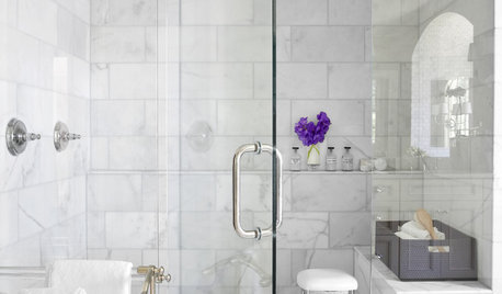
REMODELING GUIDESWhy Marble Might Be Wrong for Your Bathroom
You love its beauty and instant high-quality appeal, but bathroom marble has its drawbacks. Here's what to know before you buy
Full Story
REMODELING GUIDES8 Natural Home Materials That Can't Be Beat
See how designing with natural stone, clay, wood and more can give a house luminosity, depth of color and lasting appeal
Full Story
BATHROOM DESIGN14 Bathroom Design Ideas Expected to Be Big in 2015
Award-winning designers reveal the bathroom features they believe will emerge or stay strong in the years ahead
Full Story
LIFE6 Tips for Teaching Your Kids to Be Good Neighbors
Everyone wins when your children learn to respect boundaries, get help when they need it and show others they care
Full Story
MOVING9 Things New Homeowners Know to Be True
Just moved into a new home? Congratulations! The fun is about to begin
Full Story
REMODELING GUIDES10 Features That May Be Missing From Your Plan
Pay attention to the details on these items to get exactly what you want while staying within budget
Full Story


3mutts